


The Rules of Composition
A look at the core principles of composition in design, and how and where to use them

In design, the idea comes first. But first impressions matter just as much. Even the best idea can be ruined by poor design, while a simple phrase, well presented, can stay in people's memory for years.
Composition is the first impression. It is the reason some things strike us as beautiful, while others leave us thinking, "For some reason, I just don't like it." Composition guides the eye, sets the rhythm, and makes an image feel harmonious or, on the contrary, off-putting. In this article we explain how to use composition to create a strong first impression and make your design work.
In this article you will learn:
- What ties elements together
- Where the center of a composition is
- What creates dynamics
- The types of balance
- What sets the rhythm
- How color works
What composition is
Put simply, composition is the arrangement of elements and the relationships between them that make them work together and shape how the viewer perceives them.
In more depth, composition is the relationship between elements within a frame or a space, following certain rules or a structure. It is these relationships, not the elements themselves, that we notice first. The way elements are arranged in an image creates the first impression: the rules of composition work on a subconscious level.
How visual perception works
Grouping elements
In the early 20th century, German psychologists Max Wertheimer and Kurt Koffka studied how people see the world around them. They identified a set of rules rooted in our natural drive to find order in chaos. Their experiments showed that when the brain processes what it sees, it perceives several separate elements as one. In other words, the viewer unconsciously groups similar elements, looks for patterns, and so simplifies complex images.
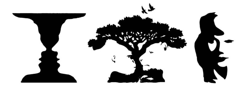
For more than a century these principles have stayed the same, and they are still used in graphic design today.
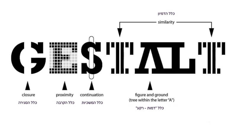
- Law of proximity – elements that are close to each other in space or time appear to form groups, and we perceive them together.
- Law of continuity - we tend to follow a direction that lets us connect the elements we see into a continuous sequence or a single orientation.
- Law of similarity – similar elements are perceived together and form closed groups.
- Law of closure – we tend to complete unfinished shapes and fill in empty gaps.
- Law of simplicity - we perceive and interpret complex objects as the simplest possible shape or group of shapes.
- Figure-ground law - perception is organized so that we see the object (the figure) and the background it sits on.
Active areas
Later, the German philosopher and theorist Rudolf Arnheim, building on the work of the Gestalt psychologists, applied these principles to the analysis of works of art. In his view, every image has specific points of attraction.
If a composition has no accents that grab attention immediately, the eye will always stop at the center and at the four corners of the rectangle. These are the best places for the key elements.
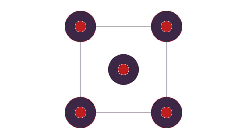
Another model that underpins modern design is the Gutenberg diagram. According to it, the eye usually moves from the top-left corner to the bottom-right corner, passing through the center. Arnheim also noted its optical significance. Note that this applies to left-to-right languages. In right-to-left languages such as Hebrew or Arabic, the pattern is mirrored.
Top-left corner - the primary optical area: this is where the eye naturally lands first. Because we are used to reading from left to right and top to bottom, we unconsciously start here. The logo and the most important information are usually placed here.
Top-right corner - a strong fallow area that the eye picks up next. It is a good spot for supporting messages, and contact details or search are often placed here.
Bottom-left corner - the weak fallow area that gets the least attention. It is considered the least noticeable part of the page, where people spend the least time looking. If the content in this corner is not prominent or "heavy" enough, users will simply ignore it.
Bottom-right corner - the terminal area, where the gaze comes to rest. It is typically used for a CTA (call to action), a chat button or a sign-up.
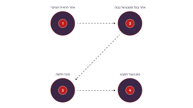
An example of the Gutenberg diagram in social media design.
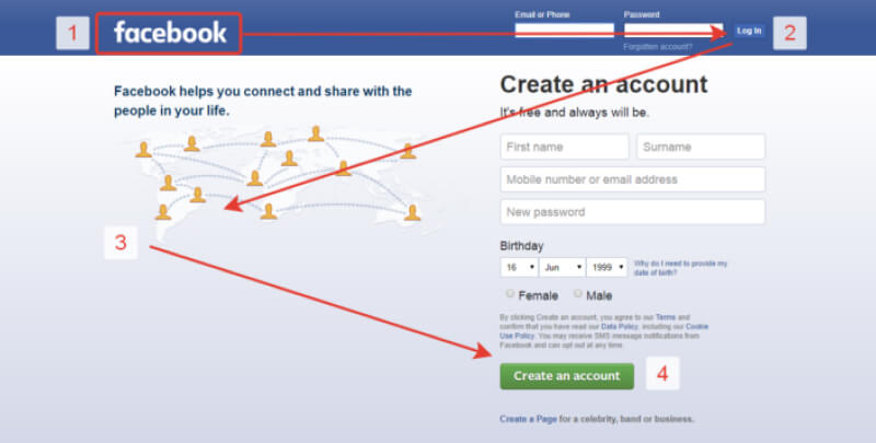
Knowing Rudolf Arnheim's principles and the Gutenberg diagram helps you not only draw attention to an element, but also "hide" it.
The rule of thirds
The rule of thirds is most often used in poster design, photography and advertising.
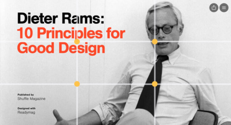
The active points sit where the lines that divide the rectangle into nine equal parts intersect, or along the lines themselves. You can see this grid, for example, in your phone's camera.
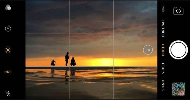
The human eye naturally stops at these points, and the resulting asymmetry (none of the points coincides with the center, since the composition is split into thirds) creates enough "tension" to give the work a sense of movement.
Focal points of a composition
A designer's job is not only to place the elements that carry the main meaning, but also to emphasize them visually. The areas that attract attention first are called focal points.
The center of mass of a composition - the simplest of them, since it sits at the center of the frame. In a rectangle or a square, for example, the center of mass is where the two diagonals cross. Any object placed here will draw attention.
The compositional center - created through contrast, color, size or shape. Unlike the center of mass, a composition can have several compositional centers. They become its key: all secondary objects are arranged around them.

Where the focal points sit depends largely on the shape the composition is built on, or on the shape of the frame.
In a rectangle or a square, objects are placed:
- On the central axis and its horizontal intersection at the optical center

- On the diagonals, especially where they cross

- On the edge of an ellipse or circle inscribed in the rectangle of the frame.

In a triangle - focal points are located where the altitudes, medians or angle bisectors meet.
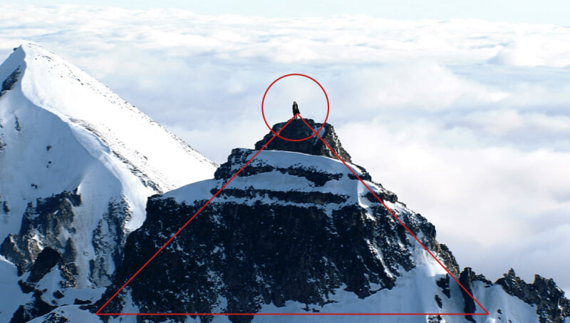
In a circle, the focal points are:
- At the center and just above the center of mass
- On the sides of a pentagon inscribed in the circle
Leading lines
Leading lines are one of the most important elements of composition. They can separate or connect elements, guide the eye, create a sense of movement or calm, and evoke emotions in the viewer.
Horizontal lines - they are at rest and in balance, which creates a sense of security and stability.

Vertical lines - they suggest growth, strength and stability because they resist gravity. The overall impression often depends on the "weight" of the objects placed along the vertical: usually it works best when the "heaviest" elements are at the bottom and the "lightest" at the top.
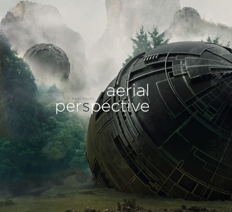
Diagonal lines - they create dynamics and can be used to lead the viewer's eye to the focal points. There are two types of diagonals in composition:
- The descending diagonal - runs from the top-left corner to the bottom-right and conveys acceleration and energy. It is also called the dynamic diagonal.

- The ascending diagonal - runs from the bottom-left corner to the top-right and conveys slowing down or effort. It is called the static diagonal.

The eye always moves faster from left to right than from right to left (in left-to-right languages), so keep this in mind when designing. In the example above, the ascending diagonal creates a sense of unease: the car is driving and a wave of sand is about to bury it. But the same feeling can come with a descending diagonal too. Climbers scaling a slope, for example, look unstable on a descending diagonal, as if they are about to fall. On an ascending diagonal, they look like strong, determined people heading for the summit.


Balance
A sense of harmony in a composition can be very subjective. Still, there are a few rules of balance that work in roughly the same way for everyone.
Balance in composition means arranging elements so that they feel stable and static or, on the contrary, dynamic because of imbalance. The "mass" of an element is defined by its size, contrast, saturation and shape.
Symmetry
Symmetrical balance - one side of the image mirrors the other. On both sides of the central axis there are elements of equal importance.
Symmetry is easy to read and understand, and it creates a sense of stability. However, such compositions are often too static and can look boring, because their two halves are almost identical.

Asymmetrical balance - the result of the two sides of a composition being unequal. For example, the dominant element can sit on one side, balanced by a couple of less significant objects on the other.
Asymmetry is perfect for minimalist design. It creates dynamics with a minimum of detail, because every time the eye moves it gets something new, going from larger elements to smaller ones, or from dark tones to lighter ones.
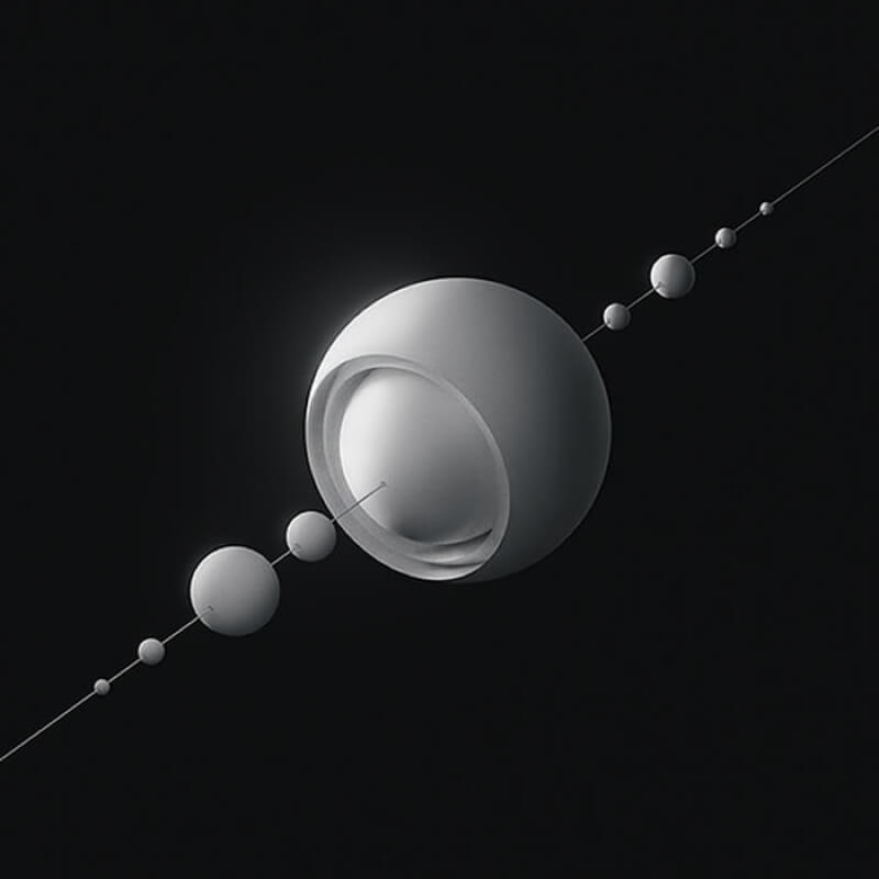
Asymmetry always looks more interesting because it offers more visual variety. However, it takes more work, since balancing individual elements is harder.
Radial balance - symmetry in several directions. Elements are arranged around the central point of the composition, like the spokes of a bicycle wheel. The center is often a circle, but designers also use other shapes: squares, triangles, octagons, stars. In this kind of design, the central point becomes the main point of attraction.
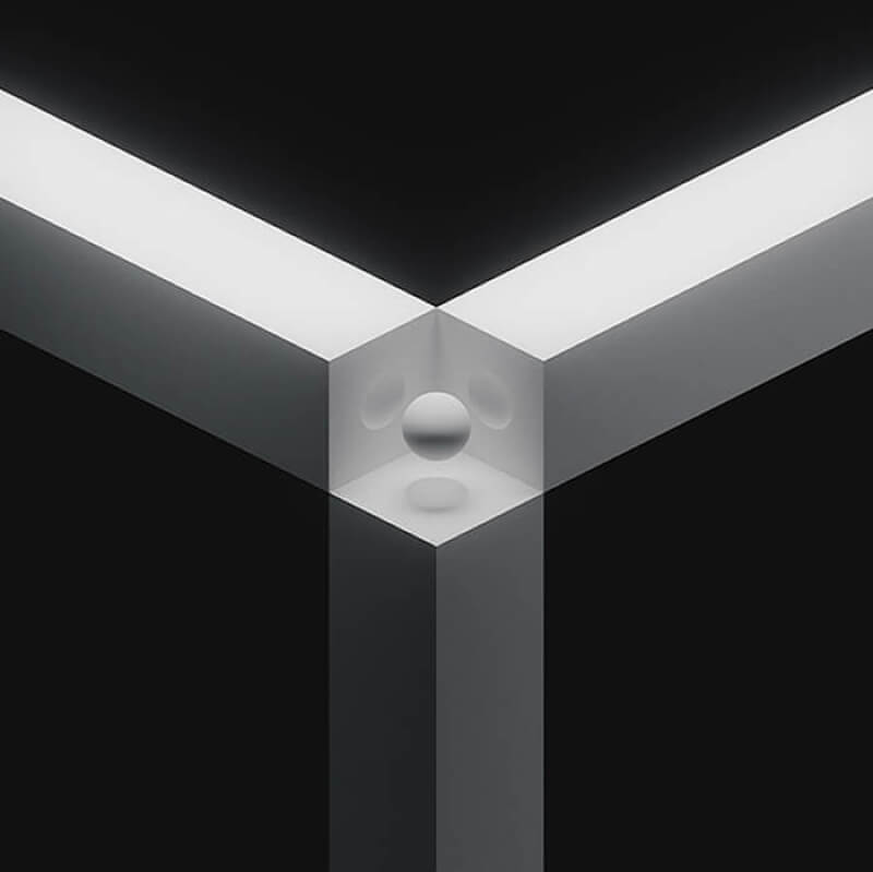
Mosaic balance - best described as organized chaos. The composition has no clear focal points, and all elements carry the same "weight". The lack of hierarchy should lead to clutter and visual noise, but balance holds because the elements are equal.
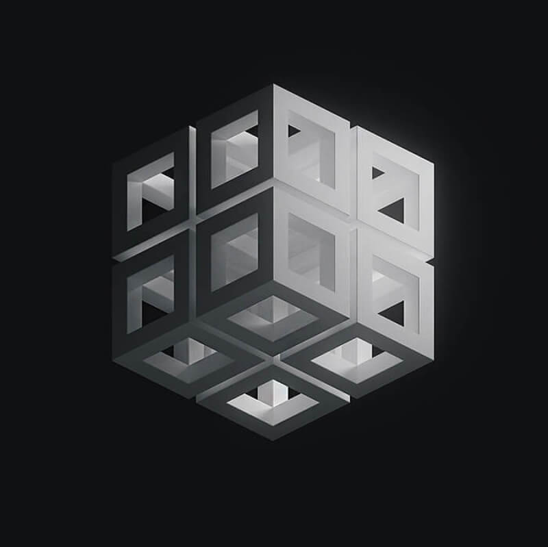
A balanced design always looks more harmonious because its content is organized, which avoids the "tension" of visual chaos.
The golden ratio
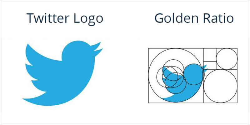
The ratio of parts that our perception finds most pleasing in a shape or structure is called the golden ratio.
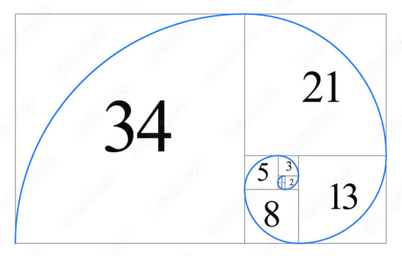
The golden ratio defines how the larger part relates to the smaller one, and the larger part to the whole. That makes it very handy for choosing element sizes. The ancient Greeks derived the universal number for this proportion: roughly 1.618. By scaling elements relative to each other by this factor, you get a more harmonious result.

Designers also use the golden spiral, built on the golden ratio, to create harmonious compositions: key elements are placed along its curve.
Negative and positive space
What matters is not only the elements themselves, but also the space between them. Positive space is the area the elements occupy. Negative space is the gap between them.
Negative space is crucial for grouping elements and separating the primary from the secondary. Empty areas can also create optical illusions, for example hidden elements.

Rhythm in composition
Rhythm brings order and harmony to a composition. A rhythmic pattern is built from similar elements and the intervals between them.
Types of rhythm in composition:
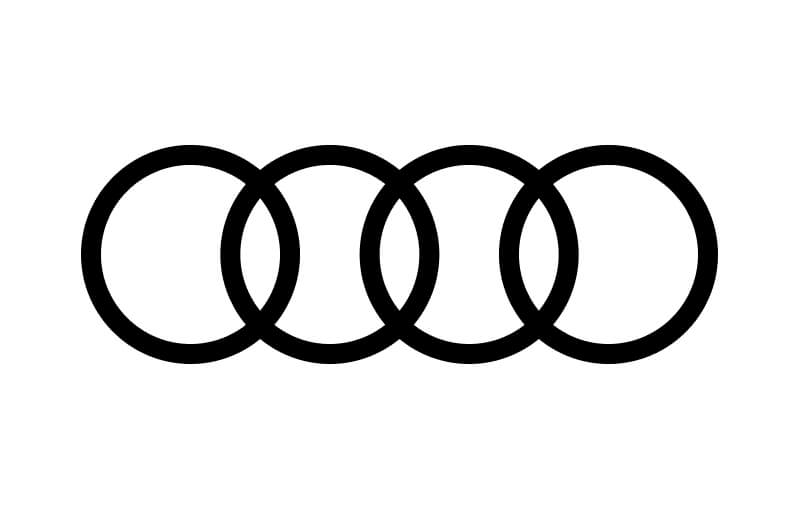
- Regular rhythm: the spacing between elements is predictable, or the elements themselves are similar in size and length. Regular rhythm is static, but contrast brings the design to life.
- Flowing rhythm: repeated elements follow curves and wavy lines. Each one is unique, though similar to the previous one. In nature you can see this rhythm in animal markings such as tigers or zebras, in tree rings and in fingerprints. This kind of rhythm creates a sense of smooth, natural movement.

- Progressive rhythm: shapes or figures change size and form consistently with each repetition. It can also be created by changing the spacing between elements. The result is an illusion of movement.

Variations in the structure always make it more interesting. The rhythm is predictable, and an unexpected element that breaks the pattern stops the eye for a moment.
Color
Research has repeatedly shown that color plays a key role in capturing attention and in how much we like a product when we first encounter it.
The most harmonious color combinations follow the 60-30-10 rule: 60% is the dominant color, 30% the secondary and 10% the accent.
Hue
Johannes Itten, who proposed the color wheel, made a major contribution to color theory. Based on the color wheel, all colors (hues) can be grouped into three categories: complementary, analogous and triadic.
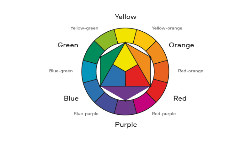
Complementary colors - sit opposite each other on the color wheel, like red and green.
A complementary color scheme creates contrast between elements and separates them from each other. The image becomes more vivid, but overusing complementary colors can make a composition off-putting.

Analogous colors - sit next to each other on the color wheel, such as red, orange and yellow. Close hues make a design more harmonious, predictable and easy to read.

Triadic colors - are evenly spaced around the color wheel and tend to look vivid and dynamic together.
A triadic color scheme creates visual contrast without making the image look "loud".

Besides hue, every color has other basic properties: saturation, brightness and temperature.
Saturation
Saturation describes how intense a color is. Saturated colors give a composition a bright, clean look and make it more dynamic. However, too many saturated colors can be confusing, as each bright color competes with the others for our attention.
Brightness
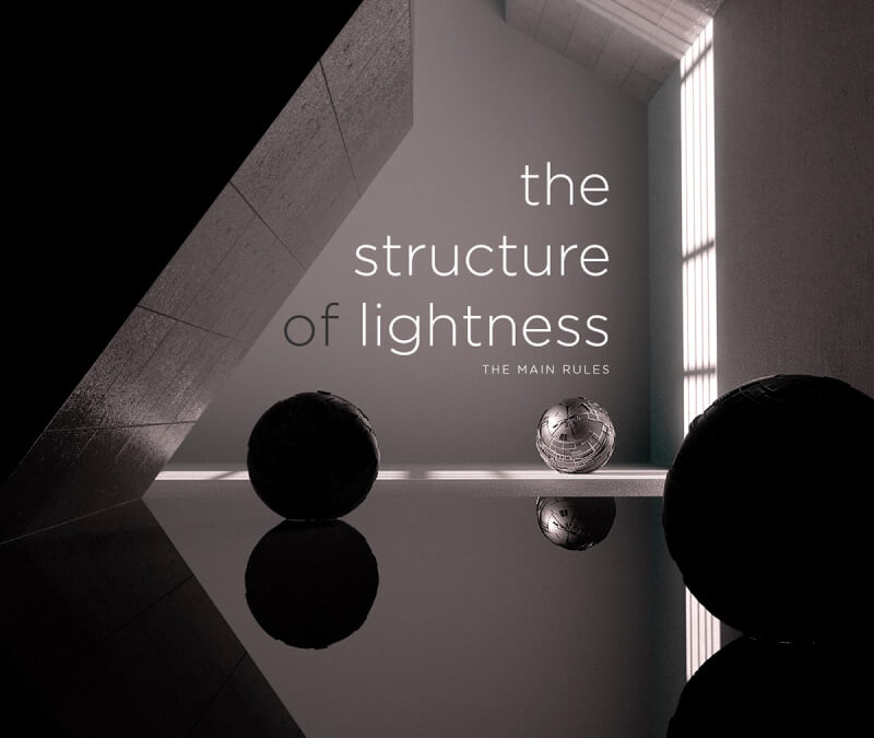
Brightness defines how light or dark a hue is. It is used to guide the viewer's eye and create focus in a composition: a light color stands out more against a dark background, and vice versa.
Temperature
Broadly speaking, colors fall into two groups: warm ones, such as red, yellow and orange, which remind us of the sun or fire, and cool ones, which include blue, green and purple.
Warm colors always appear closer, while cool colors recede into the background. In a composition, this property can be used effectively to guide the viewer's eye.

Disclaimer: blog content is for general information and learning only and is accurate as of its publication date. It is not professional, legal, financial or business advice, nor a recommendation or call to take any action. Any use of this information is at the reader's own risk, and we accept no liability for any resulting loss. Links to external websites and tools are provided for convenience only. We recommend consulting a qualified professional before making decisions.