

"The Inmates Are Running the Asylum": How to Design Interfaces the Right Way
A summary of a book that teaches designers how to build interfaces that don't drive users crazy.

Alan Cooper believes people are the lunatics who make life harder for themselves with clumsy interfaces. In his book The Inmates Are Running the Asylum he explains why this happens and what interface and system designers can do so their products stop frustrating users. Although the book was originally written for programmers and managers, it is just as useful for designers working on human-computer interaction.
Alan Cooper is an American designer and programmer. He is known as one of the creators of the Visual Basic programming language and was inducted into the Computer History Museum in 2017. He developed goal-directed design, a method focused on user goals, and was one of the first to use personas in product design.
In the book, Alan explains how "tech rage" arises, why modern systems ignore human behavior, and how to make sure your product becomes a market hit, even if it arrives several years late.
In this article you will learn:
- Why the number of features does not determine a product's success
- What problems users run into with modern systems
- Why you need a persona when designing an interface
The Dancing Bear
You have probably seen this video of an office worker losing his temper at his computer:
Alan calls this "techno-rage" or "computer Tourette's": the user flies into an uncontrollable fury, starts swearing loudly and hitting the computer. If you have ever worked in an office, you have seen for yourself how perfectly normal people start behaving badly when they sit in front of a computer.
Who knows what caused such an outburst: a lost file, an inaccessible image or an annoying interaction. Or perhaps the program politely deleted the only copy of the user's manuscript, all 500 pages, because the user answered "Yes" to a confirmation dialog, assuming they were asked to save their changes, when in fact they were asked to discard their work.
Cooper blames "apologists" for the rise of bad interfaces. He means programmers who don't care how complex a system is. They defend the computer simply because it lets them get their tasks done, even at the cost of a lot of effort.
On the other side are the "survivors". Cooper means ordinary users without a technical background who want a system to work in a clear, predictable way. They are the ones who often feel stupid when they can't figure out a new feature because the system is so complex.
Take the interface of the Xfinity X1 TV box. It lets you save a viewing schedule for shows in the Schedule submenu. That submenu sits under the Saved tab, and you simply cannot guess that without instructions:
This is an example of a "dancing bear": the schedule-saving feature exists, it works badly, but it works!
Deadlines and Features
In 1990, GO developed PenPoint, which was supposed to be the prototype for personal digital assistants, but it failed in 1992. The next attempt came from Apple with its Newton, and then from General Magic with its Magic Link in 1994. All of these products failed, and investors wrote off the PDA market as hopeless. But in 1996 the PalmPilot appeared. It was six years late, yet thanks to its appeal it managed to conquer the market.
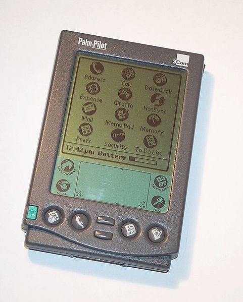
A late launch is usually not fatal for a product. A product launched with mediocre quality often turns out to be a failure, but if it delivers value to users, a slipped schedule will not necessarily cause long-term damage. If your product turns out to be a real hit, being a month or even a year late hardly matters.
Users often don't care at all what features a product has. They only care whether they can achieve their goal with your product. Sometimes that takes features, but too many of them can only do harm.
Alan believes features are behind one of the biggest problems in design. When there are too many, they start to seriously confuse the user. On top of that, building them makes the product more expensive and more complex: you not only have to write code for every new feature, you also have to somehow explain to the user how it works.
Problems with Modern Systems
Software forgets - Most programs remember the settings the user specified at some point. But they still forget the little things. For example, in the book Alan scolds Photoshop for not remembering which folder the user keeps all their images in. The problem is still relevant, which is why designers have a permanent mess on their desktops.
Software is lazy - Most programs make no effort to help users solve their problem. At the same time, they go to great lengths to please programmers. For example, an ordinary calendar can be overloaded with unnecessary functions, buttons and submenus. A programmer will happily dig into it to figure out what does what. The average person will not, because they can't even check today's date and the calendar explains nothing.
Just because you love power drills doesn't mean she loves them too. By directing programmers' efforts toward building what the user actually needs, we can make users far happier without forcing developers to work too hard.
Software doesn't give enough information - Programs often don't tell the user enough about what state they are in. Sometimes a system even hides information about itself until an error occurs.
I just bought a new bedroom clock with a built-in radio, the JVC FS-2000. It is very hard to tell when the alarm is on, so every now and then it misses my Monday wake-up call and throws me out of bed early on Saturday morning. Of course the clock has an alarm indicator, but that doesn't mean it is usable.
Software is inflexible - People constantly assess a situation and often adapt to it. Software is rarely that flexible. For example, if a person sees that a task is urgent, they deal with it first. A computer, on the other hand, will run tasks one after another, regardless of their actual priority.
Users prefer systems that allow a little cheating. They need to be able to nudge the pinball machine a bit to keep the ball in play, not too much, but enough to tilt the outcome in their favor. It is this flexibility that makes manual systems so effective, even if they are slower than computerized ones.
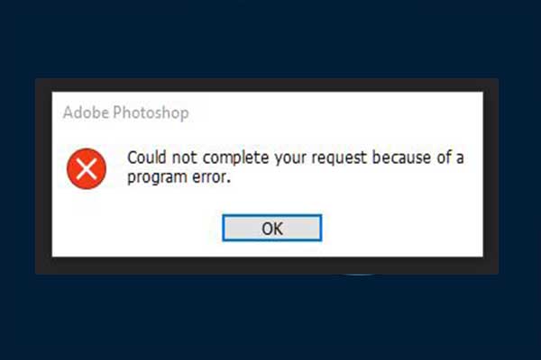
Software blames the user - When something unexpected happens in a system, the software blames the user and forces them to fix the problem. For example, Photoshop shows an error message with a huge red icon when a sequence of actions is wrong:
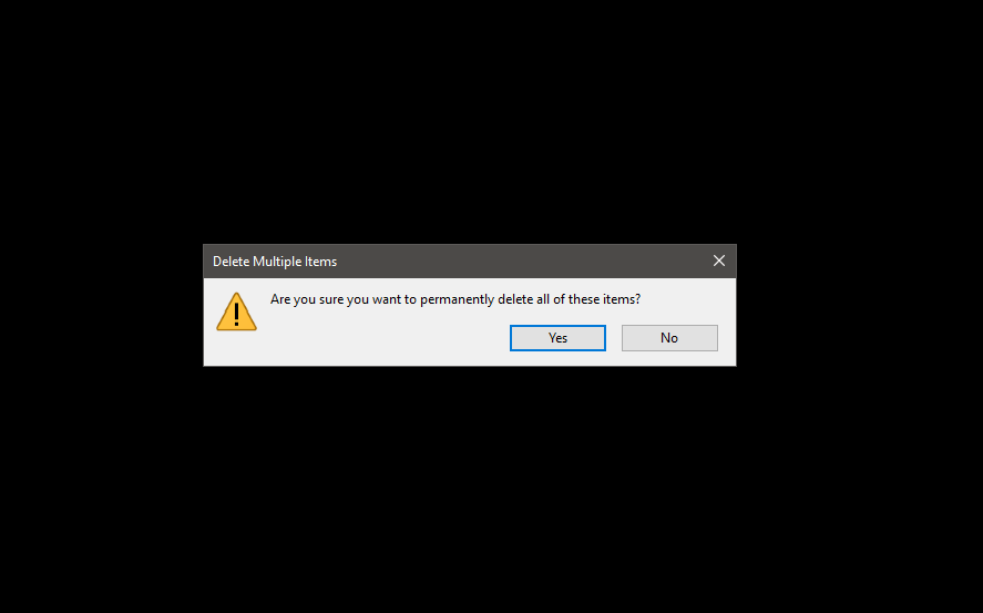
Software doesn't take responsibility - The silliest invention in computer systems is the confirmation dialog. The first few times, you read them and consciously click Accept or Cancel. But over time these dialogs become annoying and you start ignoring them without thinking, automatically clicking "Accept". That way the system absolves itself of responsibility for permanently deleting important files.
Designing for Outcomes
People use software and devices to achieve some goal. For example, when someone uses a kettle, their goal is not to heat water to 100 degrees but to make tea or coffee. If system developers don't understand this, the odds of creating a successful product approach zero.
Developers often don't understand the difference between goals and tasks. Alan believes this is one of the main reasons inconvenient systems still exist in the world:
Goals are not tasks. A goal is an end condition, whereas a task is a process needed to achieve the goal. It is very important to distinguish between tasks and goals because they are so easy to confuse. Tasks change with technology, while goals have the nice property of being stable. If my goal is to relax in a hammock and read the Sunday paper, I first have to mow the lawn. My task is mowing the lawn, while my goal is to rest. If I could hire someone to mow the lawn, I would achieve my goal without ever touching the mower.
Naturally, personal goals can't be reached without practical ones. For example, you can't hang a shelf (personal) without putting two screws (practical) into the wall. But the interface designer must remember that the effort invested has to match the expected result. If someone buys a TV and spends three hours setting it up the first time they turn it on, that is a bad interface. A TV should work right out of the box; then it is easier for the person to decide whether to learn its extra features or not.
People are willing to put effort into solving problems because they see it as a fair exchange. In other words, the user is willing to invest extra effort because they expect extra rewards for it.
Goals in Software Development
Personal goals are always constant and valid, regardless of how technology evolves. If a system ignores them, it is ultimately doomed to fail, no matter whether it lets you achieve other, non-personal goals.
- Not feeling stupid
- Not making mistakes
- Doing an adequate amount of work
- Having fun (or at least not being bored)
Business goals are very similar in nature to personal goals: they don't change over time either and are considered fundamental to a product's success.
- Increasing profit
- Growing market share
- Beating the competition
- Hiring more people
- Offering new products and services
- Taking the company public
Practical goals help achieve personal or business goals.
- Reducing the number of meetings
- Meeting customer needs
- Keeping records of customer orders
- Building mathematical models of the business
Programmers and designers often work on exactly these things, yet as a result the user feels uncomfortable with the system because they don't understand how to reach their personal goals. At the same time, Alan admits that software can't be built without practical goals:
If software ignores practical goals and serves only the user's goals, it means you have designed and built a computer game.
False goals are a trap for anyone who wants to make designing software easier for themselves:
- Saving memory
- Reducing the need for extra keyboard input
- Supporting work in the browser
- Ease of learning
- Ensuring data integrity
- Speeding up data entry
- Increasing software speed and performance
- Using cutting-edge technology
- Improving the visual appearance
- Keeping the interface consistent across platforms
In reality, all of these are just means to an end, and on their own they deliver no result.
For example, the false goal of a "simple interface" means nothing on its own, yet it raises many questions: "How will this help users solve their problem? Why should the interface be simple? What happens if this goal isn't met?"
Personas for Development
The most effective way to understand which personal goals to build on when designing an interface is to invent a character, a persona, and create the software for them. The persona should include the key traits of an average user:
Personas are not real people, but they represent real people throughout the design and development process. They are hypothetical archetypes of actual users. Although they are imaginary, they are defined quite precisely. In practice we don't so much "invent" personas as define them as a by-product of the research process. We do, however, invent their names and personal details.
Typically, a conversation between a designer and a developer who don't use personas goes like this:
Programmer: "What if the user wants to print this?"
Designer: "I don't think printing is needed in the first version."
Programmer: "Someone might need to print."
Designer: "Probably, but can we postpone that option until next time?"
The designer's arguments don't seem strong enough to the programmer to hold off on building the feature; someone really might need special printing. But once there is a persona in the design process, it is much easier for the designer to make the case.
Programmer: "What if the user wants to print this?"
Designer: "Sarah doesn't need printing."
Programmer: "Someone might need to print."
Designer: "But we're designing for Sarah, not for anyone else."
The most important part of creating a persona is giving it a name. Without one, you will treat it as something unreal and won't be able to picture its habits, behavior and character.
The general approach to creating a persona is to be as specific as possible so it is easier to picture them in front of you. For example, Sarah doesn't just use recipe apps, she also writes recipes in Google Docs. She doesn't just commute to work, she drives a used 2016 Toyota Camry with a blue child seat. Sarah doesn't just "have some job", she is a pharmacist at a private pharmacy at a specific downtown address. This level of detail helps you design and build the interface more accurately and imagine how a person will use your product.
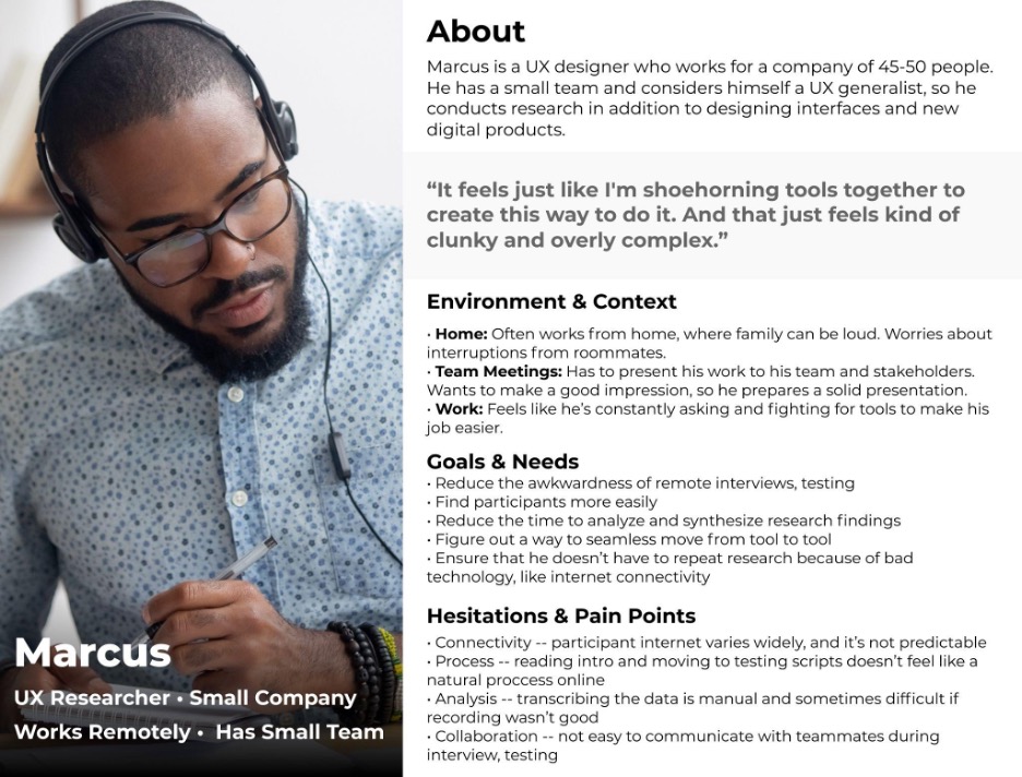
During design, designers look at the persona's goals and check whether the result fits them or not. Thanks to specific descriptions, the work gets easier.
It might seem that a real user could be used instead of a persona. The experience of an average user will help you define the purpose of the interface, but Alan warns against treating such a person as an interaction expert:
The victim of a problem is not automatically endowed with the power to solve it. A real user is a valuable resource and we pay close attention to them, but we don't let them directly influence the decision being made.
Alan believes you should design for a specific persona, not for a group of people. Otherwise designers and programmers will endlessly add new features to the product that only get in the way:
Every time you expand functionality to please one more user, you burden all the other users with unnecessary features. It turns out certain features please some users and not others. Trying to please too many people can kill a good product. However, if you design the interface around a single persona, nothing can stand between that persona and a perfect user experience.
For example, imagine car designers decided to satisfy three categories of people at once: a mother, a carpenter and a middle manager. The mother needs a spacious car for driving kids, dogs and groceries. The carpenter needs a pickup truck that fits his tools. The manager wants a two-door sports convertible to show off in. Just imagine what kind of car you would end up with.
Most likely you would never drive such a car, because it would look ridiculous. In reality, the mother, the carpenter and the manager need three different cars.
Working on Usage Scenarios
People use systems in a variety of everyday scenarios. You can usually learn about them during the research phase, when the designer conducts interviews and studies users. During the design process, it is important to understand what goal the user wants to reach and what actions they take to reach it:
The effectiveness of a scenario is determined more by its breadth than by its depth. In other words, it is more important for a scenario to describe the process from start to finish than to describe every step in exhaustive detail.
It is important to work out the daily-use scenarios right away, the ones the user performs most often. There are usually one or two of them; there may be more, but that is rare. For example, if you are building a calorie-counting app, the user will mostly add new meals and track their overall food intake. This should be as convenient as possible so the person never feels like deleting the app from their phone.
Daily-use scenarios need solid support with convenient interaction. New users must be able to master these features without trouble, which means high-quality support for fast learning. In other words, usage instructions should be placed where they are most accessible and intuitive.
Necessary-use scenarios are the ones the user performs rarely but must perform. In the same calorie-counting app, that would be a monthly report. The user only returns to this action once a month, so there is no need to obsess over small details during design.
Necessary-use scenarios should also support learning. Beyond that, the user won't progress to a higher level in these scenarios. Infrequent use means every user accepts the functions the app offers, so no personalization is needed here.
And the favorite scenario of the "apologists" is the edge case. You usually want to give such situations special attention, but in fact you can simply ignore them. That doesn't mean they shouldn't be designed at all, but it makes sense to spend resources on them only once you have finished the daily-use and necessary-use options.
For example, if a user needs to count calories in rare units, that is simply unnecessary in the first version of the app, since only 1-2% of the potential audience might need it. It's not worth delaying the product launch and complicating the interface for them.
Scenarios that are neither necessary nor daily don't require meticulous design. There is always a shortage of time and money, so such tasks are a good opportunity to save resources and spend them on something that delivers more value. We should design all scenarios, but carefully craft the interface only for the important ones or those that are used all the time.
Disclaimer: blog content is for general information and learning only and is accurate as of its publication date. It is not professional, legal, financial or business advice, nor a recommendation or call to take any action. Any use of this information is at the reader's own risk, and we accept no liability for any resulting loss. Links to external websites and tools are provided for convenience only. We recommend consulting a qualified professional before making decisions.