

Chart Types Explained: How to Pick the Right Chart
A good chart shows in a second what a table hides: a trend, an outlier, a comparison or the point where people drop off. It helps you see how sales moved over the year, which ad channel brings in the most leads and at which step customers abandon your website.
But the same data can be shown in many ways, and not all of them are good. A pie chart with 12 slices, an axis that does not start at zero or a rainbow of colours with no meaning can turn correct numbers into the wrong conclusion. In business that costs money: you shift your ad budget because a chart looks dramatic, when in reality the difference is negligible.
In this guide we cover:
- how to choose a chart based on the question you want to answer;
- which chart types are used most often and when each one fits;
- what to use for more complex data: heatmaps, funnels, Sankey diagrams and more;
- how to design a chart that is clear, honest and accessible;
- which mistakes ruin a visualisation, and which tools to use for reports and websites.
How to choose a chart type: start with the question
The most common mistake is to open Excel, select the table and click the first chart that looks nice. The right order is the opposite: first decide what the chart needs to show, and only then pick the shape.
Before you build a chart, answer four questions:
1. What job does the chart do? Compare sales across several products, show change over a year, understand which order values are most common, or find a relationship between two metrics.
2. What kind of data do you have? Separate categories, values over time periods, parts of a whole, numeric ranges, or metrics that are related to each other.
3. How many categories and series do you need to show? A chart that works perfectly with three values becomes unreadable with twenty.
4. Who will read the chart, and where? A CEO glancing at a dashboard on their phone needs something different from an analyst studying a detailed report on a large screen.
Quick reference: task → chart
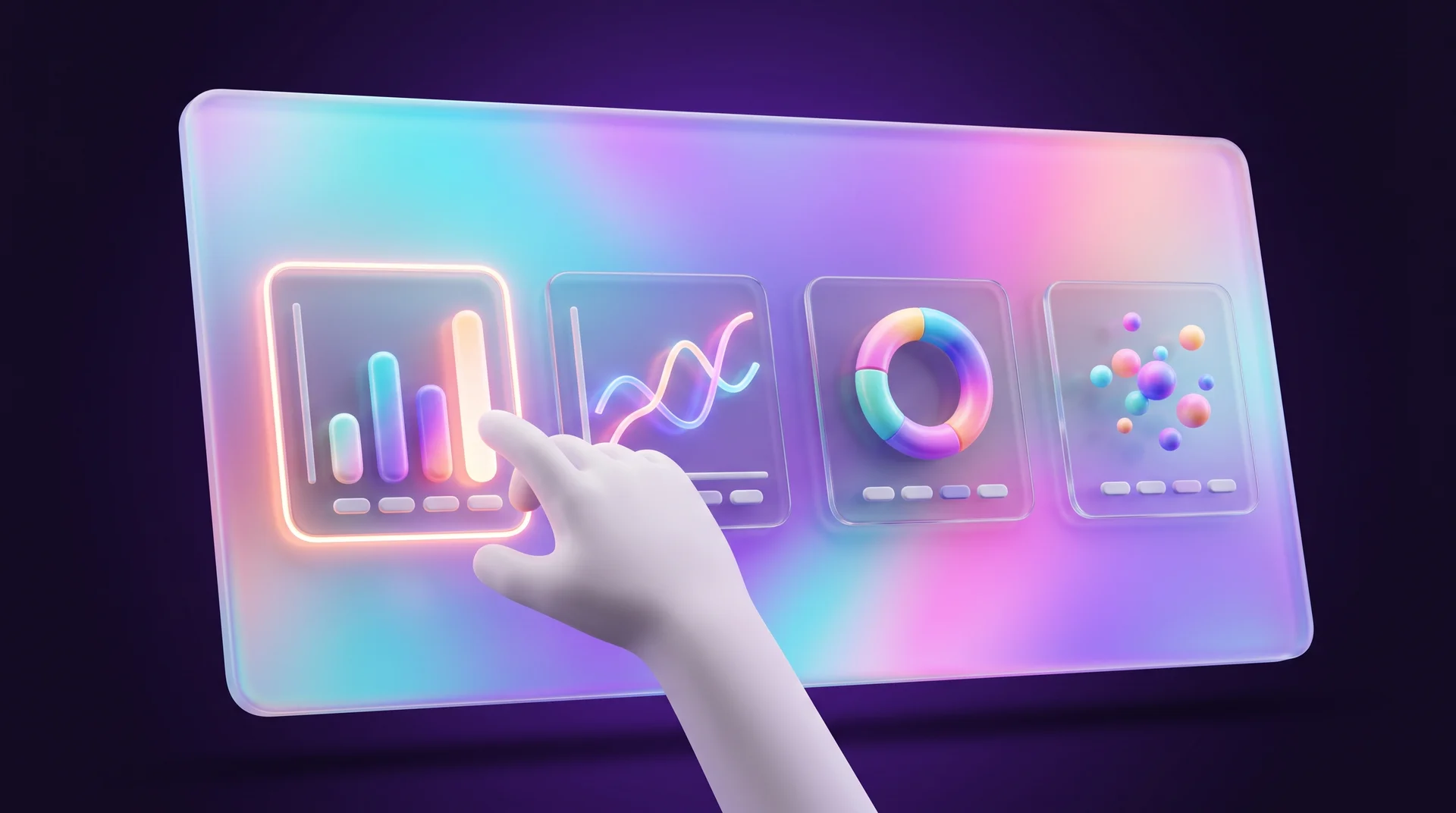
- Compare categories – a column chart or a horizontal bar chart. When you have many values and the distribution matters more than individual items, use a histogram.
- Show change over time – a line chart or an area chart.
- Understand a distribution – a histogram or a box plot.
- Find a relationship between metrics – a scatter plot or a bubble chart.
- Show the composition of a whole – a pie chart, a donut chart or stacked columns, as long as there are only a few parts.
- Show a hierarchy – a treemap.
- Show flows between stages or channels – a Sankey diagram.
- Show the steps of a process – a funnel for gradual drop-off, a Gantt chart for tasks and timelines.
- Compare regions – a geographic map or a choropleth map.
The core chart types and when to use them
Five or six chart types cover most business tasks. It is worth knowing them well before you reach for anything more elaborate.
Line chart
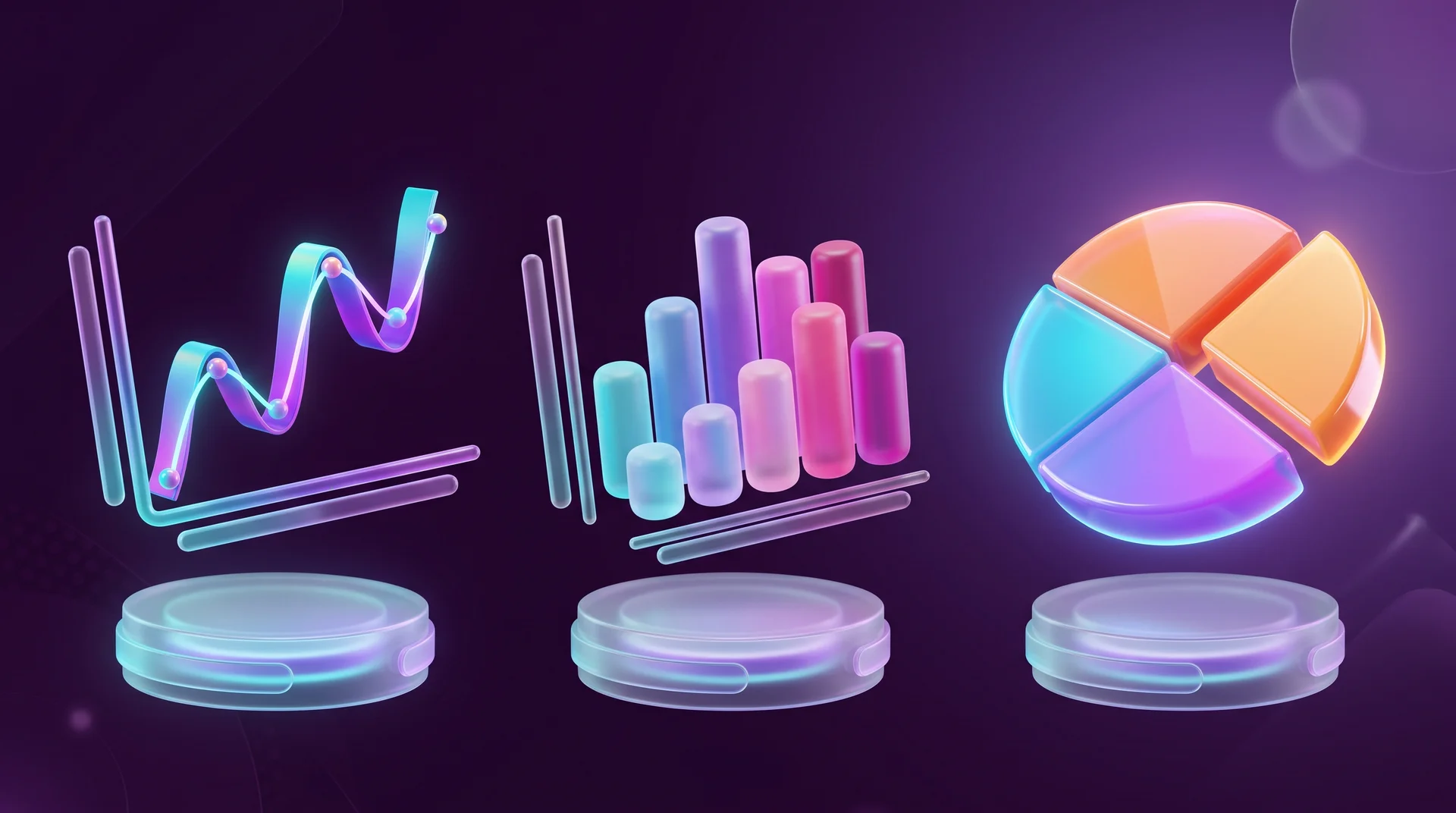
A line chart shows how a metric changes continuously, usually over time: monthly sales of an online store, website visitors by week, or cost per lead over the course of a campaign. You can plot several lines on the same axes, for example to compare the performance of Google Ads and Meta over the same period.
One important rule: only connect points with a line when there is a meaningful continuity between them. If the points are separate categories, such as different branches or stores, a line suggests a trend that does not exist.
Area chart
An area chart is similar to a line chart, but the space between the line and the axis is filled in. That puts the emphasis on volume rather than just direction. It works well with one or two series. When you stack many areas on top of each other, some values get hidden.
The normalised (100%) version shows how the ratio between parts changes over time, for example the share of traffic coming from mobile, desktop and tablet. But it hides absolute values: a channel's share can fall even when its visits actually grew, simply because other channels grew faster.
Column chart and bar chart
A column chart compares values across categories: sales of different products, revenue by location, or leads by channel. To turn it into a ranking, sort the columns from highest to lowest.
A horizontal bar chart does the same job, but the categories sit on the vertical axis. It is the better choice when you have many categories or long labels, such as landing page names or product titles. Long text stays horizontal and readable instead of being rotated at an angle.
Stacked columns show both the total and how it breaks down, for example monthly sales split by product category. The downside: only the bottom segment is easy to compare, because it is the only one with a shared baseline.
Histogram
A histogram looks like a column chart, but it works with a different kind of data. It shows how numeric values are distributed across ranges: how many orders were under €50, how many between €50 and €100, and so on (the amounts here are only an illustration). The bars touch each other because the ranges are continuous. A column chart compares categories; a histogram shows a distribution.
Scatter plot
A scatter plot helps you see the relationship between two numeric metrics, for example between an ad's daily budget and the number of leads, or between page load time and bounce rate. Each dot is a single observation. If the dots form a clear direction, there is a relationship. Remember: a scatter plot shows correlation, not causation.
Pie chart and donut chart
A pie chart shows what a whole is made of. It only works when there are few slices (four or five at most) and the differences between them are obvious. A donut chart follows the same principle, and the empty centre is a handy place for the total, such as overall website sessions. If you have many slices, or slices of similar size, a bar chart will do a better job.
Charts for complex data
Sometimes the data has a more complex structure: you need to compare three metrics at once, follow flows between channels or spot patterns in a large number of values.

Heatmap
A heatmap shows values in a grid of rows and columns, and colour represents magnitude. For example: days of the week on one axis, hours of the day on the other, and colour by the number of orders or chat enquiries. You immediately see when customers are most active, which helps you schedule campaigns and staff availability. A heatmap like this often surprises teams that copied their working hours from another market or another business: real activity peaks rarely match assumptions. Always place a legend next to the heatmap that explains the colour scale.
Funnel
A funnel shows how many people make it through each step of a process: viewed the product page, added to cart, started checkout, completed the purchase. The gap between steps shows where customers drop off, which makes the funnel a central tool for conversion analysis. We cover metrics such as conversion rate and average order value in our guide to ecommerce metrics for online stores.
A funnel does not show where the people who dropped off actually went. For that, you need a Sankey diagram.
Sankey diagram
A Sankey diagram shows how a volume splits across several directions. Stages are nodes, and the flows between them are bands: the wider the band, the larger the value. This lets you see which channels visitors come from (search, social, paid ads) and what they do next: browse the catalogue, read an article or leave. With many nodes, the diagram quickly becomes tangled.
Bubble chart
A bubble chart is a scatter plot with a third metric: bubble size. For example, price on one axis, units sold on the other, and bubble size by revenue. It is hard to compare bubble sizes precisely, so add labels for the values that matter.
Box plot
A box plot summarises a distribution compactly: the line in the middle is the median, the "box" covers the range where the middle half of the values sit, and the "whiskers" show the rest of the range. It is a good way to compare, say, delivery times across several courier companies. Points outside the whiskers are potential outliers, but not necessarily errors.
Waterfall chart
A waterfall chart shows how a starting value changes through a series of positive and negative components. The classic example: start with revenue, subtract cost of goods, salaries and advertising, and arrive at profit. It explains "what drove the change" better than any table.
Gantt chart and treemap
A Gantt chart places tasks on a timeline: research, specification, design, development and testing of a website. You can see what runs in parallel and what depends on what. A treemap shows a hierarchy as nested rectangles, for example sales by category and subcategory in an online store. Both become cluttered when there are too many levels or tasks.
How to design a clear and honest chart
Even the right chart type can mislead if it is badly designed. These are the rules worth checking before every report or presentation.
One takeaway per chart
Before you build anything, write one sentence: what should the reader understand? The title, labels and highlights should all serve that takeaway. If the chart shows sales for ten products, plus profit, plus average order value, but the goal is to show the growth of one product, keep only that product and move the rest to a separate chart.
A good title is the takeaway itself: not "Leads by month" but "Leads from Google doubled after the new website launched".
Honest axes and scales
In a column chart, the axis must start at zero. If the values 95 and 100 are drawn on a scale from 90 to 100, the second column looks several times taller, even though the difference is five per cent. In a line chart you can sometimes start above zero, as long as the range does not create an exaggerated impression.
Colour with a purpose
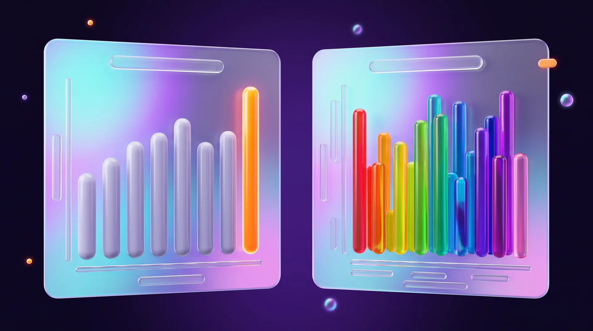
Colour should either separate categories or highlight what matters. If ten columns from the same series are painted in ten colours, readers look for a meaning that is not there. Use one colour for all of them, plus a single accent, such as your brand or highlight colour, for the data point that matters. It pays to build a fixed chart palette from your brand colours, as we explain in our guide to building a brand colour palette.
Labels, units, source and period
A chart should make it clear what was measured and in what units: euros, percentages, number of orders. State the period and the source as well, for example "January–September 2026, GA4 data". "Sales grew by 25%" without a period and a source is a claim nobody can check.
Less legend, less grid
A light, subtle grid is enough. If you can write the series name directly next to its line, you do not need a legend at all. Borders, shadows and background images compete with the data for attention.
Accessibility and mobile
Do not convey information through colour alone: red versus green is unreadable for some people. Add labels, markers in different shapes or dashed lines. Under WCAG, meaningful graphical elements need a contrast ratio of at least 3:1 against the background, and regular text needs 4.5:1. In the EU, the European Accessibility Act and national accessibility rules can also apply to websites and online services, so a chart on a website should have a text alternative: a short description of the takeaway or a data table. This is general information, not legal advice. We go deeper in our website accessibility guide.
On a phone, a wide chart turns into crumbs. Check that labels are readable without zooming and that the legend does not take up half the screen.
Common data visualisation mistakes
A pie with many similar slices
Angles and areas are hard to compare. Replace it with a bar chart, where readers compare lengths.
A truncated axis on a column chart
A small difference looks huge. Start from zero, or switch to a line chart and clearly mark that the axis does not start at zero.
Two vertical axes with no explanation
In a combo chart, for example columns for units sold and a line for average price, two axes on different scales can create the impression that both metrics move together. Label both axes clearly, and if that still does not help the comparison, split it into two charts.
3D effects
"3D" columns and pies in a report distort sizes: perspective makes some elements bigger and others smaller. In most reports a flat, clean chart is the better choice.
Dozens of lines on one chart
The result is a ball of yarn. Keep the series that matter, split them into several small charts, or highlight one line and show the rest in grey.
Mixing absolute values and percentages
The region with the most customers is not necessarily the leader in the share of customers relative to its population. Decide upfront what you are comparing, counts or rates, and use the same measure across the whole chart.
Tools for building charts and dashboards
You do not need to draw charts by hand in a design tool. There is a suitable tool for every job:
- Google Sheets and Excel – for simple tasks: column, line, pie, scatter and combo charts straight from the table.
- Looker Studio – Google's free dashboard tool that connects to GA4, Google Ads, Search Console and Google Sheets and refreshes automatically.
- Power BI and Tableau – BI tools for large datasets and company-wide dashboards. We compare them in our guide to what business intelligence is.
- Datawrapper, Flourish and RAWGraphs – publication-ready charts and maps you can embed on a website, including less common types such as Sankey diagrams and treemaps.
- Built-in dashboards – monday.com, HubSpot and other CRM systems show charts for leads and deals without any export.
- Code libraries for websites – Chart.js, Apache ECharts and D3.js for interactive charts on a website or in an app.
- Figma plugins – when designers need an editable chart inside an interface mockup.
- AI tools – ChatGPT, Claude and Gemini can build a chart from a data file and suggest which type fits. Check every number in the output: a model can get a calculation wrong or choose a misleading scale.
And sometimes you do not need a chart at all. If you only have three numbers, one sentence or a small table will get the message across faster.
Charts on websites and dashboards: what to plan for
Charts for international and multilingual audiences
If your website or reports serve several countries, the numbers themselves need localisation. Many European languages, including Portuguese and Greek, use a decimal comma and a different thousands separator than English, and the position of the euro sign varies by locale. A chart that shows "1,250.5" to a reader who expects "1.250,5" invites misreading. Most charting libraries can format numbers, dates and currencies with the browser's locale settings, so use that instead of hard-coding strings. Keep date formats consistent across axes and tooltips, and if any language version of the site is right-to-left, check that the library does not accidentally mirror the chart and that currency and percentage signs stay on the correct side of the number.
A business dashboard: start with the questions
A good dashboard does not show everything that can be measured. It answers five or six recurring questions: how many leads came in this week and from which channel, what a lead costs, where people drop off in the funnel, how many deals closed. For each question, pick one suitable chart using the reference list at the start of this guide. We explain how to bring data from your website, ads and CRM into a single picture in our guide to end-to-end marketing analytics.
Privacy
A dashboard shared with suppliers or shown in a presentation should not expose personal details of customers. Work with aggregated data and limit access by role. This is in line with the data minimisation principle of the GDPR; for anything specific to your business, check with a privacy professional, as this is not legal advice.
Charts inside your website
A chart on a website is part of the design: it needs your brand's fonts, colours and spacing, it must load quickly and it must work on a phone. You usually have three options: a static image (SVG or WebP) with alt text, an embed from a tool such as Datawrapper, or an interactive chart in code. In Webflow and WordPress you can also pull data from the CMS or an API and update a chart automatically.
How RJL Studio helps you present data clearly
At RJL Studio we design and build interfaces where data plays a central role: client dashboards, results pages, calculators and interactive reports on Webflow and WordPress websites. We choose the chart type based on the business question, adapt it for every language version and for mobile, and take care of accessibility. When needed, we connect charts to live data from GA4, your CRM or an API using n8n, Make and Zapier.
Want a dashboard or data page that people actually understand? Read about our UX/UI design services and automation and integrations, or get in touch and we will get back to you.
Frequently asked questions
What is the difference between a graph and a chart?
In everyday use the two words mean almost the same thing. "Graph" usually describes values plotted on axes, such as a line chart or a scatter plot, while "chart" is the broader term that also covers pie charts, funnels, treemaps and process diagrams.
Which chart is best for comparing categories?
A column chart or a horizontal bar chart. The eye compares lengths far more easily than angles and areas, so these charts are more accurate than a pie. Sort the categories by value, and if the labels are long, choose horizontal bars.
When should you still use a pie chart?
When you have two to five parts of a whole, the differences between them are clear, and the message is "which part is the biggest", for example the share of traffic from mobile. If readers need to compare precisely, or there are more slices, a bar chart will work better.
Which free tool is best for a small business dashboard?
If your data lives in Google tools, Looker Studio is a good starting point: it is free, connects to GA4, Google Ads and Google Sheets, and refreshes automatically. For simple data, the built-in charts in Google Sheets or Excel are often enough.
How do you make a chart on a website accessible?
Do not convey information through colour alone, keep sufficient contrast, add alt text that explains the takeaway, and include a data table for complex charts. Also check that labels are readable on a phone and that interactive elements can be navigated with a keyboard.
Disclaimer: blog content is for general information and learning only and is accurate as of its publication date. It is not professional, legal, financial or business advice, nor a recommendation or call to take any action. Any use of this information is at the reader's own risk, and we accept no liability for any resulting loss. Links to external websites and tools are provided for convenience only. We recommend consulting a qualified professional before making decisions.