

User Flow Design: How to Map the Path Through Your Site
Whether a website or an app succeeds depends on many things: a good idea, clean design, stable code, persuasive content and smart marketing. But if you want people to do more than visit once, if you want them to get in touch, buy and come back, you need one more thing: a clear, comfortable path from the moment they land on your site to the moment they get what they came for.
That path is planned very early in a project, before a single screen is drawn. The tool for planning it is called a user flow.
In this guide we cover:
- what a user flow is and how it differs from a customer journey map and a wireframe;
- who on the team needs it and what it saves the business owner;
- what a user flow diagram is made of;
- what you need to know before you start;
- how to build a user flow step by step, with an example from a service business website;
- which tools to use and which mistakes to avoid.
What is a user flow
A user flow, sometimes called a user flow diagram, is a visual representation of the route a person takes through a website or app, from the entry point to the goal. It shows which screens the user passes through, which buttons they click, which decisions they make along the way and what happens after each one.
The word "flow" comes from psychology. Flow is the state in which a person is fully absorbed in what they are doing and the activity moves forward without effort or interruption. That is exactly what interface design aims for. When a path is well planned, simple and in line with what the user expects, they move towards their goal almost without thinking. Every unnecessary screen, unclear field or button that is not where it should be breaks the flow, and very often breaks the decision to buy or to get in touch as well.
It is important to understand that a user flow is always a diagram. It is not a general idea and not a description in words. Think of it as a map that marks every step and every key action from the moment someone arrives on the site until they reach the destination. That destination can be anything: buying a product, booking an appointment, requesting a consultation call, checking the status of a delivery or contacting customer support.
In books and tools you will also see other names for the same idea: user flow diagram, task flow, UX flow, interaction flow or wireflow. The differences between them are small, and we explain them below.
User flow vs customer journey map vs wireframe
These three tools complement each other, but each one answers a different question:
- A customer journey map describes the customer's entire relationship with the business: from the first time they heard about it on social media, through the enquiry, the purchase and the service, to recommending it to friends. It includes emotions, expectations and touchpoints that happen outside the website.
- A user flow focuses on what happens inside the digital product: which screens, actions and decisions lead the user to a specific goal.
- A wireframe is a sketch of a single screen: what goes on it and where. Wireframes are planned after the user flow, once it is clear which screens are needed in the first place. We cover this in detail in our guide what a wireframe is and how to plan one.

Who needs a user flow and why
A user flow is a working tool, not another document you prepare just to tick a box. Everyone who designs or builds a digital product benefits from it.
Designers
The diagram helps designers focus on an interface that actually works rather than on design for its own sake. Only once the path is clear do they sketch wireframes, build prototypes, assemble UI components and settle on a visual style.
Developers
When the logic is written down in advance, developers do not have to keep coming back with questions like "what happens if the user clicks here?" You can build a website without a user flow, but then the gaps surface during development, and fixing them costs time and money.
Product managers and project managers
A product manager uses the diagram to protect the core idea and to check how a new feature will affect the experience. A project manager uses it to split work between designers, developers and content writers, and to estimate timelines.
Marketing and sales
For the marketing team, a user flow is a picture of the funnel inside the website. It shows where the user is supposed to leave their details, where they might drop off, and where it makes sense to place social proof, an offer or a WhatsApp button.
The whole team
- everyone sees the same scenario and understands where the structure of the site comes from;
- anyone can point to a spot in the diagram and explain what should change and why;
- the team has a shared tool for checking whether something in the interface gets in the way of the flow.
Users and the business owner
User flows are one of the foundations of human-centred design. Websites with a carefully planned path are pleasant to use, so people come back to them. For the business owner, the diagram saves money: questions and grey areas come up on paper, before you pay for design and code. Communication with the studio or freelancer also becomes simpler, because everyone is looking at the same map.
A good example is the "Undo" option that appears after you remove an item from the basket in an online shop. A feature like that is born from exactly the kind of question asked while planning the flow: "What if the customer removes a product and immediately changes their mind?" Automatic saving of a draft in a long form comes from the same thinking: if someone is filling in a detailed application, there is a good chance they will be interrupted halfway and return later.

What a user flow diagram is made of
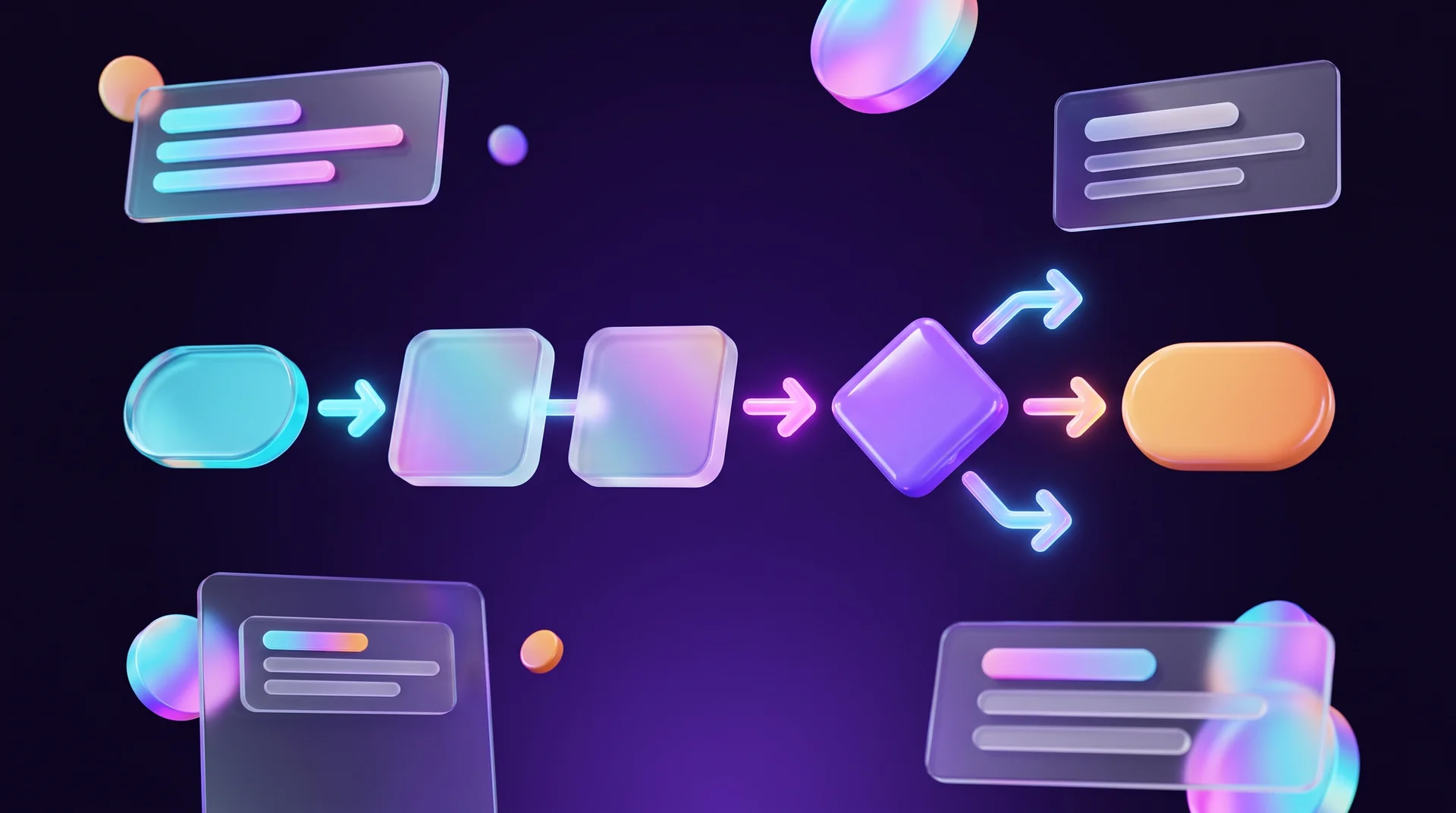
In most cases a user flow is drawn as a flowchart that describes three things: which screen the user is on, which conditions they face and what they do to move forward. The diagram can be high-level or very detailed, depending on the size of the product and the team's resources. To keep it useful and readable, it helps to mark a few standard elements.
Starting point
The moment the user enters the product. Remember that a website usually has several entry points: the home page, a landing page from a paid campaign, a blog article found through Google, or a link someone shared in a messaging app. Each of these may have its own path. The starting point is usually drawn as an oval.
Actions and screens
The steps the user takes: opening a page, filling in a form, closing a pop-up, adding a product to the basket. These are usually drawn as rectangles.
Decision points
The places where the user chooses between several options, so the path splits. For example: "Do they have an account?" Yes or no. "Is the form valid?" Yes, or back with an error message. Decision points are drawn as diamonds.
Connectors
Arrows that show how the points and actions relate to each other and in which direction the user moves.
End point
The goal the user has reached: the order is paid, the meeting is booked, the details are sent. This is also drawn as an oval, sometimes in a stand-out colour.
Ideally, the sequence of rectangles, diamonds, ovals and arrows describes all of the functionality and every possible scenario. If the diagram grows to the point where it is no longer readable, split it: each major process, such as sign-up, checkout or contacting support, gets its own diagram.
Task flow, user flow and wireflow
- A task flow is the simplest kind of path: one task, one route, no branches. It suits a linear process such as resetting a password.
- A user flow includes decision points and different scenarios depending on the type of user, for example a new customer versus a returning one.
- A wireflow combines the diagram with sketches of the screens themselves. It is especially handy for apps and for processes where a lot happens on a single screen.
What you need to know before you plan a user flow
A good user flow is built on information, not on gut feeling. The deeper the upfront research, the more real-world cases the diagram will account for.
Your audience
Who your users are, what they want to achieve and what gets in their way. To find out, run surveys, in-depth interviews, observation sessions and usability tests. At this stage it is important not to rely only on the personal experience of the business owner or the designer, but to talk to real and potential customers.
The market and your competitors
Study competitors' websites and apps, and not only from an aesthetic point of view. Walk through the path yourself: try to order, book an appointment or leave your details, and write down what felt easy and what broke the flow. This also shows you what customers are already used to.
The context
In what situations will the user reach your product? On their phone during a break at work, on a desktop in the office, on the move? For many business websites today, most visits come from mobile devices, so it usually makes sense to design the path for a small screen and one thumb first. Check your own analytics to see the real split. Context also decides how short the path needs to be: in a navigation app, for instance, the route to a result has to be as short and simple as possible, because safety is at stake.
Your business goals
Every step should feel logical and comfortable for the user, but it also has to lead them to the action the business needs: "Checkout", "Book a call", "Send us a message". A user flow that ignores the business funnel produces a pleasant website that does not bring in leads.
How to build a user flow step by step
Step 1: Define the user's goal and the business goal
Write down in one sentence what the user wants to achieve and what the business wants to happen. For example: "The user wants to understand how much a new website will cost; the business wants an enquiry with enough detail for a discovery call." If there are several goals, each one gets its own diagram.
Step 2: Map the entry points
Where do your users come from? Look at Google Analytics to see your top landing pages and which channels bring in traffic. A user who clicked a Facebook ad and landed on a specific landing page is in a completely different situation from someone who found a blog article through a Google search.
Step 3: List the steps on the main path
This is the "happy path": the shortest route to the goal when everything works. Write down every screen and every action, and ask about each step: is it really necessary? Could it be merged with the previous one?
Step 4: Add decisions, errors and edge cases
This is where most of the diagram's value lies. What happens if the form is filled in incorrectly? If the payment is declined? If the user closes the window halfway through? If the product is out of stock? Every scenario like this needs a clear next step, not a dead end.
Step 5: Draw it and share it
Turn your list into a diagram in a tool the whole team can open and comment on. At this point it is worth showing the diagram to everyone involved: the business owner, the sales team, the developer. Each of them will spot things the others missed.
Step 6: Test with users and update
Based on the diagram, build a simple prototype and ask a few people to complete the task. Where do they get stuck? Where do they look for a button that is not there? You will find out how to run a test like this in our guide to website usability testing. A user flow is not a document you make once: after launch, keep updating it based on real usage data.
Example: a user flow for enquiries on a service business website
Imagine a private clinic that wants new patients to book a consultation through its website. A possible path:
1. Entry: a paid social media ad leads to the landing page for a specific treatment.
2. Browsing: the user reads about the treatment and sees before-and-after photos and reviews.
3. Decision: "Ready to book?" If yes, they move on to step 4. If not, they see a WhatsApp button for a quick question, and the conversation is logged in the CRM.
4. Choosing a time: a calendar with available slots, with no need to phone.
5. Details: a short form with name, phone number and consent to the privacy policy. Three fields, not ten. Under GDPR, ask only for the data you actually need and make it clear how it will be used (this is a general principle, not legal advice).
6. Decision: "Is the form valid?" If not, an error message appears next to the problem field, and the details already entered are not wiped.
7. End: a thank-you page confirming the appointment, plus a confirmation message by WhatsApp, SMS or email and a reminder the day before.
Even this simple diagram captures important business decisions: a user who is not ready yet does not get lost, the form is short, and an automated process starts as soon as the form is sent. All of this is decided before a single screen is designed.

Tools for building a user flow
You can draw a user flow in any way you like: with a marker on a whiteboard, on sheets of a spreadsheet or in any graphics editor. The only rule is that the result must be clear to everyone involved. In practice, it is easiest to work in tools that support real-time collaboration:
- FigJam: Figma's collaborative whiteboard, with ready-made user flow templates from the Figma Community. A big advantage is that the diagram sits right next to your design files, so you can go straight from it to wireframes.
- Miro: an infinite whiteboard for workshops and client sessions, with a large library of templates for flowcharts and customer journey maps.
- Lucidchart: a dedicated diagramming tool with a full set of flowchart symbols, well suited to complex processes and documentation.
- Whimsical: a simple, fast tool for flowcharts and basic wireframes.
- FlowMapp: a tool that specialises in sitemaps and user flows, handy when planning the structure of a new website.
Many of these tools now also have AI features that generate a draft diagram from a text description. That is a good starting point, but you still need to check the decisions and edge cases by hand against how your business really works.
A user flow does not have to be a classic flowchart. Some teams prefer a sequence of screenshots with arrows, or a colour-coded map organised by funnel stage. What matters is that everyone involved understands the visualisation.
Common user flow mistakes
Planning only the happy path
The diagram shows how everything works when the user does exactly what was expected. But real users fill in fields incorrectly, go back, enter from the "wrong" page and lose their internet connection halfway through. If there is no planned next step for these cases, the developer will improvise one, and not always for the better.
Ignoring entry points other than the home page
Many visitors never see your home page at all: they land directly on a service page, an article or a product page. Every page like this should give them a clear way to continue towards the goal, not just a menu.
Adding unnecessary steps
Every extra screen, field or confirmation is one more chance for the user to leave. Forcing people to register before they can buy, forms with fields nobody reads and double confirmation steps are classic examples. Ask about every step: what would happen if we removed it?
Paths that end in a dead end
A thank-you page with nothing to do next, an error message that does not explain what to do, or a 404 page with no link back. The end of a path is also the start of the next step: a relevant offer, a newsletter sign-up or more content to explore.
Designing for yourself, not for your users
A business owner knows the product inside out, so what seems obvious to them is not always clear to a new customer. Without testing with real people, the diagram reflects the way your team thinks, not the way your audience does.
Not updating it after launch
Websites change: new services, new campaigns and new integrations are added. If the diagram is not kept up to date, it stops reflecting reality and loses its value. Come back to it with every significant change and compare it with real data.
How RJL Studio plans user flows for websites
At RJL Studio, every new website or redesign project starts with structure and user paths, not with colours. On the first call we clarify the business goal and the audience, then map the entry points and the route from each of them to an enquiry, a purchase or a booked meeting. Only once the path is agreed do we move on to wireframes, design and build.
We plan user flows for company websites, landing pages, online shops and systems with forms, booking calendars, CRM integrations and WhatsApp. For existing websites we also analyse the current path: where users drop off and which steps can be shortened. You can read more about how we work on our UX/UI design services page, and if your site is built on Webflow, on our Webflow development page as well.
Want your website to guide visitors all the way to an enquiry without losing them on the way? Get in touch, and we will come back to you with a proposal for planning your user flow.
Frequently asked questions
What is the difference between a user flow and a sitemap?
A sitemap shows which pages exist and how they are arranged in a hierarchy. A user flow shows how a user moves between those pages to achieve a specific goal, including the decisions and actions they take along the way. You usually plan both, and the sitemap is updated based on what the user flows reveal.
Does a small website or a landing page need a user flow?
Yes, but on a smaller scale. For a landing page, one diagram is enough: where visitors come from, what they see, where they make a decision and what happens after they submit the form. It is about an hour's work, and it saves you fixes after the campaign is already running.
Who should create the user flow?
On a small project it is usually the UX/UI designer. On a medium or large project, a UX researcher, an analyst and designers work on it together with the product manager. The business owner does not need to draw it themselves, but they should approve the diagram and add what they know about customers and the sales process.
How long does it take to build a user flow?
For a simple process, such as submitting details on a landing page, an hour or two is enough. For a product with several user types, checkout, a personal account and integrations, planning can take several days, including conversations with the team and testing with users.
How do you know the user flow is working after launch?
Look at the data: in Google Analytics you can build a funnel report that shows how many users move from each step to the next and where they drop off. It is also worth watching session recordings and running a short usability test from time to time. A step with unusually high drop-off is the first place to improve.
Disclaimer: blog content is for general information and learning only and is accurate as of its publication date. It is not professional, legal, financial or business advice, nor a recommendation or call to take any action. Any use of this information is at the reader's own risk, and we accept no liability for any resulting loss. Links to external websites and tools are provided for convenience only. We recommend consulting a qualified professional before making decisions.