

Landing Page Design: Structure and Principles for a Page That Converts
A good landing page doesn't just show a product. It makes the visitor want it. In this guide, we explain how to build a page like that, step by step.
In an online store, every product has a small page: a photo, specs and a short description. Sometimes that's enough, but often the visitor leaves without buying, because the information doesn't answer the question that really matters: what's in it for me? Compare a new smartphone's page in an electronics store with the launch page for the same model on the manufacturer's site. In the store, you'll mostly find a spec table and a price. The manufacturer has large images, feature demos and an explanation of the technology.
A landing page isn't better than a product page; it simply has a different job. A product page in a store helps people buy what they already want. A landing page has to make them want it.
Business owners and marketers use landing pages to sell a product or service, collect leads from a campaign or launch a new offer. So the page's main goal is to spark interest and show the visitor exactly what benefit they'll get.
In this guide, we cover:
- the difference between a landing page and a product page;
- why you start with a customer journey map;
- which blocks a converting landing page is built from;
- how to write copy using the 4U formula;
- what matters most on a landing page for mobile-first audiences;
- how to test what works and which mistakes to avoid.
What a landing page is and how it differs from a product page
A landing page is a standalone page built around a single goal: a purchase, a lead form submission, a webinar signup or a file download. Visitors usually arrive from a paid campaign, an email or a social media post, so everything on the page should move them toward that one action.
These are the main differences between a landing page and a regular product page:
- Goal. A product page serves someone who has already decided what they want. A landing page also has to persuade someone who heard about the product for the first time a minute ago.
- Navigation. A product page has a menu, similar products and recommendations. A landing page minimizes outbound links so the visitor stays focused.
- Content. A product page presents specs. A landing page tells a story: what problem the product solves, how it works in real life and why it's worth acting now.
- Measurement. A landing page has a clear conversion goal, so it's easy to measure and improve through testing.
Before design: the customer journey map (CJM)
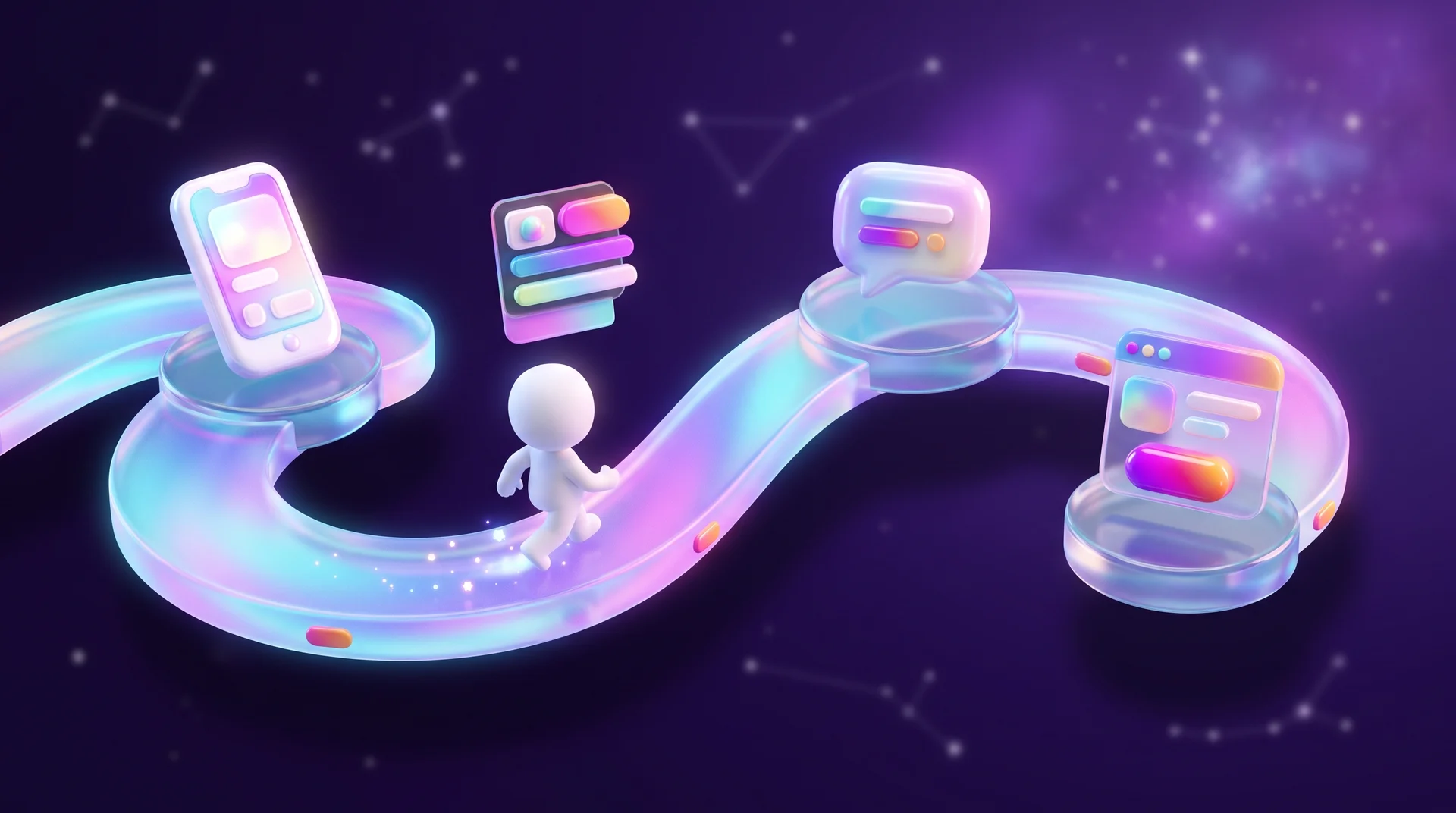
To build a landing page, it's worth starting with a customer journey map (CJM). The map describes how the customer will encounter the page, what they expect to find, what worries them and where they might drop off.
You can build a CJM in a simple Google Sheet, on a whiteboard like FigJam or Miro, or in a dedicated tool. If you already work in Figma, FigJam is a natural choice: the map and the design stay in the same place.
Here's how to build the map:
- Split the audience into segments. A small business owner, a marketing manager at a large company and a private customer come with different questions, even when they're looking for the same service.
- Define touchpoints for each segment. Where the visitor comes from (a Google ad, an Instagram Reel, a WhatsApp recommendation) and what they've already seen before landing on the page.
- Write down expectations and concerns. What they want to know on the very first screen, what might confuse them and what would make them distrust the business.
- Mark drop-off points. Where the visitor might leave: unclear pricing, a form that's too long, too little proof.
A map like this turns the page structure from a guess into a reasoned decision: every block on the page answers a question or concern that appears on the map.
The structure of a converting landing page
There's no single template that fits every product, but most successful landing pages repeat the same four blocks: introduction, demonstration, handling objections and a call to action.
First screen: introducing the product
Everything on the page, text, images and design, should say something about the product. That's why you start by introducing it. To grab attention and show the product in action, use a large image, a short video or an infographic.
Within a few seconds, the visitor needs to understand three things: what's being offered, what they'll gain and what the next step is. So a good first screen includes a headline that explains the benefit, a subheadline that sharpens it, a large product visual and a call-to-action button.
Look at Apple's launch pages: the product is always large and prominent, and the headline promises an experience, not a spec sheet. The visitor immediately understands who the hero of the page is and exactly what's on offer.
Demonstration: delivering on the promises
The second and third screens show how the product delivers what the first screen promised. Say you're selling a smart ring and promised it can be worn all the time. In the next blocks, show what it measures while you sleep and what it displays after a workout. If you promised a minimalist design, show the product up close and from several angles.
You can add as many demonstration blocks as you like. What matters is that they support the promise from the first screen and highlight what matters to your target audience. To find out what matters, read reviews of similar products and note what customers mention most, good and bad.
On a landing page for a service, the demonstration is usually the work process, a portfolio and client results: before and after, numbers and case studies.
Handling objections: FAQ and reviews
After the demonstration, answer the questions that came up for the visitor while reading. Usually this happens in the same blocks that demonstrate the product, using images and videos. It's also worth adding an FAQ block and a reviews block.
Reviews only work when they're real. Don't make them up: people quickly spot fabricated text, and it damages trust in the whole page. It's better to bring in reviews from Google, Facebook or other platforms and link to the source so anyone can check.
These objections come up in almost every field: how much does it cost, how long does it take, what if it doesn't suit me, and why choose you specifically.
Call to action (CTA)
The call-to-action block should stand out from the rest of the page, so it's convenient to place it on a different-colored background or in a separate card. Put the price, an image and the product name in the most prominent spot. If possible, also add perks: free shipping, a warranty, installments or a gift.
The action button should say what will happen after the click: "Get a quote" is clearer than "Submit". On a long page, repeat the button several times so the visitor doesn't have to scroll back up.

Copy that sells: the 4U formula
If you put only beautiful images on the page, nobody will buy, because nobody will understand what's being offered. On the other hand, you can't write "Buy now!" in every line: that tone is instantly noticeable, and people don't stay on pages like that.
To help the visitor decide, explain the benefit right at the start: what the product helps with and for whom, or what it saves them from. To make writing easier, try building your headlines and copy using the 4U formula:
- Useful: what problem does the product solve?
- Ultra-specific: what exactly will the customer achieve? Numbers and details are more persuasive than general promises.
- Urgent: when will the customer see results, and why act now?
- Unique: how is your offer different from everyone else's?
Example: a cleaning company could write "Professional cleaning services", but a headline like "Post-renovation apartment cleaning in one day, with a satisfaction guarantee" says much more: what you get, how fast and why you can trust the company.
The 4U formula, like any other formula, doesn't guarantee success. It helps you remember what matters, but the result also depends on the design, the product and the target audience.
Landing pages for mobile-first audiences: what matters most
The principles of a good landing page are the same everywhere, but many markets share a few traits worth planning for up front.
Mobile first
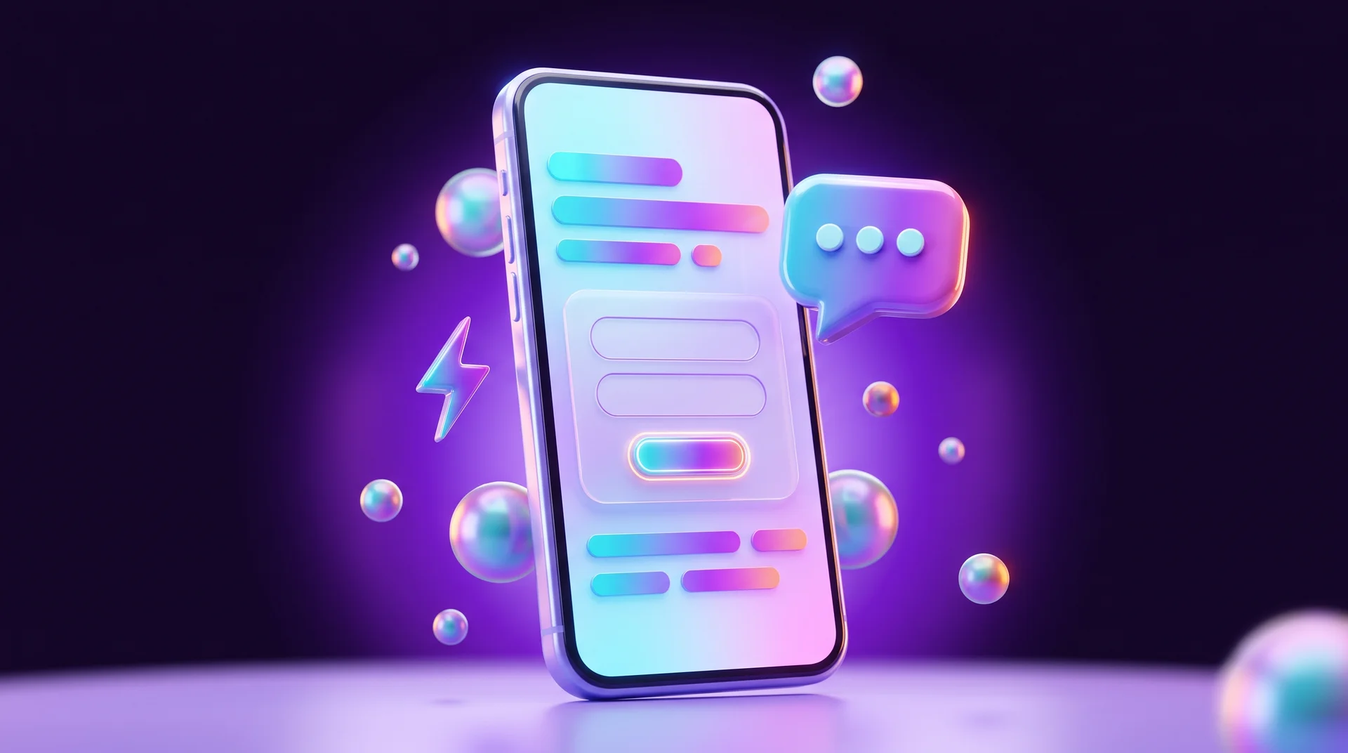
Most traffic from social media campaigns comes from phones, so design the page for small screens first. The headline should be readable without zooming, the button should be within thumb reach, and images should load quickly even on a mobile connection.
WhatsApp alongside the form
In many markets, customers prefer to message on WhatsApp rather than fill out a form. A WhatsApp button on a landing page is an extra conversion channel, not a replacement for the form. You can connect it to a chatbot that replies instantly, qualifies inquiries and passes warm leads to a sales rep.
A short form
Every unnecessary field in a form reduces the number of inquiries. For a first contact, a name and phone number are usually enough, and other details can be clarified on a call. Next to the form, say what happens after submission, for example "We'll get back to you within one business day".
Language and text direction
If your page targets several languages, choose a font designed for each script rather than a Latin font with partial support. On right-to-left pages, pay special attention to lines that mix languages and numbers: a brand name, price or percentage can jump to the wrong position. "Next" and "previous" arrows and icons also need to point the right way.
Load speed
A slow page loses visitors before they even see the offer, and in a paid campaign that means paying for clicks that went nowhere. Compress images to WebP, cut down on scripts and test the page in PageSpeed Insights. You can also compare your speed with competitors' pages, as we explained in our guide to benchmarking for business.
Accessibility
More and more businesses are required to make their websites accessible, and most standards, including the European Accessibility Act requirements, are based on WCAG. A landing page is part of your site, so it also needs sufficient contrast, alt text for images and keyboard navigation.
Test, don't guess: A/B testing
Analytics tools provide lots of data today, but you can't predict in advance which page will work. It depends on the design, the product and the audience. So don't assume; test.
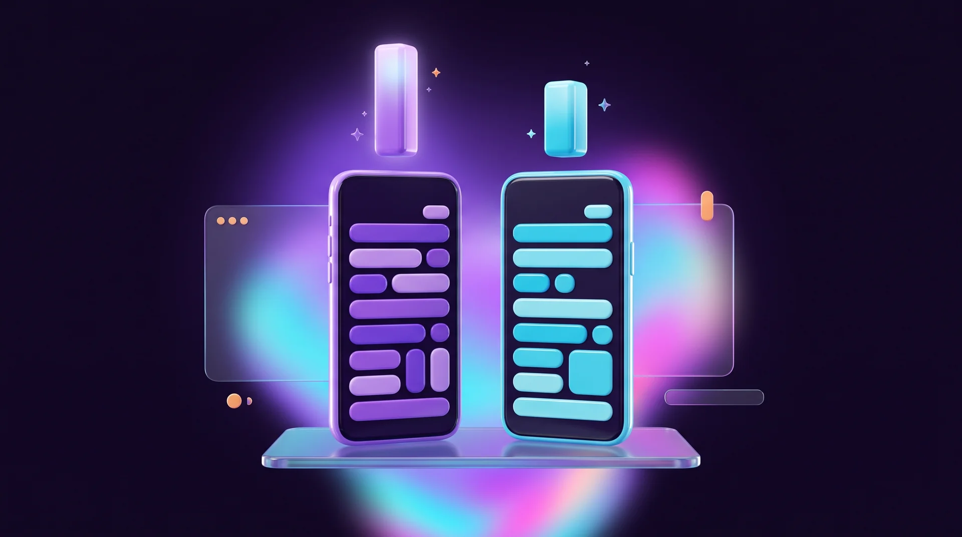
In an A/B test, some visitors see one version of the page and others see a second version, and you compare conversion rates. These are the things worth testing first:
- the first-screen headline;
- the text and color of the call-to-action button;
- the number of form fields;
- page length: short vs. long;
- the order of blocks and the placement of reviews.
There are no universal answers. If the product sells after a short page, keep it short. If reviews don't affect conversion, you can drop them. Test one change at a time and let the test collect enough visitors, otherwise the result may be random.
To know which version brings paying customers and not just leads, connect the page to end-to-end analytics: that way you can see what happened to each inquiry even after it entered the CRM.
Common landing page design mistakes
Multiple goals on one page
A page that asks visitors to subscribe to a newsletter, download a catalog and book a meeting all at once scatters their attention. Pick one main action; everything else can wait for the next stage.
A first screen that says nothing
A nice slogan like "Innovation starts here" doesn't explain what you sell. If the visitor hasn't understood the offer in the first three seconds, they probably won't keep scrolling.
Generic stock photos and fake reviews
People smiling at a laptop say nothing about your business. It's better to use real photos or illustrations created specifically for you. If there's no budget for a photoshoot, you can generate images with AI, as we explained in our guide to AI photoshoots.
A form that asks for too much
An ID number, full address and budget on the very first contact scare customers away. Ask only for what you need to get back to them.
A page not tested on mobile
A page that looks perfect on a large screen can break on a phone: a button that disappears below the fold, cut-off text or a form that's hard to fill out. Before launching a campaign, go through the page on several devices.
How RJL Studio builds landing pages
At RJL Studio, we plan and build landing pages for campaigns and launches: from specs and a customer journey map, through UX/UI design, to development in Webflow with fast loading, full mobile optimization and accessibility. We connect forms to your CRM and WhatsApp, set up conversion tracking and run A/B tests so the page keeps improving throughout the campaign.
Want a landing page that brings in leads? Get in touch and we'll come back to you with a proposal.
Landing page design FAQ
What's the difference between a landing page and a website?
A website presents the whole business: services, team, blog and contact options. A landing page focuses on one offer and one action, which makes it especially well suited to paid campaigns and launches.
How many blocks should a landing page have?
The foundation is four blocks: first screen, demonstration, handling objections and a call to action. A complex or expensive product usually needs more demonstration and proof blocks, while a simple product can get by with a short page.
Long or short landing page?
It depends on price and complexity. A simple, inexpensive decision is made quickly, so a short page is enough. An expensive or complex service needs more explanation and proof. An A/B test gives you the right answer for your product.
How many fields should a form have?
As few as possible. For a first contact, a name and phone number are usually enough, sometimes with one field for choosing the service. Other details are better clarified on a call.
Which platform should you build a landing page on?
You can build a landing page in Webflow, WordPress or a dedicated page builder. Check four things: load speed, full support for your languages (including right-to-left if needed), ease of editing for your team and easy connection to your CRM and analytics tools.
Disclaimer: blog content is for general information and learning only and is accurate as of its publication date. It is not professional, legal, financial or business advice, nor a recommendation or call to take any action. Any use of this information is at the reader's own risk, and we accept no liability for any resulting loss. Links to external websites and tools are provided for convenience only. We recommend consulting a qualified professional before making decisions.