

Dark Patterns in UX: What They Are and Why They Hurt
Every website and app exists to sell something: a product, a service, a sign-up or a lead. Good design influences users' decisions, and that is perfectly fine. But there is a line between design that helps a customer decide and design that pushes them into doing something they never meant to do. Whatever sits on the far side of that line is called a dark pattern.
In this guide we cover:
- what dark patterns are and how they work;
- the main types and how to spot them in an interface;
- what the law says in the European Union and the United States;
- why manipulative interfaces damage a business in the long run;
- how to design a fair interface that still converts well, and how to audit your own website.
What dark patterns are, in plain terms
Picture an ordinary situation: you are buying a plane ticket online. You pick a flight, fill in your details and move on to payment. Suddenly the final price is higher than you expected. It turns out that somewhere along the way, baggage insurance or a paid seat was added to your basket by default. To remove it, you have to go back and hunt for a tiny checkbox you can barely see.
That is a dark pattern: a technique in which a digital product steers user behaviour in the company's favour rather than the user's. Common examples include:
- misleading labels and copy;
- hidden fees and add-ons;
- a deliberately complicated cancellation process;
- pre-ticked checkboxes.
These techniques work because they exploit mental shortcuts, also known as cognitive biases. Our brains are wired to complete tasks quickly and efficiently, so we sometimes skip small but important details. Dark patterns take advantage of that: they play on our habits and expectations and lead us down the path of least resistance, which happens to be the most profitable path for the company.
Where it all started
Psychological sales tricks are much older than the internet. Shopkeepers created artificial scarcity by leaving two items on the shelf and hiding the rest in the stockroom, and they hung "Closing down sale, last two days" signs when the sale was not really ending. Putting four-day-old milk at the front of the fridge while the fresh cartons sit at the back is a dark pattern too.
E-commerce made these manipulations far broader and more varied. Websites can collect almost any data about their users, test which tricks work and roll them out to millions of people at once.
The term "dark patterns" was coined in 2010 by Harry Brignull, a UX designer with a PhD in cognitive science. He documents examples and legal cases on his Deceptive Design website and today prefers the term "deceptive design". His definition is simple: these are tricks that make you do something on a website or in an app that you did not mean to do.
How dark patterns are classified
There are many lists and taxonomies. Brignull himself names types such as "fake social proof", "nagging" and "preselection". In 2021, researchers at Princeton University reviewed dozens of studies on the subject and proposed grouping all dark patterns into two broad directions:
1. Modifying the choice architecture. The interface presents options so that the one that suits the business stands out, while the one that suits the user is hidden or made harder.
2. Manipulating information. The interface hides, distorts or invents information, and often creates the illusion of free choice.
This split is handy in practice: when you review a screen, you ask two questions. Are all the options presented fairly? And is the information complete and accurate? Let's look at each direction in turn.
Modifying the choice architecture
Here, visual emphasis and wording change how users perceive their options. What they see as available and prominent are the options the service needs, not the ones they need.
Asymmetry
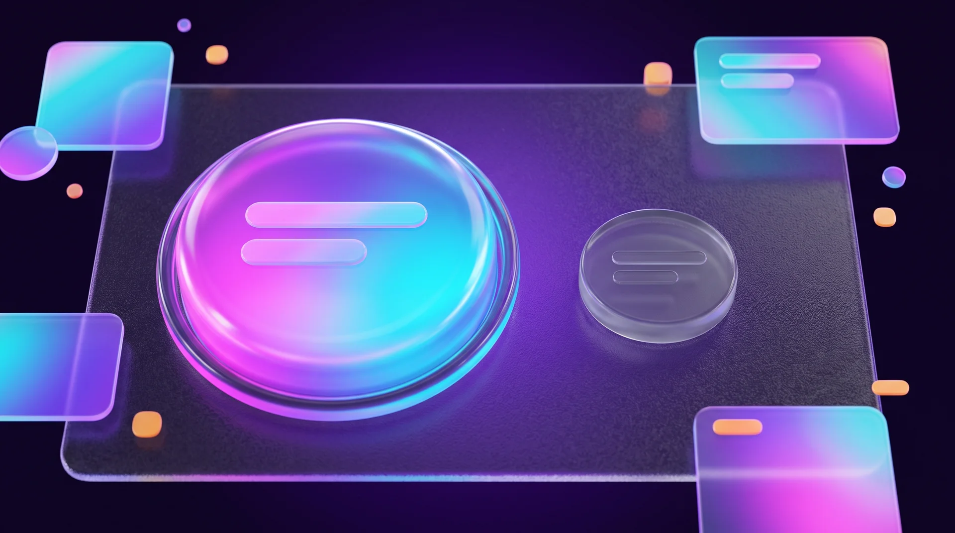
This is the most common type, and it shows up mostly in consent dialogs: accept or decline, sign up or skip. The interface appears to offer two choices but pushes you towards the one that benefits the business. The "I agree" button is large and colourful, while "No thanks" is a small grey link tucked into a corner.
Another example: a ride-hailing app cannot find a car, and instead of clearly showing a button to cancel the booking, the screen highlights "Keep searching". Or a notification prompt where the second button says "Maybe later" instead of "No": there is no way to actually refuse, and the prompt will keep coming back.
Pricing tables use asymmetry too. The middle plan is highlighted and placed next to a far more expensive one, so the middle option looks like a bargain. This is known as the decoy effect. Highlighting a recommended plan is not wrong in itself, but when the only purpose of a plan is to make another one look cheap, it becomes manipulation.
Confirmshaming: making people feel bad for saying no
The interface makes users feel uncomfortable about declining. The invitation to join a newsletter reads "Yes, I want to stay in the loop", while the decline option reads "No, I'd rather fall behind". The wording turns an ordinary action, saying no, into something embarrassing.
Defaults
Pre-enabled toggles and pre-ticked checkboxes also reshape the choice architecture. People tend to keep whatever has already been chosen for them. Marketing consent, parcel insurance, a small "round-up" donation: if they are pre-selected, most users will not change them, and not because they decided to keep them.
Obstruction and difficult cancellation
The goal here is to keep users subscribed even when they no longer want the service. Signing up takes a minute, but cancelling means digging through menus, clicking through several "Are you sure?" screens, filling in a survey and sometimes even phoning during limited hours. In the industry this is called a roach motel: easy to get in, hard to get out.
A subtler version: instead of a cancel button, the service offers to "pause" the subscription, and the "Cancel" button looks like a button that simply closes the window.
Unfair segmentation
Dividing users into segments is normal. It becomes a dark pattern when segmentation leads to discrimination or unfair treatment: a different price for the same product depending on the device or location without the user knowing, or blocking a basic action until the user pays. Games offer plenty of examples, such as pay-to-skip mechanics, where you pay to skip a waiting time that was created on purpose.
Hidden mechanics
The interface leads to a decision but hides how it influences you, the consequences and the alternatives. The best-known example is a free trial that requires card details. If you forget to cancel in time, you start paying automatically, sometimes without even receiving a reminder before the first charge. Another example is notifications that are switched on automatically, or privacy settings that are open by default.
Manipulating information
Patterns in this group hide or distort information and usually create an illusion of free choice.
Deception and fake urgency
Prominent, persuasive banners with information that makes users believe something untrue. Common examples:
- Fake countdown timers. The offer "ends in 10 minutes", and when the timer reaches zero, it starts again.
- False scarcity. "Only 2 left in stock" appears next to every product, all the time.
- Fake social proof. Pop-ups such as "Anna from Lisbon bought this 3 minutes ago" that are generated automatically and do not reflect real purchases.
- Inflated discounts. A "was" price that nobody ever actually paid.
Hidden information and drip pricing
Important information is hidden, shown in small print or worded in a confusing way. A user in a hurry simply does not see it. Examples include a subscription checkbox buried in the terms of use, shipping costs that appear only at the final step of checkout, or insurance added to the price that is visible only if you expand the order details.
When the price grows step by step during the purchase process, it is called drip pricing. The user has already invested time in filling in details, so they are willing to pay more than they planned just to avoid starting over.
Confusing wording
Double negatives such as "Tick here if you do not want to not receive updates", or two adjacent checkboxes where one asks you to tick to opt in and the other asks you to tick to opt out. The goal is to make the user get it wrong.

What the law says: the EU and the US
Regulators around the world are paying more and more attention to dark patterns, and what once looked like a clever marketing trick can now end in a complaint, a lawsuit or a fine. This is not legal advice, and rules differ between countries, but it is worth knowing the general direction.
European Union: consumer protection
- EU consumer law prohibits unfair and misleading commercial practices. A fake timer, a "was" price that never existed or a hidden add-on can all be treated as misleading.
- Consumers should see the full price, including taxes and mandatory charges, before they commit. Drip pricing runs directly against this principle. When you announce a price reduction, EU rules also require you to show the lowest price applied in the period before the discount, so invented "was" prices are a real risk.
- For most distance purchases, including buying online, consumers generally have a 14-day right of withdrawal (with exceptions). Rules also apply to subscriptions and other ongoing contracts, and regulators increasingly expect cancelling to be as easy as signing up. If joining takes a minute and leaving requires a half-hour phone call, treat that as a warning sign.
- The Digital Services Act (DSA) prohibits online platforms from designing interfaces that deceive or manipulate users or impair their ability to make free and informed decisions. The European Commission has also announced plans for a Digital Fairness Act that is expected to address dark patterns more directly.
European Union: data and privacy
If you collect personal data or send marketing to people in the EU, data protection rules apply:
- GDPR requires consent to be freely given, specific, informed and unambiguous. The Court of Justice of the European Union has ruled that a pre-ticked checkbox is not valid consent for cookies.
- ePrivacy rules require prior consent for non-essential cookies and, in most cases, for marketing emails and messages. A pre-ticked box or a "reject" option hidden three clicks deep does not meet the standard, and data protection authorities have fined companies over cookie banners that make refusing harder than accepting.
United States
In 2022 the Federal Trade Commission (FTC) published a comprehensive report on dark patterns, and it has taken action against companies over complicated cancellation flows and charges that were not properly disclosed. In California, privacy law explicitly states that agreement obtained through a dark pattern does not count as consent.

Why dark patterns hurt your business
Many companies use dark patterns, whether because of pressure to show fast growth or because of tough competition. A 2019 Princeton University study examined around 11,000 online shops and found dark patterns on roughly 11% of them. The more popular a website was, the more likely it was to contain manipulative design.
The familiar argument against dark patterns is ethical: deceiving users is wrong. But an ethical argument on its own rarely convinces management teams who look at the numbers. So it is worth making the business case: any short-term gain from a dark pattern tends to disappear in the long run.
Manipulative interfaces burn through your customer base: they create negative experiences, and customers drift away. A PwC survey found that about a third of customers would walk away from a brand they love after just one bad experience.
People are smarter than businesses think
"How websites trick you" is a popular topic in the media and on social networks. Users quickly learn to recognise tricks and work around them, and once they spot one trick, they stop trusting the honest parts of the website too.
Manipulation has a hidden cost
If you add a product to the basket without the customer asking, their order value goes up. But so do support tickets, returns, chargebacks and the workload on your team. All of this costs money in the end, often more than the trick brought in.
Negative reviews stick around
A customer who feels cheated writes a review on Google, on social media or in an online community. Potential customers look for exactly this kind of review before they buy. In smaller markets and niche B2B sectors, where word of mouth is a key sales channel, this damage is felt especially quickly.
How to design a fair interface that still converts
A fair interface is not an interface without influence. You can highlight the main action, recommend a plan and remind customers what they might miss out on. The difference is that users always understand what is happening and can easily choose otherwise. Here are practical rules for the sensitive points of a website.
Cookie banners and consent
- A "Reject" button at the same level and on the same screen as "Accept", not hidden inside "Settings".
- No pre-ticked boxes for marketing cookies or newsletters.
- Short, clear wording: what you collect and why.
Forms and newsletter sign-ups
- The marketing consent checkbox is not pre-ticked and is kept separate from accepting the terms of use.
- A neutral decline option: "No thanks", without shaming.
- Ask only for the fields you really need. We wrote about clear calls to action that convert in our guide to website button design.
Checkout and pricing
- The full price, including taxes and estimated shipping, is shown as early as possible, ideally on the product page.
- Add-ons such as insurance or extended warranties are offered as a choice, not added automatically. For ideas on offering complementary products fairly, see our guide to upselling and cross-selling.
- Timers and stock levels are shown only when they are real.
Subscriptions and cancellation
- Cancellation sits in a clear place in the user account and takes about as many steps as signing up.
- You can offer a pause or a discount before cancellation, but as one option next to a clear "Cancel" button.
- An email or SMS reminder before the end of the free trial and before every annual renewal.
Accessibility is fairness too
An interface that is hard to read, with low contrast and tiny buttons, trips up people with disabilities in particular. An accessible interface is usually more transparent for everyone. We cover this in detail in our website accessibility guide.

How to audit your website and win over management
Dark patterns are not always created on purpose. Sometimes they are the result of an A/B test that won in the short term, a ready-made template or a plugin someone installed. That is why it pays to review your website systematically.
Step 1: Walk through the key journeys
Go through the important journeys yourself, as a new customer would: sign-up, purchase, lead form, subscription cancellation and account deletion. On every screen, ask: are all the options visible? Is the price clear? Has anything been chosen for me?
Step 2: Ask other people to try
Usability testing with real users quickly reveals whether people notice the tricks and whether they get annoyed. You do not need a lab: five to eight participants are enough. We explain how to find them in our guide to choosing participants for UX research.
Step 3: Read reviews and support requests
Online reviews, support tickets and chargeback requests are among the most accessible sources of insight. If customers write "I didn't notice", "I was charged without asking" or "I couldn't cancel", that is a clear signal.
Step 4: Change what you measure
Dark patterns inflate short-term metrics such as conversion rate or the number of sign-ups. To see the full picture, add long-term metrics: customer retention, returns, cancellations in the first month, customer lifetime value and review ratings.
Step 5: Offer management an alternative, not just criticism
When you present the problem to management, bring a solution as well: new copy, a balanced design and a test plan that measures not only conversion but also returns and retention. Mention the legal risk and the company's values: if the business says it respects its customers, the interface should show it.
How RJL Studio builds fair interfaces
At RJL Studio we design user experiences and interfaces for websites, online stores and business systems, and we build them in Webflow, WordPress and Wix. We review the critical journeys on your website, identify patterns that damage trust and propose alternatives that convert without misleading anyone: clear forms, a transparent checkout, a compliant cookie banner and a simple cancellation flow. We also set up measurement, so you can see how the changes affect conversions, returns and retention.
Want a website your customers trust? Read about our UX/UI design services and Webflow website development, or get in touch and we will get back to you.
Frequently asked questions
What is the difference between persuasive design and a dark pattern?
Persuasive design helps users understand the value and make a choice, for example by highlighting the main call to action or recommending a plan. A dark pattern hides information, makes it hard to say no or gets users to do something they did not intend. A simple test: would the customer feel fine about the decision if they understood exactly what happened?
Are dark patterns illegal in the EU?
There is no single EU law that bans "dark patterns" under that name in every context, but many of them conflict with existing rules: the ban on misleading commercial practices, price transparency requirements, the right of withdrawal, GDPR and ePrivacy consent rules, and the Digital Services Act for online platforms. This is not legal advice, so for a specific case it is worth consulting a lawyer in the relevant country.
Is a countdown timer on a website always a dark pattern?
No. If the offer really does end at the time shown, the timer is accurate and useful information. It becomes a dark pattern when it is fake: it restarts on every visit, or it appears on an offer that never actually ends.
How do dark patterns affect SEO?
Indirectly. Google values user experience and trustworthiness, and users who feel tricked leave quickly, do not come back and write negative reviews. All of this damages the reputation of the business and, eventually, its organic traffic.
Where should we start if our website already uses these patterns?
Start where the damage is greatest: checkout, cancellation and the cookie banner. Remove pre-ticked boxes, show the full price early and add a clear cancel button. Then track conversions, returns and support requests for a few weeks to see the impact.
Disclaimer: blog content is for general information and learning only and is accurate as of its publication date. It is not professional, legal, financial or business advice, nor a recommendation or call to take any action. Any use of this information is at the reader's own risk, and we accept no liability for any resulting loss. Links to external websites and tools are provided for convenience only. We recommend consulting a qualified professional before making decisions.