

Website Button Design: Rules, Examples and Mistakes
A button is one of the few elements on a website where visitors take the action you built the site for: buying a product, submitting a form, booking a meeting or downloading a file. If the button is hard to find, or it isn't clear what happens after the click, visitors may leave right at the last step. All the work on content, campaigns and design is lost in a second.
The good news is that good button design doesn't take rare talent. It rests on a few clear rules about hierarchy, size, contrast, wording and feedback. In this guide we go through them one by one, including what changes on multilingual and right-to-left sites.
In this guide:
- how a button differs from a link, and why it matters in code too;
- which button types exist and how to build a hierarchy between them;
- the minimum button size and where to place it, including on right-to-left sites;
- how to choose color and shape and meet contrast requirements;
- what to write on a button and what not to;
- which states every button needs, and why hover doesn't work on mobile;
- common mistakes, and how to build a consistent button system in Figma, Webflow and WordPress.
What a website button is and how it differs from a link
A button is an interactive element that invites the visitor to take an action. Visually it looks like "something you click": it has a clear shape, a fill or border, and it usually reacts to touch or mouse hover. From a business perspective, it's the point where a visitor becomes a lead or a customer.
It's worth separating buttons from links, because they play two different roles:
- A link takes you somewhere else: another page on the site, a section further down the page or an external website.
- A button performs an action: submits a form, adds a product to the cart, opens a dialog, filters a list or starts a sign-up flow.
In design language the line sometimes blurs: a link to the "Contact" page is often styled as a button, and that's perfectly fine. In code, though, the distinction matters. An action should be built as a button element, and navigation to a page as an a element with an href. Screen readers, keyboard navigation and search engines treat the two differently. When you build a "button" from a div with a script, it looks fine on screen, but keyboard users can't reach it and screen readers won't recognize it as a button.
Another rule of thumb: reserve buttons for the actions that really matter. An interface full of buttons in every color tires the eye, and visitors stop understanding what's expected of them. The fewer prominent buttons on a screen, the better each one works.
Button types and hierarchy
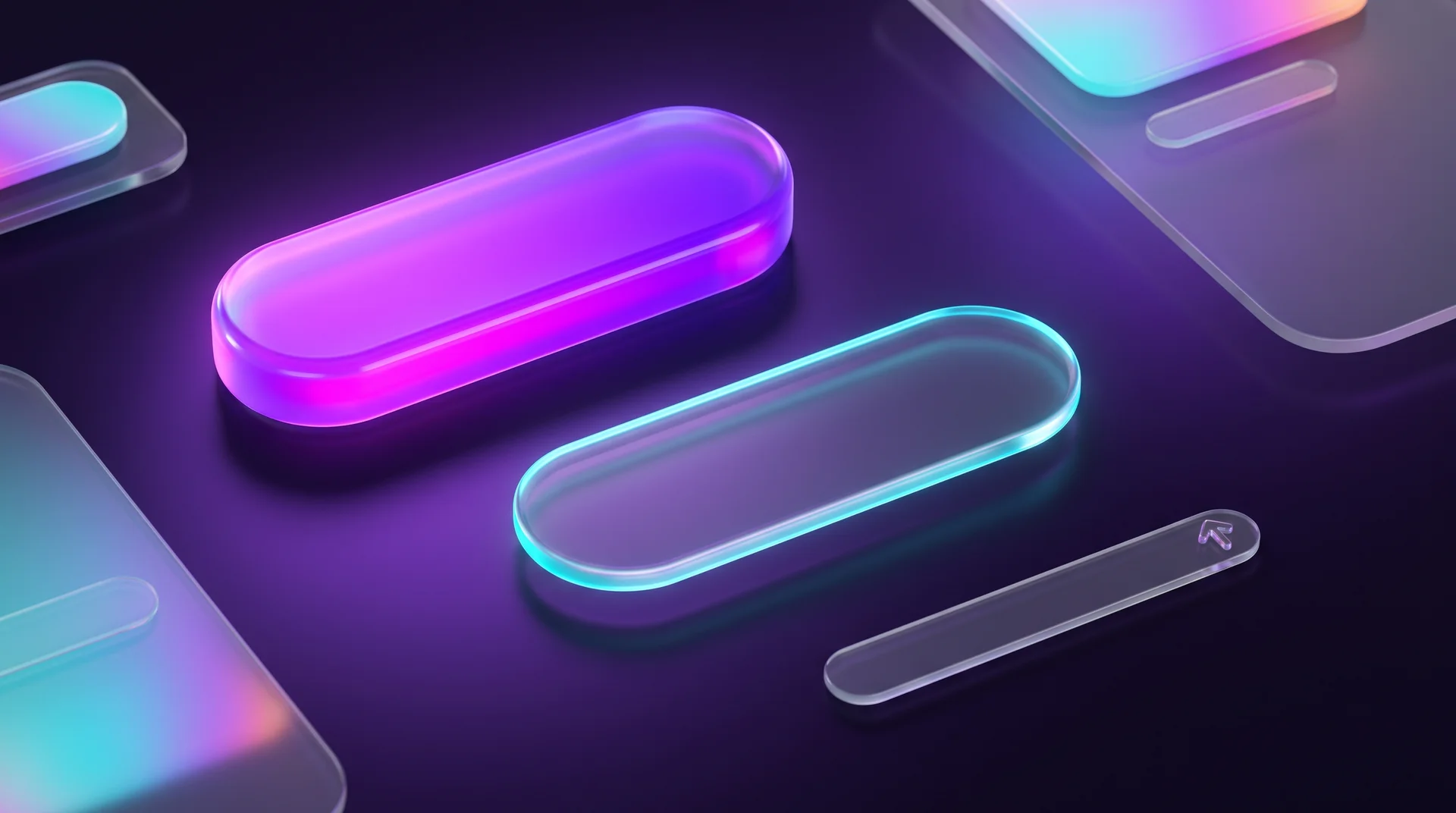
Not all buttons are equally important. One of the designer's main jobs is to visually separate the main action from secondary ones. On most websites the hierarchy has three levels.
Primary button
The primary button handles the main action on the screen: buy, send an inquiry, book a meeting or start a free trial. It's the most prominent element in the interface, so it gets a solid fill in the brand color or an accent color. An important rule: one screen, and certainly one section, gets only one primary button. Two primary buttons side by side compete with each other, and visitors hesitate instead of acting.
Secondary button
A secondary button offers an alternative action: read more about the product, go back a step, view examples. It should be noticeable without pulling attention away from the primary button. The common approach is an outline button with no fill, or a button on a light, neutral background.
Tertiary button
A tertiary button is for truly minor actions: subscribe to the newsletter, show reviews, clear filters. It usually looks like a text link, sometimes with a small arrow icon. It shouldn't compete with anything else on the screen.
Special buttons: destructive and unavailable actions
Beyond the three levels, two cases need their own design:
- A destructive button is used for actions that can't be undone, like deleting an account or canceling an order. It's usually red, its label is explicit, and clicking it opens a confirmation dialog.
- A disabled button signals that an action isn't possible yet, for example because required fields are still empty. It's styled in faded tones. We'll come back to it in the section on button states, because it comes with a few traps.
Size, placement and spacing
A beautiful button that's hard to press is a bad button. Size and placement decide whether visitors find it at all, and whether they can tap it without missing.
Minimum tap target size
On most service and e-commerce sites, the bulk of traffic comes from mobile, where a finger replaces the mouse. So it helps to know a few standard numbers:
- WCAG 2.2 requires, at level AA, a target area of at least 24 by 24 pixels (or enough spacing around a smaller element), and recommends 44 by 44 pixels at level AAA.
- Apple's iOS guidelines recommend at least 44 by 44 points, and Google's Material Design recommends 48 by 48.
In practice, a primary button on a mobile site is usually 44 to 56 pixels tall and often stretches across the full screen width. Even a button that looks small can get a larger tap area through padding, without changing how it looks.
On the other hand, don't overdo it. A giant button surrounded by pop-ups and animations feels pushy and puts people off. The button should fit into the page composition: be the most prominent element in its section, but not shout.
Where to place the primary button
Placement follows the visitor's journey, not habit. A few principles that work on most sites:
- Above the fold. The primary button appears at the top of the page, under the headline and the main promise.
- Next to the content it relates to. An "Order now" button belongs next to the price and the package description, not at the other end of the screen.
- Repeated on long pages. On a long landing page, repeat the call to action after every major block and at the end of the page, so visitors don't have to scroll back up.
- In the header. Service websites commonly place one prominent button in the navigation, like "Book a call" or "Contact us".
Right-to-left sites: mirror the layout
If your site also runs in a right-to-left language such as Arabic or Hebrew, reading direction is reversed, so button order flips too. When two buttons sit side by side, like "Next" and "Back", their order should follow the direction of movement through the flow: on an RTL site "Back" usually sits on the right and "Next" on the left. The arrow inside a "Next" button points left, not right. In an RTL header, the logo is usually on the right and the prominent button on the left, at the end of the navigation row.
This is one of the most common mistakes on sites translated from English or built on a foreign template: icons, arrows and button order stay in the original direction, and visitors feel something is "off", even if they can't say what.
Spacing between buttons
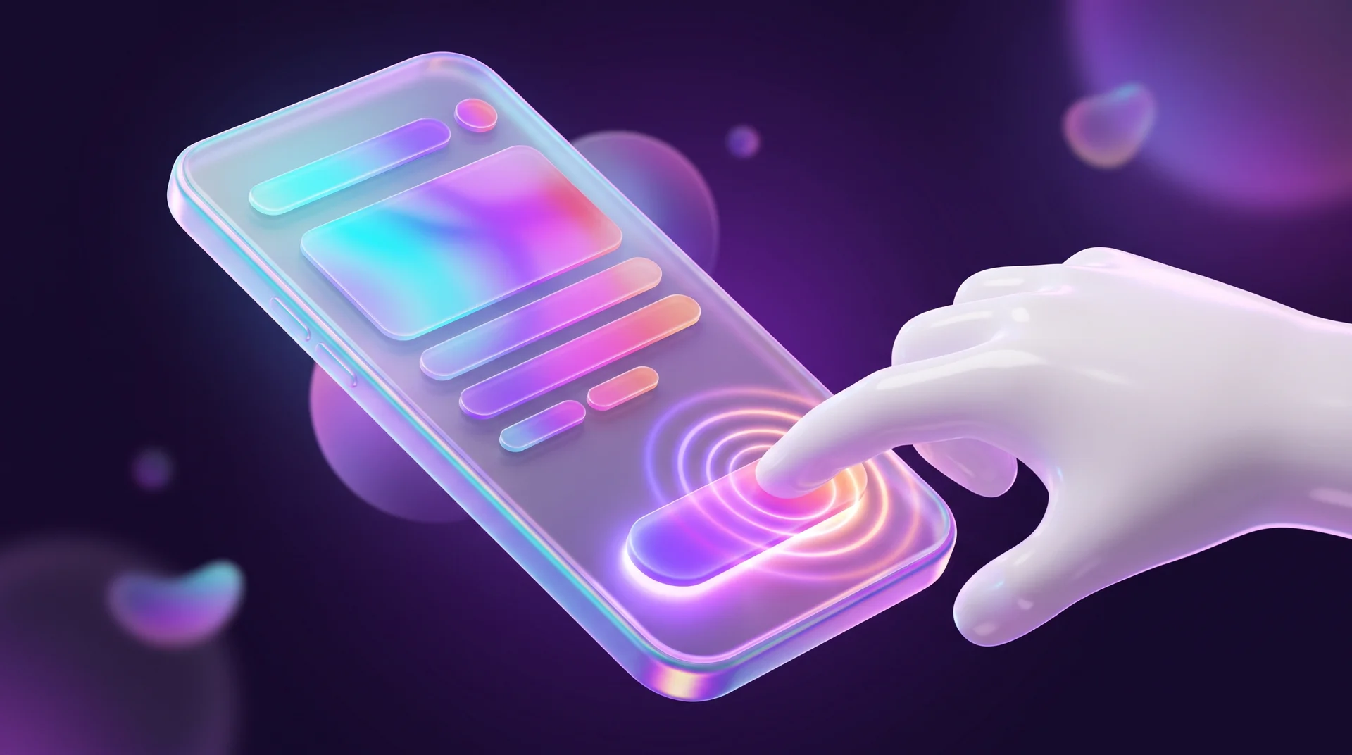
When buttons sit too close together, it's easy to hit the wrong one. On mobile this is especially frustrating: tapping "Cancel" instead of "Save" can wipe out an entire form. Leave at least 8 pixels between buttons, and separate positive and destructive actions even further.
Color, contrast and shape
The simplest way to draw the eye to a button is a color that stands out against the page background. On a light, clean site, a button in the brand color, orange, purple or deep blue, is spotted instantly. On a dark site, brighter tones work well. Ideally the color is part of the business's visual identity: that way the button both grabs attention and reinforces the brand.
Contrast that meets the standard
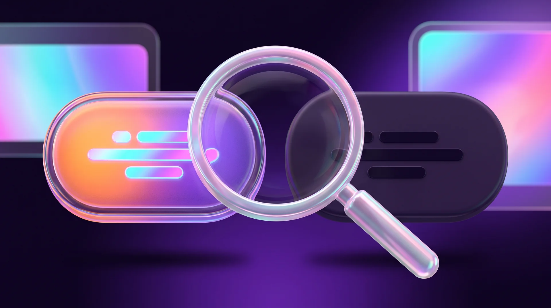
A button has to be legible for every visitor, including people with low vision or color blindness, on an old phone screen or in midday sun. WCAG, the basis for most accessibility laws and standards, including the ADA in the US and EN 301 549 in the EU, sets two thresholds:
- Button text needs a contrast ratio of at least 4.5:1 against the button color (or 3:1 for very large text).
- The button's own boundaries, meaning the shape that lets you recognize it, need at least 3:1 contrast against the background.
Tools like WebAIM Contrast Checker or the built-in contrast check in Chrome DevTools answer this in seconds. It pays to check at the design stage instead of discovering the problem after launch.
Don't rely on color alone
The classic convention says green for positive actions and red for destructive ones. It's useful, but color must never be the only signal. A color-blind visitor can't always tell green from red. So always add clear text, and sometimes an icon too, like a trash can next to "Delete".
Shape: sharp or rounded corners
Two shapes dominate digital design: a rectangle with sharp corners and a button with rounded corners, all the way to a full "pill". Sharp corners usually feel serious and technical, while rounded corners come across as softer and friendlier. There's no single right answer, but there's one rule you must keep: consistency. If buttons are rounded on the home page, they should be rounded on the product page, in the form and in the pop-up too. The corner radius should also match the rest of the site's elements: cards, form fields and images.
When you don't want a colorful button
Luxury and fashion brands sometimes choose a deliberately restrained button: a thin black border on a white background, or a black button with white text. That can work very well, as long as the button is still clearly recognizable as a button, sits where people expect it and meets contrast requirements. Elegance shouldn't come at the expense of clarity.
Button text: what to write so it's clear
Shape and color catch the eye, but the text is what tells visitors what will happen. It should be short and to the point, ideally one to four words.
A verb that describes the action
The best choice for a primary button is a verb that describes exactly what happens: "Add to cart", "Download the guide", "Book a consultation". A visitor reading the button knows what they'll get. Generic words like "OK", "Submit" or "Next" only work in a very clear context, such as inside a dialog or on one step of a multi-step form. On a home page they say nothing.
Match the button to the promise
The text should continue the page's promise. If the headline promises "A free website audit within 48 hours", the button should say "Get my free audit", not "Contact us". When the headline promises one thing and the button asks for another, visitors lose trust and hesitate.
Voice and tone: pick one and stick to it
Button copy can address the visitor in several ways. The common options are:
- Imperative: "Order now", "Get a quote". The most common choice on business websites.
- Outcome-focused: "Free quote", "Free website audit". Short, neutral and works well on buttons.
- First person: "I want a quote", "Send me the guide". Adds a personal touch and works especially well for forms and offers.
What matters is to choose one style and keep it across the whole site, so all buttons speak with the same voice.
When longer text is actually needed
There's one case where it's worth being more explicit: destructive actions. Instead of "OK", write "Permanently delete account" or "Cancel order". Explicit text prevents mistakes and protects both the visitor and the business from frustrated support requests.
Button states: hover, focus, active, loading and disabled
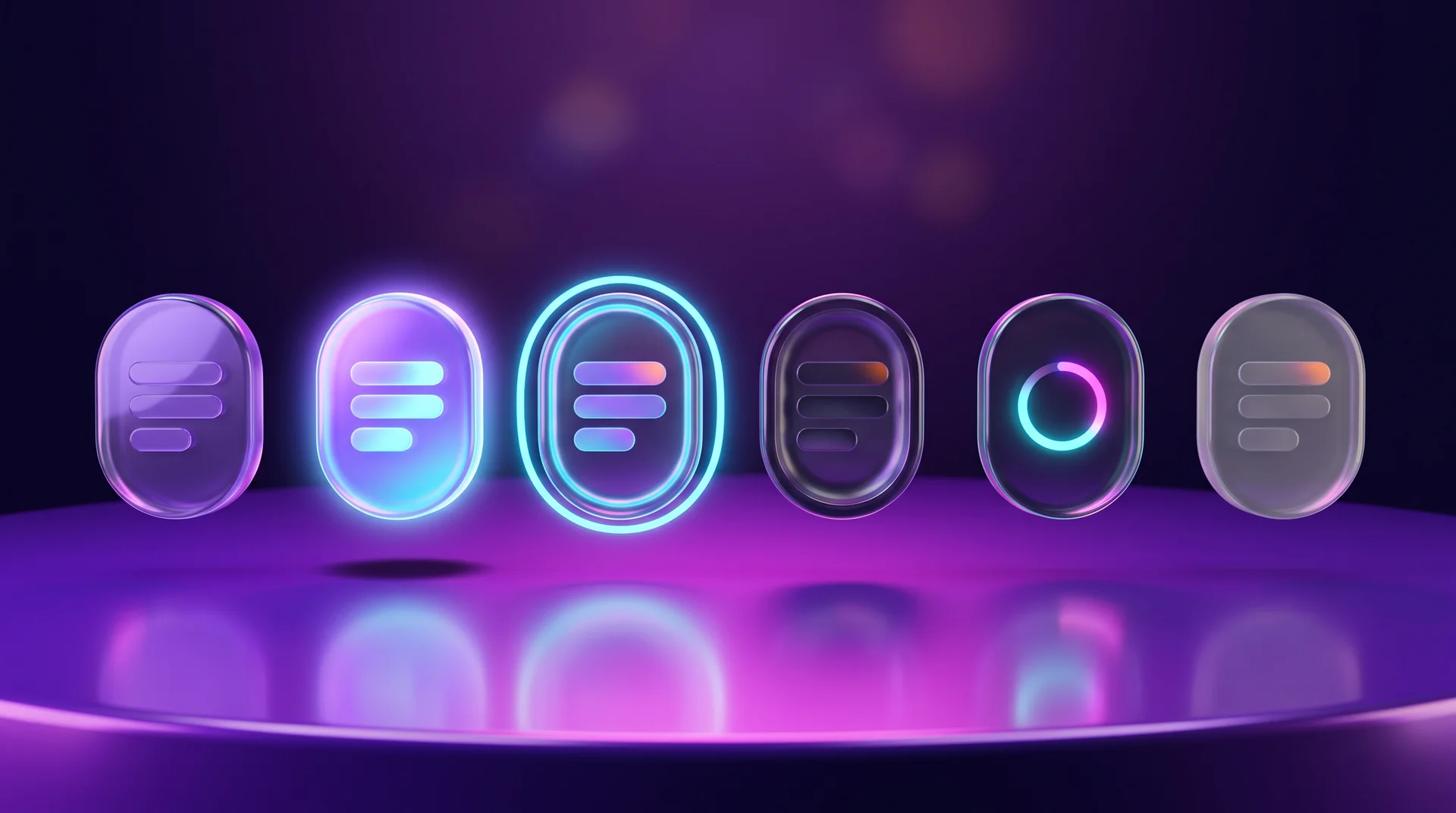
Styling the button is only half the job. A good button responds to the visitor and shows that the action was registered. These are the standard states:
- Default – the normal state, when nobody is interacting with the button.
- Hover – the pointer is over the button: the color darkens slightly, a shadow appears or the button lifts a little.
- Focus – the button is selected with the keyboard (Tab) or assistive technology, and gets a clear outline.
- Active / Pressed – the moment of the click itself: the button "presses in" or darkens.
- Loading – the request has been sent and is processing: a spinner appears and the button is locked to prevent a double click.
- Disabled – the action isn't available right now.
Hover doesn't exist on mobile
Phones and tablets have no pointer, so there's no hover. Any information that only appears on hover, like an explanation, a price or an extra link, simply won't reach mobile visitors. On top of that, some mobile browsers leave the hover state "stuck" after a tap, and the button stays colored. The fix in code is to define hover effects inside @media (hover: hover), so they only apply on devices that actually support hovering.
Focus: don't remove the outline
Many designers remove the browser's focus outline because it's "ugly". That's a serious accessibility mistake: keyboard users can't tell where they are. Instead of removing it, design your own outline that fits the brand. With :focus-visible, the outline only appears during keyboard navigation, not on every mouse click. WCAG 2.2 adds a requirement that the focused element must not be hidden, for example behind a sticky header or a cookie banner.
Loading: prevent double clicks
When submission takes a second or two, people click again. The result: two leads in the CRM, two charges or two orders. A clear loading state that locks the button until a response arrives solves this. After submission, show an explicit success or error message instead of leaving visitors to guess.
Disabled: explain why
A gray button with no explanation is confusing: visitors don't understand what's missing. There are two good approaches. The first is to keep the button active and, on click, show exactly which fields are missing. The second, if you do use disabled, is to add short text next to the button explaining what needs to be done. Note that a button with the disabled attribute doesn't receive keyboard focus, so screen reader users may not even know it exists.
Don't overdo the animation
A subtle transition between states, around 150 to 250 milliseconds, makes the interface feel alive and responsive. But a button that shakes, blinks or runs away from the pointer is annoying and sometimes genuinely hard to click. Also respect the prefers-reduced-motion setting, which visitors use to ask their operating system for less motion.
Common button design mistakes
These are the mistakes we run into most often when doing UX reviews of existing websites, and how to fix each one.
The button looks like plain text
Visitors don't realize they can click it. How to fix it: a primary button gets a solid fill and a clear shape. A tertiary link gets at least an underline or an arrow icon.
Weak contrast
The button blends into the background, especially over background images and on low-quality screens. How to fix it: check contrast with a dedicated tool and change the color or add a background layer behind the button.
Too many prominent buttons
When every button is colorful, none of them stands out. How to fix it: one primary button per section, everything else secondary or tertiary.
The button is far from its content
An "Order" button a full screen away from the price doesn't connect to it. How to fix it: place the button directly below or next to the content it relates to.
A color that contradicts the action
A green "Delete" button or a red "Save" button is confusing. How to fix it: use a color that matches the meaning, plus explicit text.
Buttons too crowded on mobile
A missed tap can cancel an entire flow. How to fix it: a tap target of at least 44 pixels and clear spacing between buttons.
Different buttons on every page
Height, radius and font that change from page to page look unprofessional. How to fix it: build a single button system, as we explain next.
How to build a consistent button system and test that it works
The safest way to avoid most of these mistakes is not to design every button from scratch, but to build a small system up front: a few types, a few sizes and all the states, and use it across the whole site.
Step 1: Define the system in design
In Figma, build a button component with variants: type (primary, secondary, tertiary, destructive), size (for example small, default, large) and state (default, hover, focus, pressed, loading, disabled). Colors and radii are defined as variables, so one change updates everywhere. If you're just getting started with the tool, read our complete Figma guide. Already at the wireframe stage, mark where the primary button sits on each screen.
Step 2: Build the system on the site
- In Webflow, define a base class such as button and combo classes like is-secondary or is-small, in line with the Client-First approach. Style the hover, pressed and focus states in the Style panel, and save the most common button as a component where the text and link can be changed.
- In WordPress, define button styles at the theme level: in theme.json for block themes, or in Elementor's global settings. That way every new button inherits the same look.
The goal on both platforms is the same: nobody styles a button "by hand" on a single page.
Step 3: Test before going live
- Tab through the whole site and make sure every button gets a visible focus state.
- Check the contrast of every color combination.
- Tap every button on a real phone, not just in a simulator.
- Run Lighthouse in Chrome and fix the accessibility issues.
Step 4: Measure and improve
After launch, buttons turn into data. Set up a Google Analytics 4 event for clicks on every primary button, and use heatmaps, for example the free Microsoft Clarity, to see what visitors click and what they ignore. If an important button gets few clicks, check its placement, text and contrast, and change one thing at a time. For all the principles of a page that converts, see our landing page design guide.
How RJL Studio designs buttons that get clicked
At RJL Studio we plan buttons as part of the entire user journey: what the main action on each page is, where it appears and what each of its states looks like. We build a button system in Figma and implement it in Webflow or WordPress, test contrast and accessibility against WCAG, adapt everything for multilingual and right-to-left sites where needed, and set up click tracking in Google Analytics 4 so we know what actually works.
Want a website where visitors always know what to do next? Read about our UX/UI design services and Webflow website development, or get in touch and we'll get back to you.
Website button design FAQ
What is the recommended button size for a website?
For a primary button on mobile, a tap area 44 to 56 pixels tall is recommended. WCAG 2.2 requires at least 24 by 24 pixels at level AA and recommends 44 by 44 at level AAA. You can enlarge the tap area with padding without changing the look.
How many primary buttons can a page have?
Each section of a page should have only one primary button. On a long page you can repeat the same primary button several times, after different content blocks, as long as it leads to the same action.
What is the best color for a button?
There's no single color that converts best. What matters far more is that the button stands out against the background, meets contrast requirements, fits the brand identity and that its color isn't used for other things on the page. A prominent button in a distinctive color beats any "magic color".
What should I write on a button?
A verb that describes the action ("Get a quote") or the outcome the visitor gets ("Free quote"). Avoid generic words like "Submit" or "Click here", and choose one voice for the whole site.
Does a disabled button hurt accessibility?
It can, because a button with the disabled attribute doesn't receive focus and doesn't explain why it's inactive. It's better to keep the button active and show a clear error message on click, or at least add short text next to the button explaining what's missing.
Disclaimer: blog content is for general information and learning only and is accurate as of its publication date. It is not professional, legal, financial or business advice, nor a recommendation or call to take any action. Any use of this information is at the reader's own risk, and we accept no liability for any resulting loss. Links to external websites and tools are provided for convenience only. We recommend consulting a qualified professional before making decisions.