

Does Your AI-Built Website Look Cheap? 6 Signs and How to Fix Them
Building a website interface has never been easier. Building one that convinces customers is another story. AI tools can put together a neat landing page in an evening, but when thousands of businesses use the same tools, the same components and the same prompts, everyone ends up with the same result. And your visitors are starting to notice.
This guide is for business owners, marketing managers and anyone who has built a site with AI and wants to understand why it "doesn't feel professional", even though everything on it looks tidy. We will cover:
- why AI website builders have gone mainstream;
- why AI-generated websites look so alike;
- why a "clean and tidy" design is no longer enough to stand out;
- 6 signs that give away a site no designer has touched;
- 6 steps that give a generic site its own character;
- what AI still misses, especially on multilingual and right-to-left sites;
- when a prompt is enough, and when it is time to work with a designer.
Why AI website builders have gone mainstream
Tools like v0, Lovable, Bolt and Figma Make, as well as the AI site builders in platforms like Wix and Webflow, let you assemble a working interface in hours. They have even spawned a new term, "vibe coding": instead of writing code line by line or nudging pixels in a mockup, you give the model a general direction, a "vibe" or a concept, and refine the result with prompt after prompt until it "feels right".
These tools did not take off just because of the AI hype. They removed several barriers that used to stand between an idea and a working website.
Results appear almost instantly
Even a simple prototype used to take several steps: a sketch, a build, a browser check and fixes. Today you get a first version after a few prompts and can immediately change the structure, copy and design. Don't like the first screen? No need to redraw it. Just describe what to change.
You build a site in plain language
You no longer need to know Figma, HTML, CSS or JavaScript to try out an idea. Ask for "a landing page for an app", "a sign-up form" or "a three-column pricing block" and you get something clickable. Working on an interface has become a conversation.
Fewer steps between mockup and live site
These tools generate not just a picture of the future site but code as well. You can open the result in a browser, check how it looks on mobile, click a button and see how the form behaves. For a quick prototype, this shortens the familiar chain of "design, handoff to developer, build, test, fix".
Even the first version looks tidy
Generators rely on ready-made components and common UI patterns: they lay blocks out on a grid, keep spacing consistent, use familiar buttons, cards and forms, and adapt the page to different screen sizes. People with no design experience no longer start from a blank page.
This has changed what a "good enough" website looks like. Putting together a neat landing page or MVP is now much easier, which is great when you need to test a hypothesis, show a prototype to your team or launch a first version. But the same ready-made solutions that help you get a decent result without experience create a new problem: without polish, every site starts to look the same.
The standard stack trap: Tailwind and shadcn/ui
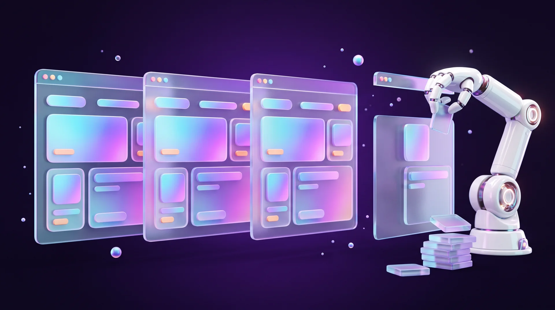
Most UI generators run on the same "fuel": the Tailwind CSS framework and the shadcn/ui component library. These are excellent tools in the hands of professionals, but for a language model they have become the equivalent of a standard-issue apartment block. The model takes the defaults: the same buttons, the same rounded corners, the same grid and the same font. The result is clean but completely faceless.
The digital plastic effect
The telltale sign of a cheap website used to be stock photos with fake smiles. Today AI "noise" has taken their place. It is not just odd images, but also:
- the same font pairings repeated in every project;
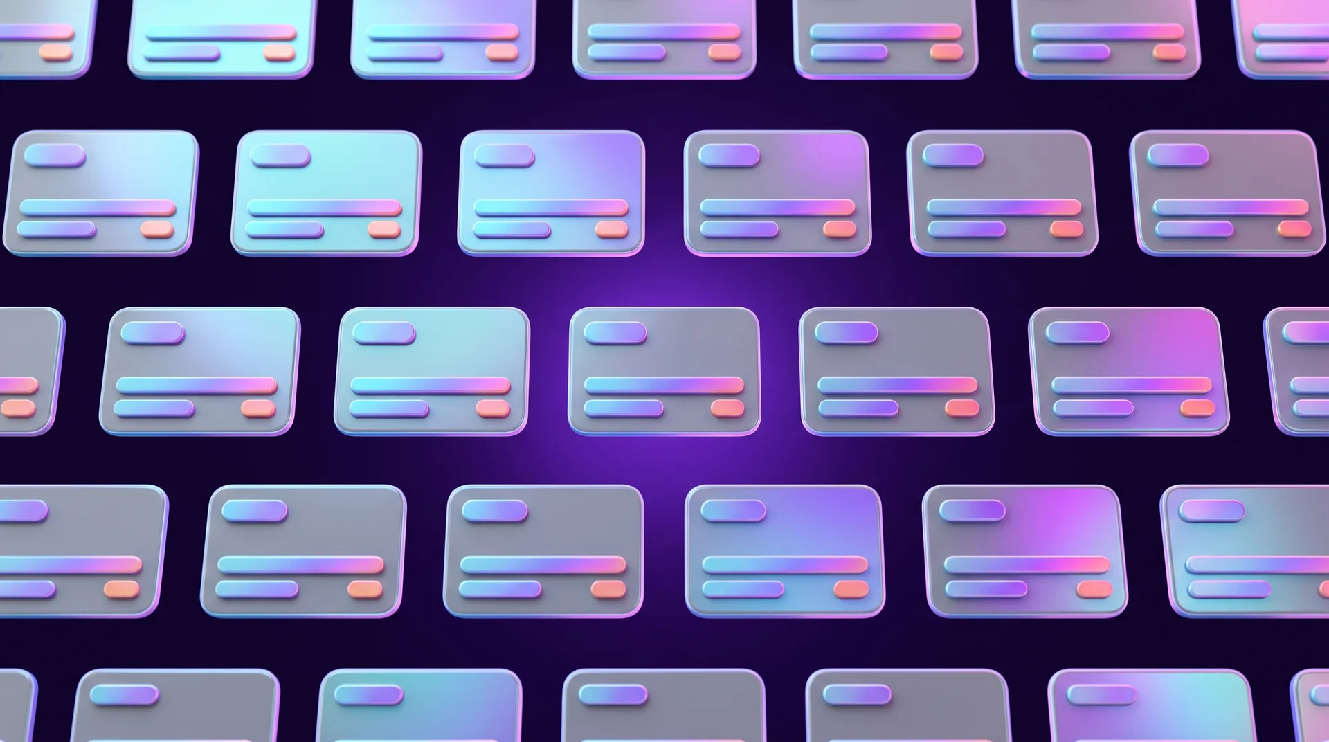
- a predictable layout: a hero with a centered headline, three identical cards, testimonials, pricing, FAQ, always in that order;
- sterility: everything is technically correct, yet nothing reminds anyone of your brand in particular.
The eye learns to spot this quickly. Just as cheap printing instantly gives away the level of a business, visitors who are not designers start to tell "quick" projects from serious products. The moment a visitor senses the site was made with a single prompt and no human touch, trust in the brand drops.
When generated code can't handle real content
Another common problem shows up once real content goes in. The generator built the block around a four-word headline, and the client enters a two-line one. Cards that were equal in height stretch, text overflows its container and buttons wrap onto a new line. It is even more noticeable in languages other than English: word lengths differ, and the content often looks nothing like the English sample the component was built around.
Why a tidy design is no longer enough
Until recently, a neat, clear website stood out from the competition: it was enough to design pages consistently, tune the typography and make the site easy to use. Now that AI builders give almost anyone this baseline, it is no longer an advantage.
A clean grid, clear buttons and mobile responsiveness have become the default, so they no longer help a brand stand out. What sets you apart today is what is hard to get from a standard prompt: typography with character, composition, a visual language of your own and details tied specifically to your business.
Problem 1: sites that look like twins
When you use standard components without polish, you voluntarily give up your identity. The site works, but nobody remembers it. For a business, that means the communication fails: if your site looks like your competitor's, you become invisible and visitors have nothing to hold on to.
Problem 2: losing trust in the premium segment
For an MVP, a template site is perfectly fine. But when you are going after big deals, an "average" result doesn't work. A major client or investor reads your approach: if the interface was thrown together, it signals how the company treats its product as a whole.
Problem 3: architecture that falls apart as the business grows
An AI template is always a bit of a "black box". As long as you need a single page, everything works. But as the business grows, new sections are added, the funnel changes and SEO gets more complex, and an interface written in prompts starts to fall apart. The model does not keep the architecture of the whole project in mind, so fixing one bug breaks two other things. You end up spending time on endless fixes to code that was built without a plan in the first place, and the site becomes a fragile structure nobody dares to touch.
6 signs your website looks cheap
An AI-built interface that no designer has polished always leaves traces. These are small flaws that visitors can't always put into words, but they register them as "something cheap". Here are six signs that nobody has "combed through" the interface.
1. Breaking the law of proximity
Generators often set the same large line height for all text. A two-line headline "falls apart": the gap between its lines equals the gap to the next block, and the eye can no longer tell what belongs to what. According to the law of proximity, related things should sit closer together than unrelated ones.
2. Mathematical instead of optical centering
When an icon or text sits inside a rectangle, the model centers it by the exact pixel. Because of how fonts are built, the text looks as if it has "dropped", and a triangular "play" icon looks shifted to the side. A designer corrects this by eye, not by the numbers.
3. Random emphasis
Models love to italicize or bold phrases with no visible logic. In professional design, emphasis is a rare tool that guides the eye. The problem is worse in some scripts: many fonts, including most Hebrew and Arabic typefaces, have no true italic, so the browser simply slants the letters artificially, which instantly looks unprofessional.
4. Everything is centered
AI often centers every text block on the screen. It is the easiest way to create symmetry, but it ruins the readability of long text: the eye has to hunt for the start of each line. Body text should be aligned to the reading direction, and centering reserved for short headlines.
5. Shadows "going nowhere"
In AI templates, shadows are usually grey, blurry and directionless. They look like a dirty smudge under the card. In reality, a shadow has a light source and takes on the tint of the background it falls on.
6. No hierarchy
On a template site, every element is medium-sized. There is no single dominant object for the eye to catch, and the page turns into a flat, monotonous strip. Visitors don't know where to start or what matters most on the page.

6 steps that give a generic site its own character
Most of the AI "sterility" can be removed with targeted fixes to fonts, grid, rhythm, color and emphasis. You don't have to rebuild the site from scratch.
1. Change the font and tune the line height
Generators use Inter, Geist or something similar almost everywhere, and on non-English sites often the same three or four Google Fonts. Choose a typeface that fits your brand, and consider fonts from independent type foundries. Then tune the line height: tighter for headlines (roughly 1.05 to 1.15) so the phrase holds together, and looser for body text (roughly 1.5 to 1.6) so it is comfortable to read. If your site uses more than one language or script, choose a font pair that matches in x-height and weight.
2. Break the symmetry
AI loves to split the screen into two equal halves (6/6 columns). Try an asymmetric grid: 7/5 or 8/4. Give blocks different sizes: instead of three identical cards in a row, use one large card and two small ones. This creates a focal point, and the eye knows where to start.
3. Tune the rhythm
A template site is one uniform strip. Alternate blocks of different density: after an "airy" hero, add a dense, fact-rich block, then more breathing room. Changing the rhythm holds the visitor's attention as they scroll.
4. Drop pure grey
Professional design has almost no "sterile" colors. Add a touch of warmth or coolness to your greys to match the brand palette. Don't use black shadows: tint them with the background color and give them a clear direction, because light can't fall from every direction at once.
5. Pick one technique
Generators often mix shadows, borders and background fills on the same card. This creates visual noise. Keep one: thin borders, soft shadows or fills. The same goes for rounded corners: one or two radii for the whole site, not five.
6. Add "handmade" accents
AI avoids extreme jumps in scale. Set one truly large headline, around 120 pixels on desktop, next to a small 14-pixel caption. Use cut-out images (no background) that break out of the frame or overlap the text. One element like this on a page does more than ten tidy cards.
To keep these changes consistent, bring them together in a small design system: variables for colors, fonts and spacing in Figma and in code, or global classes in Webflow following the Client-First approach. That way every new page inherits the character you chose instead of reverting to the generator's defaults. We cover this in more detail in our guide on how to design website buttons.
What AI still misses, especially on multilingual sites
A generator produces a static picture of a page in its "perfect" state. But a real product also includes hover states, errors, loading, empty pages and submitted forms. Launching a site "as is" means forgetting these small details, and they are exactly what creates a sense of quality.
Component states
Check every interactive component: what happens when you hover over a button, when you click it, when a form is submitted and waiting for a response, when a field is filled in incorrectly, when a search returns no results. If any state is missing, the visitor gets stuck without knowing what happened.
Multilingual and right-to-left layouts
Most generators are trained mainly on English-language interfaces. When you ask them for a site in another language, especially a right-to-left one such as Arabic or Hebrew, they usually flip the text direction and translate the copy, but don't always adapt every detail. Pay special attention to:
- "next" and "previous" arrows and icons that were not mirrored and point the wrong way;
- margins and padding still set as "left/right" instead of logical start and end;
- phone numbers, prices and foreign words inside a sentence that scramble the reading order;
- carousels and animations that still move in the wrong direction.
Accessibility
In many markets, accessibility is a legal requirement for business websites, from the European Accessibility Act to the ADA in the US, and most standards are based on WCAG. AI generators don't always check color contrast, heading order, alt text for images, keyboard navigation or visible focus. Design "polish" that doesn't include an accessibility check is only half the job.
Mobile and real content
For most small businesses, the majority of website traffic comes from mobile. Test the site on a real phone with your real content: long headlines, real photos, prices and contact details. That is where most stretched cards and buttons breaking onto two lines show up, and where you see whether the main button is within thumb reach without scrolling.
When a prompt is enough, and when it is time to work with a designer
To decide whether to leave the site to AI or bring in a professional, weigh not only your budget but also the value of your time. AI is a great starting point, but a weak foundation for long-term growth.
When AI is enough
- Project stage: an MVP or a hypothesis test in one evening;
- Complexity: a single page or a simple landing page for a short campaign;
- Uniqueness: an "average" result is acceptable, the point is to test demand;
- Technical foundation: one state of the page, and you are ready to rebuild if the idea works;
- Your cost: days of your own time spent on prompts and fixes.
When you need a designer
- Project stage: growth, big deals, clients who scrutinize you closely;
- Complexity: a complex sales funnel, a multi-page site, an online store, a CMS;
- Uniqueness: your own grid and a visual language people associate with your brand;
- Technical foundation: every component state, clean architecture, SEO and accessibility;
- Your cost: control over the result while you focus on running the business.
A founder with AI versus a designer with AI is like an accountant with a calculator versus an accountant with a spreadsheet: the one who knows the craft will do it both better and faster. And if you spend your evenings vibe coding instead of growing the business, that has a cost too.
How to work with an AI-generated draft
More and more clients come to designers with a draft they built themselves with AI. That is actually an advantage: the draft shows what matters to you, in what order, and what content you have. To get the most out of it:
- treat the draft as a wireframe, not a final design: it captures structure and content;
- note what you liked about it and what you didn't, and why;
- gather your brand assets: logo, colors, fonts, real photos;
- decide on the platform up front: for a site that will grow with content and SEO, a platform like Webflow or WordPress is easier to maintain than prompt-generated code;
- define a business goal for the page: an inquiry, a purchase or a sign-up. We wrote about the structure of a converting page in our landing page design guide.

How RJL Studio turns a generic website into one with character
At RJL Studio we work with AI every day, so we know exactly where it helps and where it leaves traces. We take a draft you built yourself or an existing site, create a design system for it with its own typography, colors and grid, adapt it for multiple languages, mobile and WCAG accessibility, and move it to a platform that is easy to maintain and promote, such as Webflow or WordPress.
Want to know what makes your site look generic and what can be improved? Read about our UX/UI design services and Webflow development, or get in touch and we will get back to you.
FAQ about AI-built websites
Can I launch a website built entirely with AI?
Yes, if it is an MVP, a landing page for testing demand or a temporary site. Before launch, check at least the six signs from this guide, the mobile view with real content, accessibility and every state of your forms and buttons.
Does Google rank AI-built websites lower?
Google doesn't penalize a site just because of the tool it was built with. What matters is content quality, speed, user experience and a sound technical structure. Problems start when the generated code is heavy, the heading structure makes no sense or the content is generic and unhelpful. You can read the official rules in Google Search's guidance on AI-generated content.
Do I need to rebuild my site from scratch for it to look professional?
Not always. Often it is enough to change the fonts, tune the spacing, break the symmetry, fix colors and shadows and add a few accents. If the generated code is unstable or the site needs to grow, it is better to move the design to a proper platform.
How can I tell if my website looks generic?
Compare it with the sites of three or four competitors and a few sites made with the same AI tool. If you could swap the logos and nobody would notice, your site is generic. Also check whether each page has one dominant element and whether the colors and fonts actually reflect your brand.
What is the difference between a designer using AI and a business owner using it?
A designer uses AI to speed up steps they already know how to do, and questions every decision: why this font, why this grid, why the button goes here. A business owner mostly gets defaults from it. The difference is not the tool, but understanding why each design decision was made.
Disclaimer: blog content is for general information and learning only and is accurate as of its publication date. It is not professional, legal, financial or business advice, nor a recommendation or call to take any action. Any use of this information is at the reader's own risk, and we accept no liability for any resulting loss. Links to external websites and tools are provided for convenience only. We recommend consulting a qualified professional before making decisions.