


UI Kit for Websites: What It Is and How to Build a Component Library
At the start of a project, you can design every button, field and card individually. But as the site grows, so do the repeating solutions: the same button appears on dozens of pages, every form field needs several states, and colors, fonts and spacing all have to stay consistent. Without a system, each new page looks slightly different, and the developer ends up with ten shades of gray instead of three.
A UI kit brings all of these solutions together in one place: a shared library of interface components that makes it easier to build new pages and keep a consistent design language.
In this guide, we cover:
- what a UI kit is and how it differs from a design system and a component library;
- what a website UI kit is made of;
- how to build a UI kit step by step;
- what to check on multilingual and right-to-left sites: RTL, fonts and accessibility;
- how a UI kit moves from Figma to a live site in Webflow or WordPress;
- where to find a ready-made UI kit and which mistakes to avoid.
What a UI kit is and why you need one
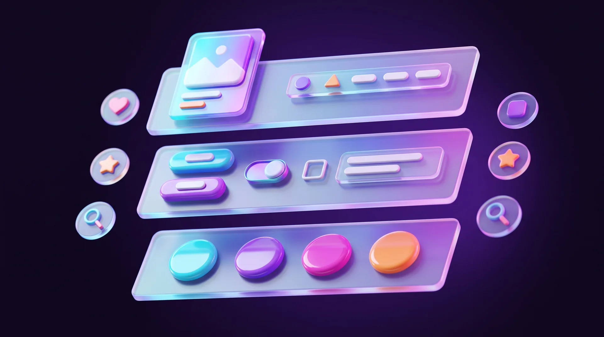
A UI kit (User Interface Kit) is a collection of visual interface elements: colors, text styles, buttons, fields, icons, cards, menus and other components. It is usually created in a design tool like Figma and used as a shared library for a website, a product or a team.
The core idea is to document decisions that have already been made so they can be reused. If the site has three button types, the designer doesn't need to remember their size, corner radius, color and states every time. All of those parameters are already defined in the kit.
A UI kit helps you:
- Work faster. A new page is assembled from existing components, like building blocks, instead of being drawn from scratch. When components are linked to the library, a change to the main component updates automatically on every page where it appears.
- Keep the style consistent. The kit defines which colors and fonts are used, what the key components look like and which states they have. That way, different pages feel like part of the same brand.
- Make development easier. Developers see which components will appear on the site and how they behave, instead of guessing from a screenshot.
- Scale without chaos. As pages, landing pages and campaigns are added and new people join the project, everyone works from a shared foundation.
Who uses a UI kit
UX/UI designers first and foremost. But design leads also use it for quality control, developers compare what they've built against it, and product or marketing managers use it to see which solutions already exist and what will change if a given component is touched. A kit like this isn't only useful for complex products: even a campaign landing page should look like the rest of the site, because it's one brand.
The key point for business owners: a UI kit isn't a luxury reserved for large companies. A ten-page corporate site benefits from one the day you add page eleven.

UI kit, component library and design system: what's the difference
These three terms are often used interchangeably, but they aren't the same:
- A UI kit is the set of visual components and the rules used to build the interface.
- A component library is the tool where components are stored for reuse. For example, the UI kit describes what a button looks like in every state, and the Figma library contains a ready-made button component that the designer drags onto the page.
- A design system is broader than both. It describes not only how components look, but also how and why they are used: design principles, tokens, accessibility rules, documentation, interaction patterns and libraries for both designers and developers, including coded components.
So a UI kit is part of a design system, but a full design system goes well beyond it. Open examples of such systems include Google's Material Design and the Atlassian Design System, which document the components, the rules for using them and the code.
In real projects, when someone says "we need a UI kit", they usually mean a component library with short guidelines explaining how everything works, so developers understand the intent. For a small or mid-sized business website, that's exactly what you need, not an enterprise-scale design system.
What a website UI kit is made of
A small site can get by with a handful of basic components, while a complex digital service may need a library of hundreds. The rule: a UI kit should reflect the site's real needs, not become a collection of everything the tool can draw. Before creating a new component, check whether an existing one already solves the problem.
Colors and tokens
The kit defines the primary and secondary colors, plus separate colors for backgrounds, text, borders, highlighted elements and states: success, warning and error. For a button, you define a base color as well as separate values for hover, pressed and disabled.
The right way to build a palette is with design tokens: fixed names for values, such as color-text-primary or color-bg-surface, instead of color codes scattered across the file. A token links the base color to its role and also enables themes: in Figma, you can set up light and dark modes in Variables, and every component will switch colors automatically. We covered choosing the palette itself in our guide to brand colors.
Typography
For text, you lock in the font, weights, sizes, line height and sometimes letter spacing. Each text level, from the main heading down to small print, gets a ready-made style so nobody has to tweak parameters by hand. Multilingual and right-to-left sites add another layer here, which we'll cover below.
Spacing, grid and corners
This is the part that's easiest to forget and most noticeable when it's missing. You define a fixed spacing scale (for example, multiples of 4 or 8 pixels), a column grid, corner radii and shadows. When every gap on the site comes from the same scale, the eye perceives order even without being able to explain why.
Buttons and forms
Buttons are a basic component of every UI kit. You define their size, height, padding, color, radius and typography, and separately their states: default, hover, pressed, focus, loading and disabled. We went deeper into this in our guide to website button design.
The same goes for forms: text fields, checkboxes, radio buttons, toggles, dropdowns and a search field. It's important to design more than the "ideal" state. A field also needs filled, error, helper text, focus and disabled states. Otherwise, when a real form is designed, the missing states get created by hand, and everyone does it a little differently.
An atomic approach helps here: every component is built from smaller ones. An input field, for example, is made of a label, a border, text, an icon and an error message, and each of these is an "atom" defined once.
Icons
Icons mark actions, statuses and areas of the site. In the kit, you unify them into one style and set their size, stroke width, shape and visual weight. Icons drawn at different times and in different styles make the interface look uncoordinated. The simplest approach is to pick one library, such as Material Symbols, Phosphor or Lucide, and stick with it.
Cards, menus and complex components
Beyond the basics, a UI kit includes more complex components: product or article cards, navigation, modals, notifications, tooltips, lists, an FAQ accordion and a footer. Each component should solve a defined task. A product card and an article card can be similar, but they don't have to become one universal component with dozens of settings. The more exceptions there are, the harder the component is to maintain.
UI patterns
A UI pattern is no longer a single component but a typical solution to a user task: product filtering, a multi-step form, a confirmation before deleting. A component is a button; a pattern is a multi-step form with fields, error messages and rules for moving between steps. On a business website, it's worth documenting at least the lead-capture patterns: the contact form, a floating WhatsApp button and the thank-you message after submission.
How to build a UI kit step by step
There's no need to draw a hundred components on day one. Start from the existing site or the design of the first page, and look for the solutions that repeat.
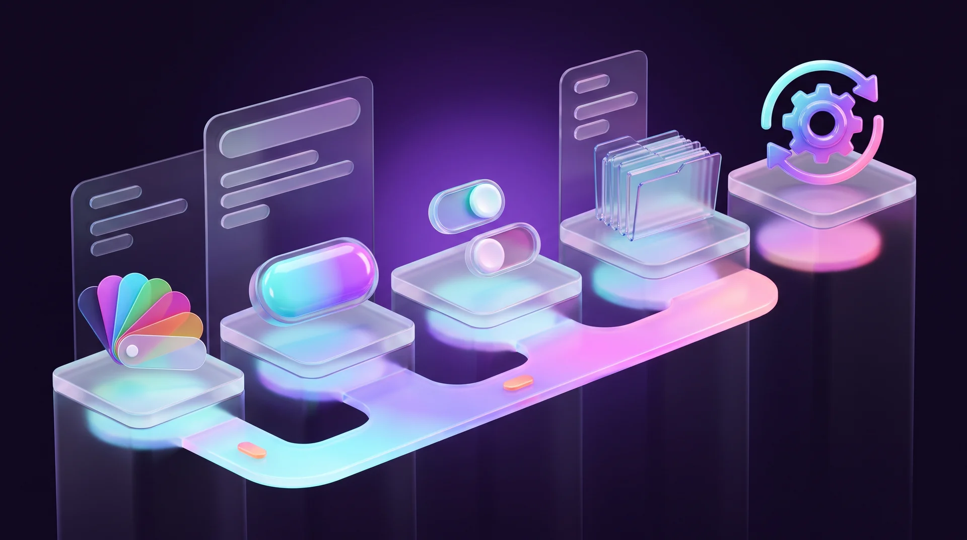
Step 1: Define the base styles
Start with the fundamentals: colors, fonts, text sizes, grid, spacing, radii and shadows. If a site already exists, this is the time to audit it. If the site has four similar shades of gray for text, decide whether you really need all of them. The same applies to font sizes and button types. The tidier the foundation, the easier it is to build on.
Step 2: Collect the core components
After the styles, move on to components, starting with the ones that appear most often: buttons, fields, links, icons, the menu. Each component is built up front for reuse, and pages use instances of it. That way, you only need to change the original component, and the change applies to every instance.
Step 3: Define variants and states
A single component often has several versions: a button has sizes and types, a field has states, a toggle is on or off. In Figma, you use Variants and Component properties for this. It's worth separating independent properties: instead of one "Style" property with values like Primary Large and Secondary Small, use two separate properties, Type and Size. That keeps the component manageable, and nobody has to hunt for the right button among dozens of near-duplicates.
For "on or off" options, such as an icon inside a button, a Boolean property works well: the instance shows a simple toggle to turn the icon on or off.
Step 4: Plan the library structure
Even a good kit is useless if it's hard to navigate. Decide on a naming and grouping system up front: pages for styles, basic components, complex components and patterns. Names should be clear to anyone who joins the project.
A tip that saves a lot of arguments: name tokens and styles so the developer can use them as-is for variables in code. That keeps the design library and the site code in sync, and the whole team speaks the same language.
Step 5: Keep the kit up to date
A UI kit isn't built once and for all. The site changes, and its components change with it. If a new component is added, the brand color changes or a button's behavior is updated, update the kit. Otherwise, within a few months the library and the site start living separate lives. It's worth appointing an owner for the library and deciding how changes get into it.
UI kits for multilingual and RTL sites: what to check
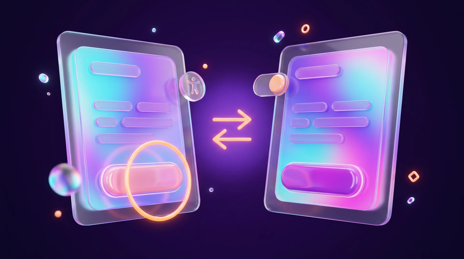
Most off-the-shelf kits are built for English and left-to-right layouts. If your site also serves right-to-left languages such as Arabic or Hebrew, or several languages at once, that's the starting point, not the finished result.
RTL direction
- Directional icons flip. "Next" and "previous" arrows, the back icon and breadcrumbs need to point the right way in RTL languages. Non-directional icons, such as search or a heart, stay as they are.
- Logical spacing. In code, use properties like margin-inline-start instead of left and right, so the same component works in both RTL and LTR languages.
- Mixed text. Phone numbers, prices, email addresses and Latin-script product names stay left-to-right inside an RTL sentence. Check them in every component that displays text.
Fonts for multiple scripts
Not every font that looks great in English supports other scripts, and not every non-Latin font looks good next to Latin. Choose a font with full support for all your languages (Google Fonts, for example, offers the Noto family, and Rubik covers Latin, Cyrillic and Hebrew) or a pair of fonts matched in height and weight. Keep in mind that some scripts, such as Arabic and Hebrew, have no uppercase and lowercase letters and usually no true italics, so hierarchy comes from size and weight.
Accessibility built into the component
In many markets, business websites are expected to meet WCAG, and regulations such as the European Accessibility Act are raising the bar. The cheapest way to comply is to build accessibility into the components, rather than fixing every page at the end:
- a contrast ratio of at least 4.5:1 for regular text and 3:1 for large text and UI elements, such as a field border;
- a visible focus state for every interactive element, for keyboard navigation;
- real labels for form fields, not just placeholder text that disappears;
- error messages that don't rely on red color alone;
- tap targets large enough on mobile.
Mobile and WhatsApp
Most visitors arrive on their phones, so every component in the kit needs a version or behavior for narrow screens: menu, table, card, form. It's also worth adding the components that show up on almost every business site: a WhatsApp button, a click-to-call button and an accessibility statement component.
From design to a live site: UI kits in Webflow, WordPress and code
A UI kit that lives only in Figma helps the designer. A UI kit carried over into the site itself helps the business for years. Here's how that looks on the most common platforms.
Webflow
In Webflow, you define Variables for colors, sizes and fonts and connect classes to them. Repeating elements are built as Components with properties, so you can change the text, image or link in each instance without breaking the design. A methodology like Finsweet's Client-First provides a consistent class naming system, which is exactly the library structure from Step 4, only inside the site. Webflow also lets you share component libraries across multiple sites belonging to the same organization.
WordPress
In WordPress with the block editor, colors, fonts and spacing are defined in the theme.json file and appear to editors as a locked palette. In Elementor, you work with Global Colors and Global Fonts in the site settings, plus saved templates for repeating elements. The principle is the same: a value is defined once, and every page pulls from it. We covered building a WordPress site from scratch in a separate guide to WordPress websites.
Code and developer handoff
In coded projects (React and similar), design components become code components, and tokens from Figma variables become CSS variables. Storybook is used to develop and document components in code, and Figma's Dev Mode shows the developer the dimensions, tokens and properties of each component. The best handoff is when the design component and the code component share the same name and the same properties.

Where to create a UI kit and where to find a ready-made one
The tool alone doesn't make a UI kit good. Structure, rules and ease of use matter more. Still:
- Figma. The most common choice for team work: components and properties, variants, variables and shared libraries, real-time collaboration and convenient developer handoff. The downside: it depends on an internet connection and on your subscription plan's limits.
- Sketch. A good fit for teams already using it. It has component and style libraries, but it's primarily for macOS.
- Penpot. An open-source tool for designing interfaces and components that you can also self-host on your own server.
- Adobe XD. Not recommended for a new project: Adobe has announced that the tool is in maintenance mode only, with no new features being developed.
- Complementary tools. Zeroheight for design system documentation, Storybook for coded components. They're used alongside the design tool, not instead of it.
Ready-made kits
A ready-made kit is useful when you need to build a prototype quickly, test an idea or start a small project. Free kits are available in the Figma Community, in official libraries (such as Google's Material 3 and Apple's UI kits) and in open design systems. Paid kits are sold in dedicated marketplaces such as UI8. Before buying, check the license (whether it allows use in a commercial client project), when it was last updated and whether it's built on Variables and Auto Layout.
Don't use a ready-made kit as-is. Some components won't fit, and standard solutions will make the site look templated. Take what you need, adapt it to the brand style and add what's missing for your languages.
Common UI kit mistakes
Too many components
Teams try to anticipate every possible scenario and create dozens of variants of the same component. In the end, the library is more complicated than the site itself. There's always a trade-off between minimal variation and a million settings, and the right direction is usually less.
Duplicates
The same button appears in the library several times with small differences. Over time, everyone uses a different version, and consistency breaks down again.
The kit isn't updated
This is one of the hardest problems. If the site has already changed and the library stayed the same, new pages get built on an outdated foundation.
Waiting for the "perfect" kit
In practice, the library grows along with the site. It's better to start with a small set of components you actually need, test it in real work and expand gradually.
Designing pages without components
Teams design ten pages without components and styles and only then try to move everything into a library. It's much easier to define the foundation on the first page and fix a component than to rebuild ten pages. If you're still at the wireframe stage, now is the time to list which components repeat.
Forgetting languages and accessibility
Teams take an English kit, translate the text and discover on the live site reversed arrows, a font without the needed script and focus states that have vanished. Check this at the component level, before it spreads across dozens of pages.
How RJL Studio builds UI kits for websites
At RJL Studio, we start every design project with base styles and components, not individual pages. In Figma, we build a kit with variables, variants and states, including RTL support, multi-script fonts and WCAG accessibility, then carry it over to the live site: Variables and Components in Webflow following Client-First, or theme.json and global styles in WordPress. That way, you can add pages and landing pages yourself without breaking the design.
Want a website that stays consistent even after a year of updates? Read about our UX/UI design services and Webflow development, or get in touch and we'll get back to you.
UI kit FAQ
Can one designer build a UI kit?
Yes. For a small project, it's enough for one designer to define the base styles and core components, without a full design system. What matters is setting rules for creating components and keeping the library organized. If the site grows, the kit expands together with the team.
How is a UI kit different from a website template?
A template is a ready-made page or site with a fixed structure and element placement. A UI kit is mainly a collection of separate, reusable components: buttons, fields, cards and icons that can be combined into different pages. In short, a template is a finished result, and a UI kit is the set of parts for building the result.
Do you need to update the UI kit after the site launches?
Yes, always. If components, styles or rules change after launch, update the kit too. Ideally, the library evolves together with the site, and its owner approves every change.
Can the same UI kit be used for several websites?
It can, if the sites share many components and rules, for example several sites belonging to the same company. But a completely identical kit isn't always a good fit, because each site has different needs. That's why it's common to build a shared foundation and add extensions for each site.
How do you hand a UI kit over to developers?
The simple way is to give developers access to the library and the documentation. The documentation should include not only images of components, but also variants, states, behavior and usage rules. It's even better when the design components are linked to the components in code or on the site, with the same names and the same tokens, so the designer and developer work in the same system.
Disclaimer: blog content is for general information and learning only and is accurate as of its publication date. It is not professional, legal, financial or business advice, nor a recommendation or call to take any action. Any use of this information is at the reader's own risk, and we accept no liability for any resulting loss. Links to external websites and tools are provided for convenience only. We recommend consulting a qualified professional before making decisions.