

How to Develop a Design Concept: Techniques and Tools
A design can be clean, tidy and technically flawless and still leave no impression at all. What makes a website, a logo or a campaign memorable is rarely another beautiful typeface or a trendy colour. It is usually a clear idea that ties all the pieces together. That idea is called a design concept.
The good news is that you don't have to wait for a concept to arrive like a bolt from the blue. Professional designers rely on a fairly stable set of tools and techniques that turn the search for ideas into a process you can manage, plan and repeat.
In this guide we explain:
- what a design concept is and why it matters to business owners, not just designers;
- what a visual metaphor is and how to build one;
- where to look for ideas, including how to use AI sensibly;
- which techniques help you train creativity and generate ideas in volume;
- which tools help you organise the work in 2026;
- how to turn a concept into a website or a brand, and which mistakes to avoid.
What a design concept is and why it matters for your business
A design concept is the central idea behind every visual decision in a project. It answers the question "what do we want our audience to feel and understand?" and translates the answer into the language of shapes, colours, images, typography and motion.
Without a concept, every decision is made in isolation: the colour is chosen because it "looks nice", the photo because it "fits", and the button because "that's what everyone does". The result is a design that is acceptable but generic, one you could swap for any competitor's. With a concept, every detail has a reason, and the website, the logo and the social media posts all tell the same story.
Business owners have at least three reasons to care about this:
1. Differentiation. In a crowded market, such as restaurants in a busy city centre or law firms competing for the same clients, a clear visual idea is one of the few ways to look different from everyone else.
2. Consistency. A concept lets different suppliers, a designer, a developer, a photographer and a social media manager, work in the same direction without guessing.
3. Faster decisions. When there is an agreed idea, questions like "does this photo fit?" are easy to answer without arguing about personal taste.
A good concept doesn't have to be complicated. Sometimes it is a single sentence, for example "our clinic is a quiet place in a noisy city", from which everything else follows: generous white space, soft colours, slow motion on the website and uncluttered photography.
Visual metaphor: the core tool for building a concept
One of the most powerful tools for building a concept is the visual metaphor. In linguistics, a metaphor is a figure of speech that describes one thing through the qualities of another: "a heart of stone", "a golden touch". In a visual metaphor, that comparison is built not with words but with an image, a shape, a colour or a context.
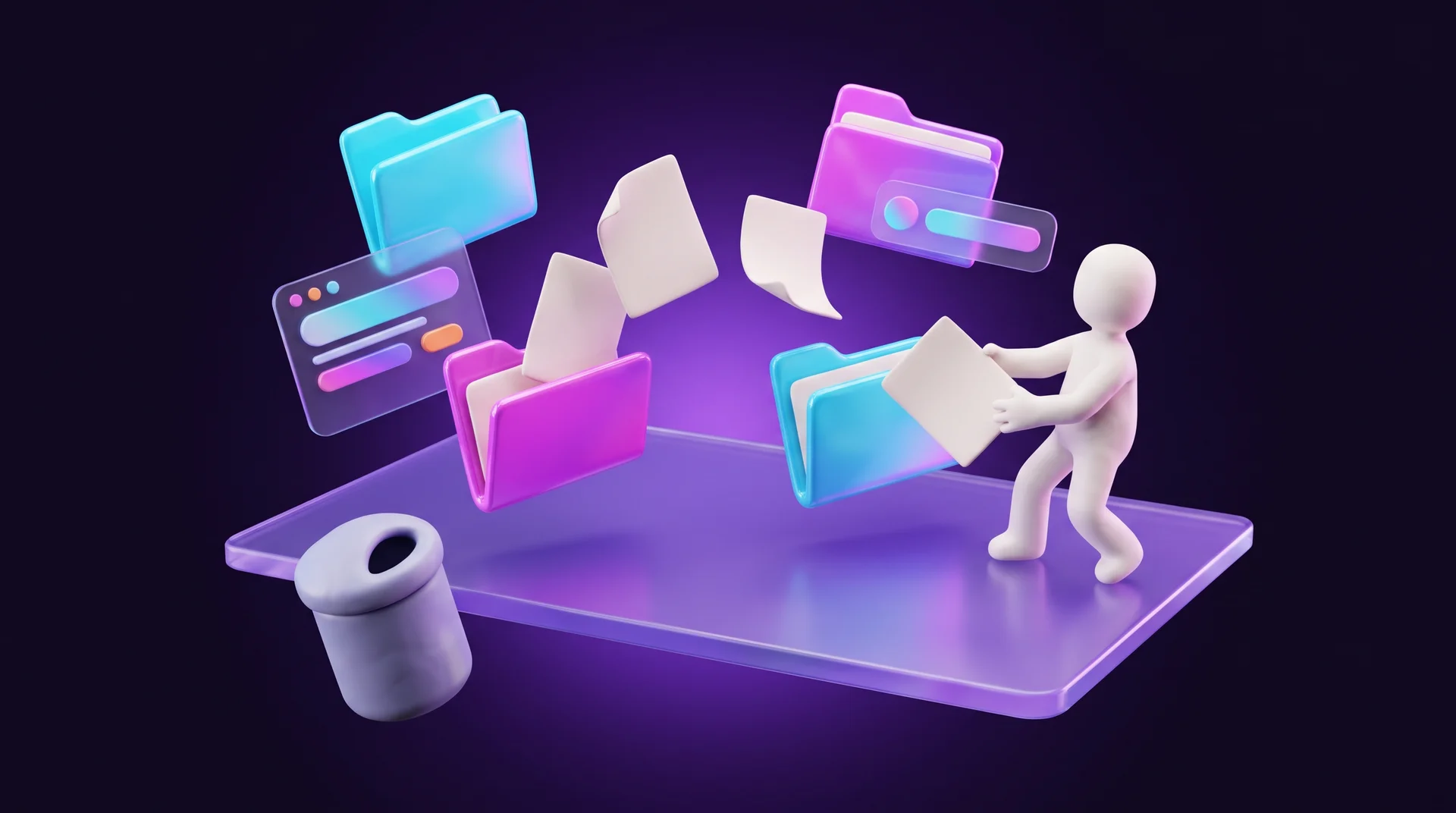
The best-known visual metaphor sits in front of most of us every day: the computer desktop. When the first graphical interfaces were developed in the 1970s, the screen was compared to a real office desk with folders and sheets of paper. A folder on a computer is of course not a folder, and a file is not a sheet of paper, but the comparison helps us handle them intuitively: we drag a document "into" a folder and move it "to the bin".
Familiar metaphors and surprising metaphors
Visual metaphors are usually divided into two types:
- Familiar (conventional). Symbols everyone already understands: a gear for settings, a shopping cart for the basket on an online store, a heart for "like", a house for the home page or the account area. Their job is instant understanding with zero effort.
- Surprising (unconventional). Comparisons the audience did not expect. Their job is to stop the eye, trigger an emotion and stick in memory. This is where they belong: in advertising, logos, packaging and brand identity.
This distinction matters a lot when you work on a website. In the interface, meaning the menu, icons, buttons and forms, you use familiar metaphors only. If you replace the heart icon with a drawing of a dopamine molecule, nobody will understand that it is a "like" button. In the hero image of the home page, in a campaign or in a logo, on the other hand, a surprising metaphor is exactly what makes people pause.
When you don't need a metaphor
Not every design has to be built on a comparison. A metaphor is only one of the tools. Sometimes abstract shapes, a consistent illustration style or a good product photo are enough. The identity for an equestrian event can simply show a horse, and that is perfectly fine. The question is always whether the metaphor adds meaning or just adds complexity.
Four ways to build a strong image
There is no single formula for a metaphor, but designers return again and again to a handful of basic moves. They are worth knowing, because they turn "think of something creative" into a list of concrete experiments.
1. Place two objects side by side
When we see two things next to each other, the brain automatically starts comparing them, looking for what they share and what sets them apart. You might, for example, show a car whose reflection in a shop window reveals the lifestyle it makes possible: a beach, a road trip, a family.
2. Replace one object with another
Take a familiar scene and swap one element for something from a different world. Imagine the bubbles of a popular push-pop fidget toy replaced with round sweets: the message is that the sweets are just as addictive as the toy.
3. Merge several objects into one shape
Two ideas meet inside a single form. Coffee packaging shaped like a neighbourhood café, or a logo where one letter is also an object related to the business. This is the classic move in logo design, because it packs two meanings into one small symbol.
4. Give an object the qualities of another
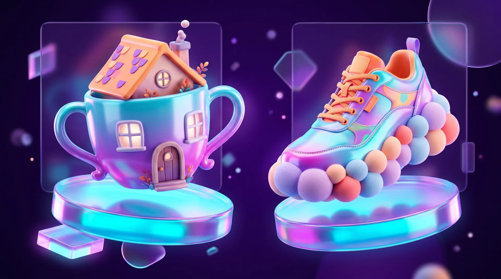
The quality can be a texture, a colour, a shape or a movement. A shoe sole made of soft toys instantly shows that the shoe is comfortable, without a single word. A special case of this move is personification: when a product or a brand takes on the traits of a living creature, it feels friendlier and more approachable. Fruit dancing on a coffee pack hints at fruity flavour notes and good energy.
Where to find ideas for a concept
Many designers "steal like an artist": they don't copy, but they take inspiration from existing work, reinterpret it and respond to cultural phenomena, events and public conversation.
In art
Paintings, sculpture and art movements are a rich source of ideas. You can quote a well-known work, play with a particular painter's technique, or design in the style of an era such as Art Deco, Bauhaus or Pop Art. Bauhaus in particular, with its clear geometry and primary colours, still feels surprisingly modern on a website.
Check the rights before you use anything. In the European Union, copyright in most works generally runs until 70 years after the author's death, and the rules differ in other countries. Even when the artwork itself is in the public domain, a photograph of it can have its own terms of use. So use only images licensed for commercial use, or create an interpretation in the style of the work rather than a copy. This is general information, not legal advice; if you plan to build a brand around an existing artwork, check with a lawyer.
In culture, events and literature
News, history, literature, mythology, jokes and well-known memes are sometimes called "precedent texts": the audience already knows them, so a small hint is enough to trigger a whole chain of associations.
It helps to distinguish between two types:
- References to current events suit a reactive social media campaign that lives for a week or two. After a short while the hint no longer makes sense, so you don't build a logo or a website on it.
- Timeless images, such as folk tales, myths, traditional symbols and images from nature, suit design that has to work for years: brand identity, a logo, a website.
If you work with international audiences, there is an extra layer. An image that feels obvious to one culture can be unfamiliar or even carry a different meaning in another, and the same goes for colours, gestures and animals. If your website speaks to several audiences, for example in a multilingual market or across several countries, test the metaphor with representatives of each of them.
In new techniques and handcraft
Sometimes the tool itself becomes the idea. Instead of working only in Figma, Photoshop or Illustrator, try watercolour, calligraphy, screen printing, paper collage or photographing real materials. A handwritten typeface for a knitwear brand, or a logo painted with a brush that is itself a vegetable, makes the process part of the story.
With AI
AI is a good assistant at the search stage, as long as you remember what it does well and what it does less well:
- Language models such as ChatGPT, Claude and Gemini help you gather background information, produce long lists of associations for a keyword and draft different concept directions to test.
- Image generators such as Midjourney, Adobe Firefly or the image generation built into Gemini and ChatGPT let you see dozens of variations of an image, style or composition in minutes.
What AI still doesn't do well is subtle metaphors and unexpected symbols that fit one specific business precisely. Its results are often generic, so treat them as a starting point, not a finished product. Check the commercial use terms of each tool, and make sure the result doesn't closely resemble an existing trademark or artwork. If you want to get more out of these tools, read our guide to writing AI prompts.
Techniques for developing creativity
Even for the most creative people, ideas don't arrive in a steady stream. Creativity is a skill, and you can train it like any other professional skill. Here are a few proven techniques.
Brainstorming and the NUF test
In a brainstorm, the team comes up with as many ideas as possible on a given topic, including strange and seemingly irrelevant ones. Judgement is postponed to the next stage. Once the list is ready, it is time to filter. A simple way to do that is the NUF test: score each idea on three criteria, New, Useful and Feasible, from zero to ten. The ideas with the highest scores move on to a closer look.
Free writing
Write by hand, without stopping and without editing, for 10 to 15 minutes. The goal is to get past your inner critic and your perfectionism. If a blank page feels hard, write about a specific problem your client has, explain a professional term in plain words, or hold an imaginary argument with a sceptical customer. Along the way, an image, an analogy or a phrase often appears that becomes the basis of a concept.
Sketchnoting
A mix of words, symbols and simple drawings on paper, in a notebook or on a whiteboard. You don't need to be able to draw: arrows, frames and stick figures are enough. The technique breaks you out of linear thinking and helps you see connections between ideas.
Mind maps
Write the task or the keyword in the middle of the page, for example the brand name. Main branches grow out of it: feelings, audience, materials, colours, places. Each branch sprouts sub-branches with second- and third-level associations. The good idea is often hiding on the most distant branch, where the association is no longer predictable.
The Disney method, or the three chairs
A method attributed to Walt Disney and later developed by the psychologist Robert Dilts. It is a role-play for one person or a team, in three stages:
1. The Dreamer: every idea is allowed, even the most absurd.
2. The Realist: check what can actually be done within the budget, timeline and technology, and filter.
3. The Critic: look for risks, weaknesses and possible audience reactions.
Ideas that survive all three stages are worth working on. It helps to separate the roles physically too, in three different spots in the room, so that dreaming and criticism don't get mixed up.
Collecting references
A designer needs a "trained eye": seeing lots of work, exhibitions, packaging, websites and images. But nobody can remember everything, so you save and sort. A reference library organised by topic becomes the starting point for every new project. We cover this in more detail in our guide to design references and moodboards.

Tools for working with ideas and concepts in 2026
There are hundreds of tools, but most teams get by with a few well-known ones:
- FigJam and Miro are collaborative whiteboards for mind maps, remote brainstorming, moodboards and voting on ideas. FigJam is especially convenient if the design itself continues in Figma, which we covered in our Figma guide.
- MindMeister is a dedicated mind-mapping tool where you build maps from ready-made blocks, with collaboration, links and images.
- Milanote is a visual board where you mix images, video, notes and links, and connect boards to each other. It works very well for collecting references for a project.
- Pinterest, Behance and Dribbble are used to search for inspiration and save collections. Remember that what you find there is inspiration, not material to copy.
- Google Keep, Apple Notes or Notion are good for capturing ideas on the go: a photo, a voice memo or a quick list, searchable by keyword.
- AI tools such as ChatGPT, Claude, Gemini, Midjourney and Adobe Firefly help with associations and quick visual variations at the search stage.
The tool matters less than the habit. A designer who records ideas regularly in a simple tool will get more out of it than someone who switches apps every month.
From concept to website and brand: a six-step process
Here is what a practical workflow looks like, from the brief to a design that goes live:
1. Define the task. Who the audience is, what they need to understand and feel, and what the business wants them to do: leave their details, buy, call. Without this, every "beautiful" idea is a guess.
2. Gather material. Competitor websites, references, the words your customers actually use, photos of the business itself. This is also where design thinking principles help: talk to real customers before you start drawing.
3. Generate lots of ideas. A mind map, brainstorming and AI tools. At this stage, quantity matters more than quality.
4. Choose two or three directions. Filter with the NUF test or the Disney method, and describe each direction in one sentence.
5. Turn them into moodboards and sketches. For each direction: colours, typefaces, a photography or illustration style and a sample hero screen. That way the client chooses an idea, not "a colour they liked".
6. Test and implement. Show the directions to a few people from the target audience, refine, and only then develop the website and the full set of assets.
A few more things are worth thinking about at the concept stage. If the website will exist in several languages, remember that the same text can be noticeably longer in one language than in another, so headlines and buttons need room to grow, and the concept has to work in every version. If you ever add a right-to-left language, directional metaphors such as a "forward" arrow or a progress bar will flip. And since most visitors arrive on a phone, the central image has to read well on a small screen, not just on a wide desktop.

Common mistakes when working on a concept
- Jumping straight into design. Opening Figma before the task is defined leads to a beautiful design that solves no problem.
- An overly complicated metaphor. If the audience has to decode the image like a riddle, most people won't bother. The comparison has to be clear to the target audience, not just to the designer.
- A surprising metaphor in the interface. Icons, menus and buttons must be understood instantly. Save the creativity for the hero image, the campaign and the brand.
- Building a brand on a trend or a meme. What is funny this week won't make sense a year from now. For a long-term identity, choose stable images.
- Copying instead of being inspired. Taking an idea from Behance as it is carries legal risk and gives up any chance of standing out. Borrow the principle, not the result.
- Treating AI output as the final product. A generated image is raw material. Without further work it will look like a thousand similar images and may contain flaws or an unwanted resemblance to existing work. It is also worth knowing how to spot AI-generated images, because your audience already can.
- A concept that never reaches the details. An idea that appears only in the logo, and not on the website, in posts and in emails, doesn't really work. The concept has to be translated into clear rules for every asset.
How RJL Studio develops concepts for websites and brands
In every branding or UX/UI design project, we start with the business and its audience, not with choosing colours. A short discovery call, a competitor review and a reference collection, followed by two or three concept directions, each with a moodboard and a sample screen, so that you choose an idea rather than just a "style".
Once the direction is approved, we translate it into a website on Webflow, WordPress or Wix, into assets for social media and into design rules you can keep working with. That way the concept stays consistent long after launch.
If you are planning a new website, a brand identity or a refresh of an existing design, tell us about your project and we will start with the idea that sets you apart.
Frequently asked questions
What is the difference between a design concept and a design style?
Style is how things look: minimalist, colourful, retro. A concept is why they look that way, meaning the idea that connects the decisions. Two websites can share the same minimalist style and still tell completely different stories. A good concept determines which style will suit it, not the other way round.
Does a small business need a design concept?
Yes, even more than a large company. A small business doesn't have a big advertising budget to make up for generic design, so a clear visual idea is a relatively inexpensive way to be remembered. The concept doesn't have to be complex: one clear sentence and a well-organised moodboard are an excellent start.
How long does it take to develop a concept?
It depends on the scope. For a landing page or a campaign, you can reach a clear direction in a few days. For a full brand identity with a website, including research, several concept directions and rounds of feedback, the process usually takes a few weeks.
Can you develop a concept with AI alone?
AI is excellent at producing plenty of associations and variations at the search stage, but it doesn't know your business, your customers and your competitors the way you do. Choosing, refining and connecting the idea to your strategy remains a human job. Use AI as a brainstorming partner, not as the designer.
How do you know a concept works?
Show it to a few people from your target audience, without explaining it, and ask what they understand and feel. If their answers are close to what you intended, the direction is right. After launch, look at the data as well: time on site, enquiries, and what people say when they describe your brand.
Disclaimer: blog content is for general information and learning only and is accurate as of its publication date. It is not professional, legal, financial or business advice, nor a recommendation or call to take any action. Any use of this information is at the reader's own risk, and we accept no liability for any resulting loss. Links to external websites and tools are provided for convenience only. We recommend consulting a qualified professional before making decisions.