

Visual Brand Identity: What It Is and How to Build It
It is tempting to think of visual identity as a nice logo. But the logo is only one part of a much bigger system. A strong visual identity makes a business look familiar and consistent at every touchpoint: on the website, on social media, in ads, in a sales proposal, on the sign by the front door and even in the very first WhatsApp message a customer receives. Colours, typefaces, shapes, photography and layout rules work together to express the brand's character and set it apart from competitors.
In this guide we walk through the process step by step:
- what visual identity is and how it differs from a logo;
- how to define the task in a brief and find the idea behind the concept;
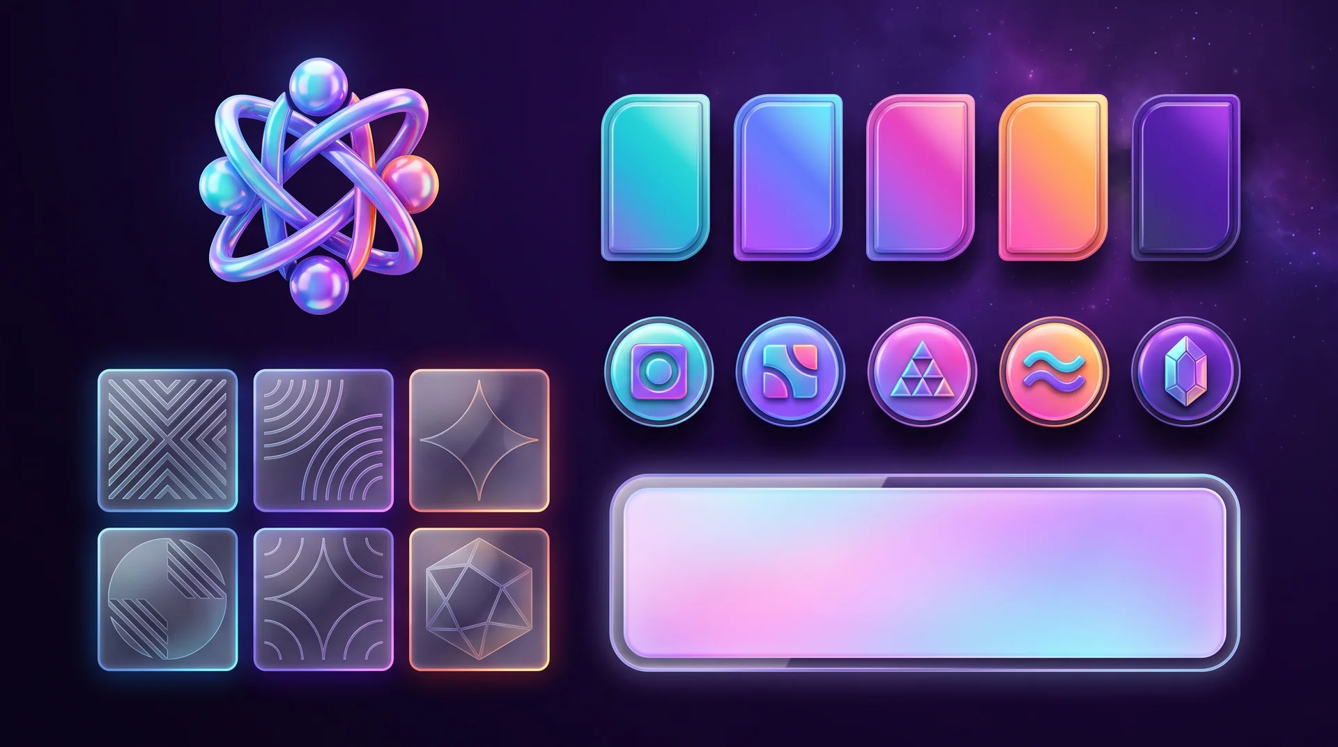
- which components make up a visual system;
- how identity works on a website and in digital channels;
- how to test it on real touchpoints and what you should receive at the end of the project;
- which mistakes stop a visual identity from doing its job.
What visual identity is and why it is more than a logo
If your brand is the way people perceive your business, your visual identity is the visual system the business uses to shape that perception and keep it steady over time.
The terms "graphic language", "style" and "branding" are often used as if they meant the same thing. The important difference is this: style describes how things look, while visual identity rests on something deeper, namely the brand's values, personality and positioning. It answers not only "which colour?" but also "why this colour and not another?".
The sign of success: people recognise the brand without the logo
A good visual identity creates a sense of wholeness and consistency. People can recognise the brand even when the logo is tiny, tucked in a corner or missing altogether: by its colours, its typeface, its photography style or a recurring graphic shape. That is the simplest test there is. Cover the logo on a post or a banner and ask yourself whether it is still obvious whose it is.
What a visual identity includes
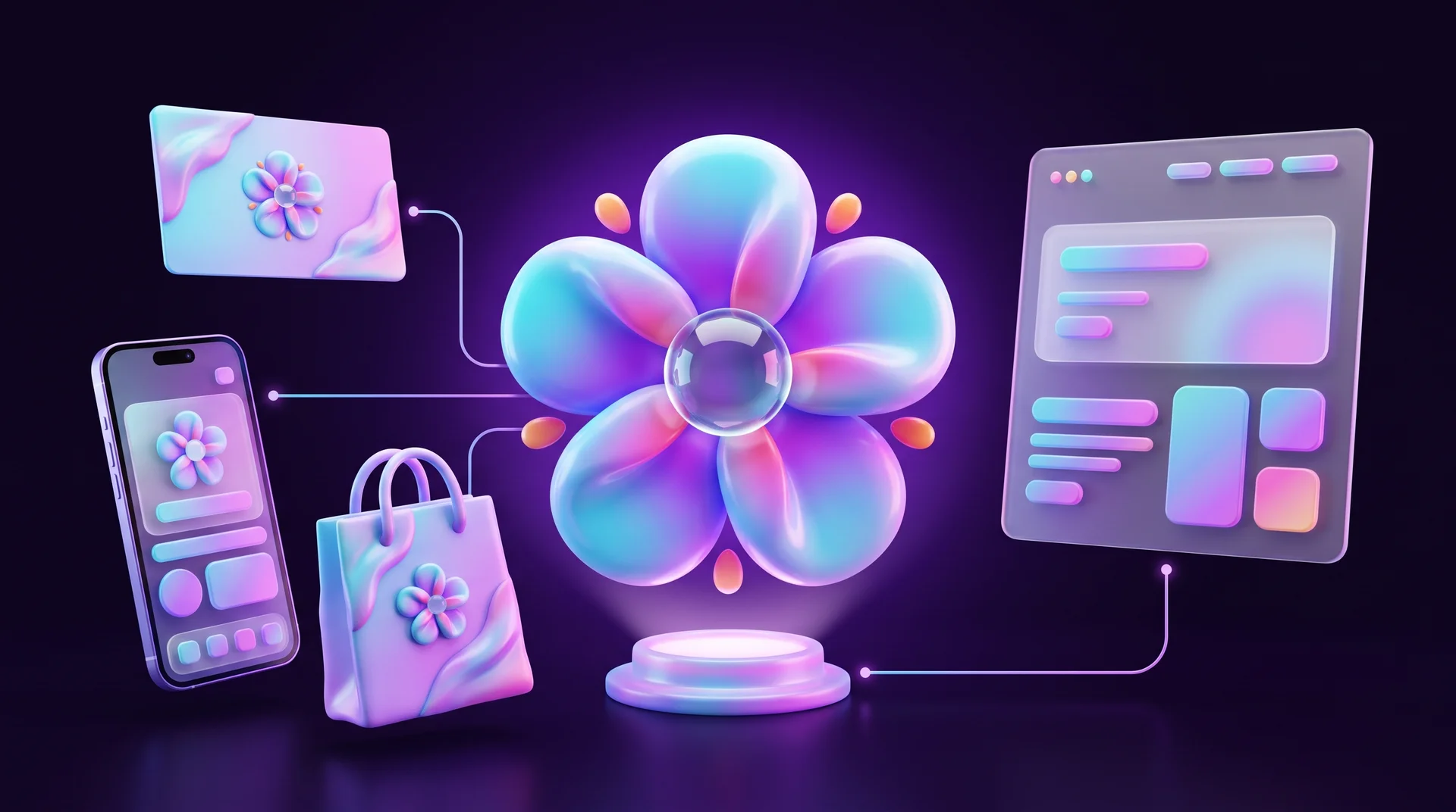
Beyond the logo, an identity usually includes a colour palette, typography, graphic elements, rules for photography and illustration, icons and composition principles. Together they form a system that is then applied to different touchpoints. Which touchpoints exactly depends on the business: a restaurant needs to think about menus, packaging and signage; a law firm about documents, presentations and its website; a software company about interface graphics, social media templates and ads.
Start with a brief: what to clarify before anyone designs
The first step is to understand why the business needs a new visual identity in the first place. Finding out which colour the owner likes is not enough. It matters far more to understand what is happening in the business itself.
A request like "we need modern branding" explains almost nothing. Perhaps the company has grown and the old design no longer fits the product. Perhaps it is targeting a new audience, for example expanding into new European markets or selling internationally for the first time. Or perhaps competitors have simply started to look more convincing. Each of these reasons leads to a different piece of work.
The questions a brief should answer
A brief is a questionnaire in which the business sets out the key information about its product and its requirements for the future identity. This is what a designer is trying to learn from it:
- what the business sells and how it operates;
- who the target audience is and what matters to them;
- who the main competitors are;
- how the brand should differ from them;
- what impression it wants to make, in three to five words;
- where the identity will actually appear: website, social media, signage, packaging, vehicles, presentations;
- which languages and scripts the brand communicates in: one language only, or also others such as Greek, Portuguese or Arabic;
- which existing elements already work and must stay;
- what the constraints are: budget, timeline, franchise rules or parent company requirements.
If you are not sure exactly who your audience is, it is worth doing that work first. Our guide on how to define a target audience for your business will help.
Who is right for the project
How deep the work goes depends on the request and the resources available. An identity for a large corporation with dozens of branches usually calls for a branding agency with a full team. For a small or mid-sized business, an experienced designer or a small studio can build an identity that genuinely works, as long as there is a clear brief and a structured process.
Research, concept and moodboard: how to find the idea
Once the brief is in place, the designer studies the product, the audience and the competitors. The aim is to understand the context: how brands in the sector usually look, which images they rely on and which graphic devices they use to express them. That shows which solutions have already become clichés and where there is room to stand out.
Say that in a particular sector almost every brand uses blue, rigid typography and stock photos of people in an office. Your client also wants to look technological and professional. You could follow the same path, but then they will look like one more company among dozens. So you look for a different idea that sets them apart. A useful tool at this stage is benchmarking: a structured comparison of competitors' websites, social media and ads.
From personality traits to a visual language
At this stage it is important to separate the brand's traits from the way those traits are expressed visually. A client may describe the brand as "technological", "lively" and "trustworthy", but those words still say nothing about a specific typeface or colour. The designer's job is to understand how the traits relate to the product and the audience, find precise associations and build a visual image from them. All of this is called a design concept: an idea that explains why the brand should look exactly this way.
"Technological" might mean precision, speed or the ability to connect complex things. "Lively" can be conveyed through movement, change or a human touch. A service built on a complex technical architecture might express its character through dots and lines that connect: in graphics, animation, illustration and the composition of its interface. The metaphor does not have to appear literally in every element. What matters is that it sets the overall principle.
A well-known example is the Burger King rebrand unveiled in 2021. The central idea was a return to its roots and to real food, and the logo, the warm colours, the rounded typeface and the photography all tell that same story through different means.
Moodboards and references
Once you have chosen a few strong ideas, you need to decide on the visuals. This is where moodboards and references work well: they show how the idea is meant to look and confirm that the team and the client agree on the direction before anyone invests in detailed design. You can collect images, posters, illustrations, packaging and websites that point towards a particular idea: an approach to typography, a photography style or a graphic shape. Today Figma or FigJam make this easy, and you can also use AI tools to generate quick variations, as long as you remember that these are sketches, not final design.
Sometimes the idea is best expressed through bold typography, sometimes through colour and graphics, and sometimes through all of them together.

What a brand's visual system is made of
Once the concept is approved, it is translated into tangible components. The key is not to choose them one by one in isolation: the logo, colours, typefaces and graphics should all support the same idea and fit together, so that the brand looks familiar on every touchpoint.
Logo
The logo should support the idea and work well at any size. That is why you design not only a primary version but also adaptations: horizontal and vertical lockups, a compact version, a symbol without text, a single-colour version and a version for dark backgrounds. It often turns out that a logo that looks great at full size is too complex for a profile picture or a browser favicon. In that case you adapt it for that specific use without breaking the system. And if the brand name is written in more than one script, check the versions side by side: the relative sizes, the stroke of the letters and how each reads.
Colour palette
When choosing a palette, you take into account the brand's character, the audience's expectations and the colours competitors use. You do not have to pick an opposite colour: sometimes it is better to keep the colour that is standard in your category and stand out through the shade, the combination or the way you use it.
After choosing the main colours, check how the palette behaves in different situations: on light and dark backgrounds, on screen and in print, as a large fill and as a small accent. This is also where you define supporting shades for backgrounds, text and secondary elements, along with colour codes for each environment: HEX and RGB for screens, CMYK and Pantone for print. We cover colour choice in depth in our guide to building a brand colour palette.
Typography
Some typefaces signal precision and technology; others signal warmth or personality. But the choice goes deeper than that. Is the typeface comfortable to read in long passages? What happens to headings at different sizes? How do the typefaces work together?
For a brand that operates in several languages there is an extra challenge: the typeface family has to cover every script you need, or you need carefully matched pairs that look like one family. Many popular typefaces cover Latin only, so if you also publish in Greek, Cyrillic or Arabic, check language support before you fall in love with a font. Compare the visual height of the letters, the stroke weight and the overall character, and make sure numbers and punctuation look right in mixed lines. Step by step you set the standards: which typeface for headings and which for body text, and which weights and sizes are allowed.
Graphic elements and icons
These are characteristic shapes, lines, patterns and other elements used alongside the logo, colours and typography. They let you design varied materials while keeping the brand recognisable. Usually several ways of using them are planned, so you can build different layouts without repeating the same template. It is also worth defining a consistent icon style: stroke weight, corners and fill.
Photography and illustration
Already at the identity stage you define how the brand uses imagery, from style to composition. For example: only natural, documentary-style photos rather than staged ones; only macro shots; a particular colour treatment; or collages in a recognisable layout. If the brand uses illustrations or AI-generated images, they need clear rules too, otherwise every post will look as if it came from a different brand.
Composition principles
These are the rules for putting all the elements together in a single layout. For example: a large heading that takes up a significant part of the space, a photo that breaks out of the grid and an accent colour that appears in only one area. Rules like these keep the brand recognisable even when there is no large logo on the layout.
Visual identity on your website and in digital channels
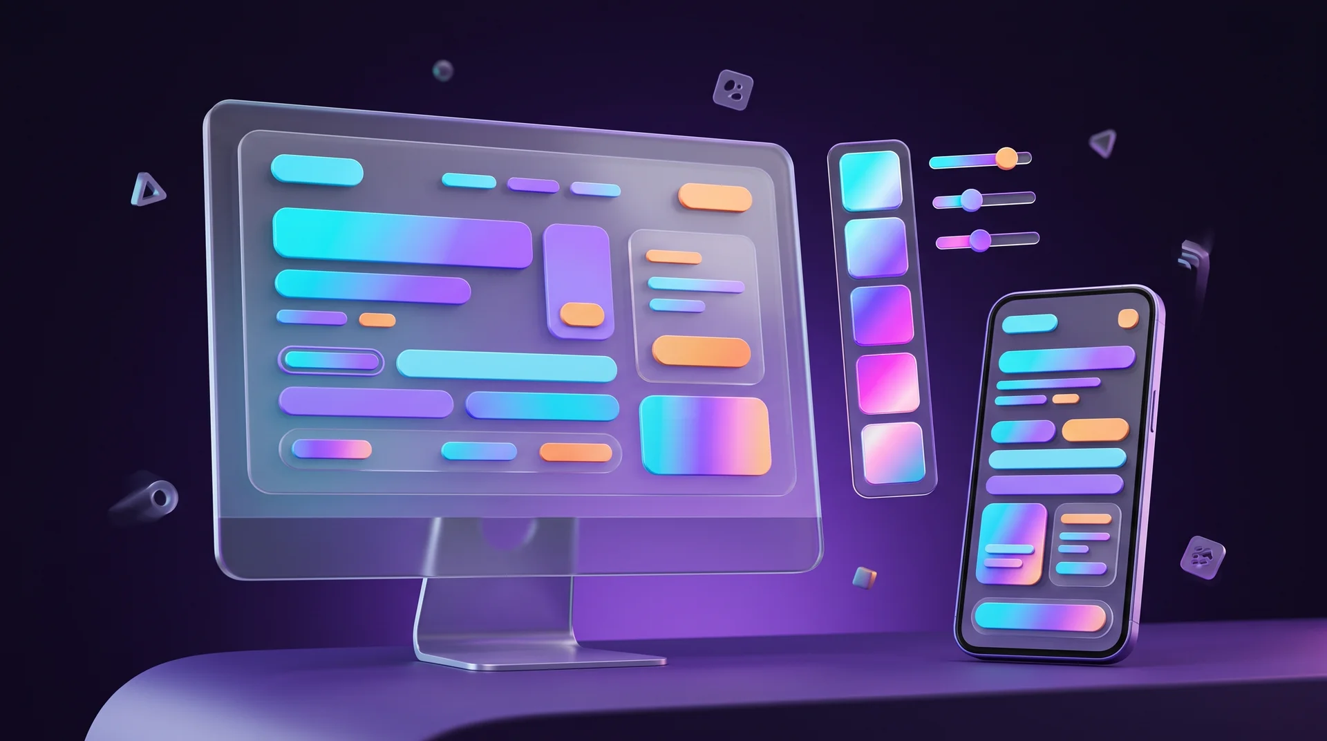
For most businesses today, customers meet the brand on their phone first: in a search result, a post, an ad or on the website. So it makes sense to test the identity on screen first, not just on a business card.
From guidelines to website: variables and a design system
To stop the identity from "falling apart" on the website, you translate it into variables, also known as design tokens: colours, typefaces, sizes, spacing and corner radii. In Figma you do this with Variables, in Webflow with Variables and shared classes, and in WordPress through theme.json or Elementor's global colours and fonts. That way, changing a brand colour happens in one place and updates across the whole site. We explain how to build this kind of component library in our guide to creating a UI kit for your website.
What to check on your website
- Accessibility: brand colours need a contrast ratio of at least 4.5:1 for normal text and 3:1 for large text and interface components, in line with WCAG. In the EU, accessibility requirements for many digital products and services are now set by the European Accessibility Act, which relies on the same WCAG criteria (this is not legal advice; check what applies to your business). Quite often a brand colour works for a button but not for small text, so you define a darker shade for text use.
- Text direction: if your site also runs in a right-to-left language such as Arabic, directional icons such as arrows need to flip, and "flowing" graphic elements should follow the reading direction.
- Web fonts: a licence for website use is often separate from a desktop licence. Heavy font files slow down loading, so check their size as well.
- Small assets: favicon, social sharing image (Open Graph), round profile picture and the profile image of your WhatsApp Business account. The full logo almost never works here, and you need the compact symbol.
- States: buttons in hover, focus and error states, system messages and dark mode, if you have one. Undesigned states are one of the most common signs that a website looks cheap.
How to test whether the concept really works
Throughout the project it is important to go back to the original task and check that the concept can grow into a complete system. These are the main criteria:
- Scalability: does the idea work on touchpoints of different sizes and formats, from a favicon to a billboard?
- Variety: can you create different layouts without repeating the same trick?
- Recognition: does the brand's character survive without the logo?
- Coherence: do colour, typography, graphics and imagery work as one system rather than a set of random decisions?
- Practicality: can the elements be used in real conditions, such as on mobile, in print, on a dark background or in single-colour printing?
Testing on real touchpoints
At the start you do not need to design every touchpoint in detail. Take a few typical scenarios, for example an Instagram post, a banner, the website homepage and a sign, and build quick mock-ups to present to the client. This shows whether the idea works across formats and allows materials that differ in content but are instantly recognisable in look. Only after approval do you design each touchpoint in detail.
If the concept relies on a single impressive trick, it probably needs strengthening. An interesting pattern can look great on packaging, but if the whole identity is built on it alone, posts and ads will quickly become monotonous. Test the edge cases too: a logo that looks good large sometimes becomes illegible when small, and a brand colour used in large amounts can tire the eye. Based on the results, you adjust the elements or the rules for using them.
What you receive at the end: files and brand guidelines
At the end of the project the business receives ready-to-use files and the rules for using them.
The files
Usually you receive the source files for the logo and the other elements, layouts for the main touchpoints, colour codes, typefaces in line with their licences and any other files the team needs. It is important to get the logo in vector format (SVG, plus PDF or AI for print) alongside PNG files in different sizes with transparent backgrounds. Make sure the files are owned by you and stored in your own accounts, not only with the designer.
Brand guidelines
Separately, a brand book is created: a document that brings together all the rules for working with the logo, colours, typography, layouts and other elements. For a small project it can be a short document of a few dozen pages; for a large brand it will be far more detailed. Good guidelines also include "do and don't" examples: how not to stretch the logo, which backgrounds it must never sit on and which colour combinations fail the contrast requirements.
Brand guidelines help designers, marketers and external suppliers create new materials in the same language while still adapting the identity to different tasks. Today many businesses keep them not only as a PDF but also as a shared Figma file or an internal web page, so they are easy to update.
Legal protection
If the business is investing in a logo and a name, it is worth considering registering them as trademarks, either with your national intellectual property office or, for protection across the EU, as an EU trade mark with the EUIPO. An early search also saves you from unpleasant surprises, such as discovering after launch that a similar mark is already registered in your field. This is not legal advice, so talk to a trademark attorney for your specific case. We cover the process in more detail in our guide on how to choose a brand name.
What happens after launch
If an agency or studio developed the identity, they can continue to support the brand or hand the work over to your in-house team. Either way, visual identity is not a one-off project: every so often it is worth checking that new materials still follow the rules, and updating the guidelines when new touchpoints appear. When the gap between the brand and the business becomes too wide, it is time to think about a rebrand.
Common mistakes when building a visual identity
An identity can look great in a presentation and still fail to solve the business problem: it may not set the business apart from competitors, may not work across touchpoints or may not fit the product. These are the mistakes to avoid:
- Starting with sketches. Without a clear task, the designer has to guess how the brand should look. Define the goals and the context of use first, and only then design.
- Choosing by personal taste. Taste can mislead, and the result is a stylish identity that was not created for this task. Judge the concept against the criteria described above.
- Trying to convey too many traits. Trying to show reliability, luxury, innovation and warmth all at once overloads the identity. It is better to pick two or three core traits and set priorities.
- Copying competitors. That kind of design may look appropriate, but the brand will get lost among look-alikes. Study which visual codes are common in your sector and look for what the market is missing.
- Testing only in a presentation. A beautiful layout does not prove the system works. Test it early on real touchpoints, at different sizes and on mobile.
- Forgetting your other languages. A logo designed for one language and a typeface without the characters your other markets need create an identity that breaks in exactly the language many of your customers read.
- Not getting the files and licences. A logo that exists only as a JPG in a chat thread and a typeface without a web licence are problems that will surface at the worst possible moment.
Visual identity is not a collection of attractive elements but a system that helps a brand stay recognisable and consistent in every situation. That is why you build it from the business task, study the context the brand operates in and look for a fresh idea. A good identity does not just look convincing in a presentation; it stays flexible, clear and useful in everyday work.
How RJL Studio builds visual identities that work on the web
At RJL Studio we start with the brief and the business task, not with the logo. We create the concept, the logo and its variations, a colour palette that meets accessibility requirements, typography that covers every language you work in, and short, clear brand guidelines. Because we also design and build websites, the identity goes straight into your site as a system of variables in Webflow, WordPress or Wix, instead of staying a PDF in a drawer.
Need a new visual identity or want to bring order to your existing one? Take a look at our branding and UX/UI design services, or get in touch for a short introductory call.
Frequently asked questions
What is the difference between a visual identity and a logo?
The logo is one component of a visual identity. The identity also includes colours, typefaces, graphic elements, photography and illustration style, icons and layout rules, plus the brand guidelines that explain how to use all of them. A brand with a strong identity is recognisable even when the logo is not visible.
How long does it take to build a visual identity?
It depends on the scope. For a small business that needs a logo, a palette, typefaces and short brand guidelines, the process usually takes a few weeks, including the brief, concepts, rounds of revisions and testing on touchpoints. A large brand with many touchpoints, languages and locations will need considerably longer.
What should brand guidelines include?
At a minimum: the logo versions and the clear space around them, prohibited uses, colour codes for screen and print, typefaces and weights for headings and body text, graphic elements, photography and illustration style, and examples of key touchpoints such as a social post, an ad and a web page. It is also worth adding accessibility rules for colour use.
Does a small business really need a full visual identity?
A small business does not need a hundred-page brand book, but it does need a basic system: a logo in several versions, two or three colours, a pair of typefaces and a few simple rules. Without that, every post, ad and web page looks different, and customers struggle to remember the business.
How do you bring a visual identity to your website?
You translate the brand guidelines into variables, such as colours, fonts, sizes and spacing, first in Figma and then in the platform itself, whether that is Webflow, WordPress or Wix. That way every button, heading and card relies on the same values, and the site stays consistent even as new pages are added. Along the way you check contrast, text direction for any right-to-left languages and web licences for your fonts.
Disclaimer: blog content is for general information and learning only and is accurate as of its publication date. It is not professional, legal, financial or business advice, nor a recommendation or call to take any action. Any use of this information is at the reader's own risk, and we accept no liability for any resulting loss. Links to external websites and tools are provided for convenience only. We recommend consulting a qualified professional before making decisions.